Become a MacRumors Supporter for $50/year with no ads, ability to filter front page stories, and private forums.

ravenvii

macrumors 604
Mar 17, 2004
7,585
492
Melenkurion Skyweir
I thought about it and to me it doesn't make a difference since I don't have the technical know-how to execute it.

That is, if it's easy enough to do and people want it, a developer can do it and I wouldn't mind.

It would look more apple like but I also wanted MR to keep its own feel so that it doesn't just come off as some fanboy site obsessed with Aqua/Mac OS X

Then you should remove the rounded left part. Just make it a input box and put a "Search" button next to it. The regular, OS-defined widget button, just like how it is right now.

Simplification of code for the win. And one less image to load!
 

Me1000

macrumors 68000
Original poster
Jul 15, 2006
1,794
4
With a nice photo in the story, for a new product release say, the posts will look dramatically different.
Sorry, should have been more clear, the center column looks fine. It was the side column that I thought made the whole thing look like a blog.

Now, what defines a 'bloggy' look and why is it a bad thing?
You cant put a finger on that, im just saying what I think it looks like, and I like the idea of MacRumors looking more like a news website and less like a blog. And like I said, I like how MacRumors doesnt currently look like a blog.

My major complaint with the current MR look is that there are too many extraneous design elements. Such as: too many colors in the left side-bar, cheesy bevel in the nav, too many boxes and outlines dividing elements of the page.

I'll agree, I hate the navigation for MacRumors now, and I dont really like the color scheme of it all as a whole either.

It would look more apple like but I also wanted MR to keep its own feel so that it doesn't just come off as some fanboy site obsessed with Aqua/Mac OS X
We aren't all fanboys? :confused:
haha :p
;)
 

ClassicMac247

macrumors 6502
Aug 30, 2007
274
0
Brick, NJ
I think the MacRumors Site should have a design like the Mac User Interface, with a dock on the bottom and drop boxes at the top of the safari window, and in the center something like the dashboard widget that displays a forum spy for ONLY your choice of forums, not all the new posts, and of course one widget for the rumors and one widget for Page 2 rumors.:rolleyes: Like thats gonna happen, but if i ever design a website thats what I would want.:D
 

hobbbz

macrumors 6502a
Mar 8, 2005
605
4
I think on the left i'll add the colored boxes behind the headers that represent the different sites that the links come from
 

Frozonecold

macrumors 6502
Mar 23, 2005
308
82
NorCal
I was never a fan of the orangey brown that Mac Rumors use for the title, I did a little mock-up and I think all blue works pretty well:

macrumorsredesign.jpg


Opinions?
Yours seems to be my favorite out of all of these. If you rounded some of those sharp corners off, I think it would be a great design.
 
I think the MacRumors Site should have a design like the Mac User Interface, with a dock on the bottom and drop boxes at the top of the safari window, and in the center something like the dashboard widget that displays a forum spy for ONLY your choice of forums, not all the new posts, and of course one widget for the rumors and one widget for Page 2 rumors.:rolleyes: Like thats gonna happen, but if i ever design a website thats what I would want.:D

That's an interesting concept! I'd love to see some mock-ups of that! I like the tabs from the MacRumors (gives it a pro feel, not just any old site look) and if I had to see them go, I would like like to see some sort of GUI rather than just a bar at the top. I've said it before but I'll say it again, How about some mock-ups of new LOGOs (I don't really like the constipated-looking apple, I mean I get it and it is clever but seems a little dated to me personally)
 

davidjearly

macrumors 68020
Sep 21, 2006
2,264
371
Glasgow, Scotland
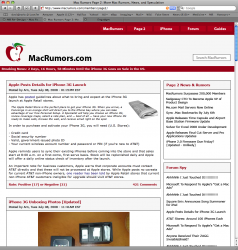
Here is my attempt.

To me, MacRumors is a news site and to that end, I think the front page should be as clean and clutter free as possible.

I realise this is far from perfect (I didn't spend that much time on the details), but this is what I would like to see MR evolve into.

David
 

Attachments

  • Picture 1 20-48-14.png
    Picture 1 20-48-14.png
    331.3 KB · Views: 192

hobbbz

macrumors 6502a
Mar 8, 2005
605
4
Here is my attempt.

To me, MacRumors is a news site and to that end, I think the front page should be as clean and clutter free as possible.

I realise this is far from perfect (I didn't spend that much time on the details), but this is what I would like to see MR evolve into.

David

You seem to have left out any room for the leaderboard and the 300x250 banner ad that the current site has. Mac Rumors being a fan run site depends on the ads it can sell to keep the site free for us.

perhaps address these constraints first.
 

davidjearly

macrumors 68020
Sep 21, 2006
2,264
371
Glasgow, Scotland
You seem to have left out any room for the leaderboard and the 300x250 banner ad that the current site has. Mac Rumors being a fan run site depends on the ads it can sell to keep the site free for us.

perhaps address these constraints first.

Well, I did mention that it was far from perfect, and that I didn't spend too much time on the details.

In any case, the reason for this is because I am a contributor to MR and always see the ad-free page. Therefore, the banner may have slipped my mind. It could easily be incorporated into the design I posted though.

David
 

hobbbz

macrumors 6502a
Mar 8, 2005
605
4
Well, I did mention that it was far from perfect, and that I didn't spend too much time on the details.

In any case, the reason for this is because I am a contributor to MR and always see the ad-free page. Therefore, the banner may have slipped my mind. It could easily be incorporated into the design I posted though.

David

that's cool. I didn't mean for my first response to seem flippant but I just know if I had left out the ads on the version I did, then I could have given my self a lot more flexibility in the layout.

i took the ads, and their position as a business requirement and worked within those constraints.
 
Register on MacRumors! This sidebar will go away, and you'll see fewer ads.