Become a MacRumors Supporter for $50/year with no ads, ability to filter front page stories, and private forums.

SMIDG3T

Suspended
Original poster
Apr 29, 2012
3,859
2,316
England
Hi all.

Just to let you know it seems Apple have made a update to the Music app in terms of UI.

The Music app on iOS 9 beta had several UI issues. Alignment issues, black text on dark backgrounds, the Beats 1 playlists were displayed in an odd fashion as well as a few other small issues.

Content under the "New" tab seems to be laid out differently.

Now, (although I don't think it's perfect and up to iOS 8.4 standards in terms of layout), it's much better. Take a look.

UPDATE:

Screenshots further down.
 
Last edited:
Hi all.

Just to let you know it seems Apple have made a update to the Music app in terms of UI.

The Music app on iOS 9 beta had several UI issues. Alignment issues, black text on dark backgrounds, the Beats 1 playlists were displayed in an odd fashion as well as a few other small issues.

Content under the "New" tab seems to be laid out differently.

Now, (although I don't think it's perfect and up to iOS 8.4 standards in terms of layout), it's much better. Take a look.

Care to post a screenshot?
 
Hi all.

Just to let you know it seems Apple have made a update to the Music app in terms of UI.

The Music app on iOS 9 beta had several UI issues. Alignment issues, black text on dark backgrounds, the Beats 1 playlists were displayed in an odd fashion as well as a few other small issues.

Content under the "New" tab seems to be laid out differently.

Now, (although I don't think it's perfect and up to iOS 8.4 standards in terms of layout), it's much better. Take a look.

uhh. screenshot?
 
Care to post a screenshot?
uhh. screenshot?

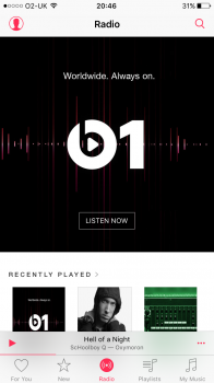
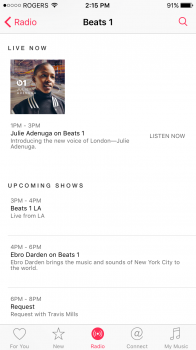
Image 1 (top left): Now has the "Listen Now" button positioned correctly, although in 8.4 I believe the button has radius applied to it.

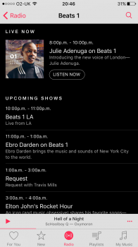
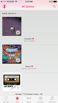
Image 2 (top right): The Beats 1 schedule is now laid out correctly, prior, text was all over the place.

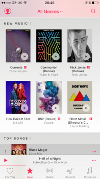
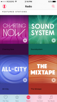
Image 3 (bottom left): In the "Now" section, things look much tidier than they were before. Still not perfect as you can see from the artwork but much better.

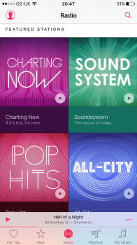
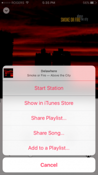
Image 4 (bottom right): The text is now white, before it was black and the colours were clashing.
 

Attachments

  • IMG_0689.PNG
    IMG_0689.PNG
    300.8 KB · Views: 431
  • IMG_0690.PNG
    IMG_0690.PNG
    215.6 KB · Views: 416
  • IMG_0691.PNG
    IMG_0691.PNG
    661.7 KB · Views: 417
  • IMG_0692.PNG
    IMG_0692.PNG
    882.3 KB · Views: 429
Image 1 (top left): Now has the "Listen Now" button positioned correctly, although in 8.4 I believe the button has radius applied to it.

Image 2 (top right): The Beats 1 schedule is now laid out correctly, prior, text was all over the place.

Image 3 (bottom left): In the "Now" section, things look much tidier than they were before. Still not perfect as you can see from the artwork but much better.

Image 4 (bottom right): The text is now white, before it was black and the colours were clashing.

Thanks for sharing. I was expecting a radical redesign and got excited, haha
 
So Apple can issue an update like that on public beta 1 without having to release it on public beta 2? So they just do it directly on your phone?
 
Non of these so called changes are showing for me. (I took these right before posting) iOS 9 Public Beta 1.
 

Attachments

  • image.png
    image.png
    176.5 KB · Views: 204
  • image.png
    image.png
    193.3 KB · Views: 190
  • image.png
    image.png
    520.7 KB · Views: 206
  • image.png
    image.png
    1.1 MB · Views: 202
So Apple can issue an update like that on public beta 1 without having to release it on public beta 2? So they just do it directly on your phone?

For certain things, yes. As an example, when Apple Pay went live in the U.K. last week, the ability to actually use the service was added without an update. The ability to add a card, new settings in Settings app etc.
 
For certain things, yes. As an example, when Apple Pay went live in the U.K. last week, the ability to actually use the service was added without an update. The ability to add a card, new settings in Settings app etc.

Apple Pay is WAY different. It's already built into the OS and only requires Apple to "flip a switch" to allow a country to see the option. Same how the new News app is. Only US can see it right now and would only need Apple to "flip a switch" so more countries see the app on their screen.
 
Apple Pay is WAY different. It's already built into the OS and only requires Apple to "flip a switch" to allow a country to see the option. Same how the new News app is. Only US can see it right now and would only need Apple to "flip a switch" so more countries see the app on their screen.

I appreciate Apple Pay is different to a few UI changes but both were still implemented without an update.
 
I love Apple Music, especially with how much louder and clearer the music is compared to Spotify.

But oh my Christ, the UI is horrible. I shouldn't have to scroll through my list of artists again if I'm already listening to them. Spotify has a "Go To Artist" button that I've become accustomed to. Hopefully it'll change drastically in the next 3 months or I'll go back to Spotify. Can't complain much for free for 3 months AND a brand new service.

You can get to an artist by tapping the three dots ". . ." On the bottom right corner of the full screen player. You see the option menu pop up (see image 1) and tap at the top where is has the little album artwork and song info. That takes you to the album the current song is playing (image 2.) From there tap the artist name below the album name (it will be artist name with a ">" after it. Then you're on the artist. (Image 3)

I know it's not exactly ideal. But the function is there and not missing.
 

Attachments

  • image.png
    image.png
    377.7 KB · Views: 195
  • image.png
    image.png
    286 KB · Views: 195
  • image.png
    image.png
    302 KB · Views: 198
  • Like
Reactions: Statusnone88
You can get to an artist by tapping the three dots ". . ." On the bottom right corner of the full screen player. You see the option menu pop up (see image 1) and tap at the top where is has the little album artwork and song info. That takes you to the album the current song is playing (image 2.) From there tap the artist name below the album name (it will be artist name with a ">" after it. Then you're on the artist. (Image 3)

I know it's not exactly ideal. But the function is there and not missing.
Wow I had no idea I could get back the the artist full catalog by doing that last step. I think the problem with this music player is people don't know all these short cuts and get flustrated.
 
Wow I had no idea I could get back the the artist full catalog by doing that last step. I think the problem with this music player is people don't know all these short cuts and get flustrated.

Yeah, there are some things in the app that are subtle or hidden and get overlooked as the whole feature being missing completely. (shuffle all for artist being a popular one seen as completely missing, when it's there, just slightly hidden.)

But once you know all the little things the app works really well.
 
I appreciate Apple Pay is different to a few UI changes but both were still implemented without an update.

Except the music app hasn't been updated today like you're suggesting. If it was there would be a whole lot more people than just you reporting it and even possibly front page news on this site if it was.
 
Except the music app hasn't been updated today like you're suggesting. If it was there would be a whole lot more people than just you reporting it and even possibly front page news on this site if it was.
Well, somethings changed...
 
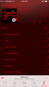
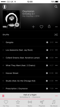
Oh and this is how the Status Bar should look in the Music app. (Not included in the changes, I found this by switching from Shazam to Music by clicking on "Listen on Apple Music".)

Surely it's a quick change?
 

Attachments

  • image.png
    image.png
    241.8 KB · Views: 208
Oh and this is how the Status Bar should look in the Music app. (Not included in the changes, I found this by switching from Shazam to Music by clicking on "Listen on Apple Music".)

Surely it's a quick change?
It seems to be a bug that applies to external links into Music.app. When you get to the same page from search the status bar shows normally.
 
Oh and this is how the Status Bar should look in the Music app. (Not included in the changes, I found this by switching from Shazam to Music by clicking on "Listen on Apple Music".)

Surely it's a quick change?

Lol, sorry. But that's a bug and not how the status bar is supposed to look in the music app. I don't know why you're so convinced that Apple somehow updated the music app without an update and seemingly only you have it and not a single person has reported the same anywhere.
 
Lol, sorry. But that's a bug and not how the status bar is supposed to look in the music app. I don't know why you're so convinced that Apple somehow updated the music app without an update and seemingly only you have it and not a single person has reported the same anywhere.

What is wrong with their screen? Mine looks the same way after the pb2
 
Register on MacRumors! This sidebar will go away, and you'll see fewer ads.