Got a tip for us?
Let us know
Become a MacRumors Supporter for $50/year with no ads, ability to filter front page stories, and private forums.
Need Help finishing main page
- Thread starter izzo
- Start date
- Sort by reaction score
You are using an out of date browser. It may not display this or other websites correctly.
You should upgrade or use an alternative browser.
You should upgrade or use an alternative browser.

I would change the text for the navigation to a more plain serif font (times new romans -ish) then perhaps add some gradients to the header and/or top of the content area.
perhaps for the header you can try working in a photo of a house or something.
You just need to try to avoid making it look too cluttered.
Also, add some padding to the top of the content area.

perhaps for the header you can try working in a photo of a house or something.
You just need to try to avoid making it look too cluttered.
Also, add some padding to the top of the content area.
I would change the text for the navigation to a more plain serif font (times new romans -ish) then perhaps add some gradients to the header and/or top of the content area.
perhaps for the header you can try working in a photo of a house or something.
You just need to try to avoid making it look too cluttered.
Also, add some padding to the top of the content area.
Thanks so much, the gradient is already making it look a lot better. When you say padding, you mean giving it space between the content and top banner?
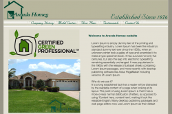
With the addition of Me1000's comments, I'd move the house photos under the certified green professional logo and move this logo up. There's a lot of dead space, which can sometimes be nice, but here I think is distracting. I'd then move the body text up to the right of these (rough example attached). This will reduce the line length of the text making it more legible and less hard work to read and get rid of some of the 'dead space'.
Also, the background of the certified green professional logo seems a slightly different colour from the page background and is also slightly distracting.
Also, the background of the certified green professional logo seems a slightly different colour from the page background and is also slightly distracting.
Attachments
With the addition of Me1000's comments, I'd move the house photos under the certified green professional logo and move this logo up. There's a lot of dead space, which can sometimes be nice, but here I think is distracting. I'd then move the body text up to the right of these (rough example attached). This will reduce the line length of the text making it more legible and less hard work to read and get rid of some of the 'dead space'.
Also, the background of the certified green professional logo seems a slightly different colour from the page background and is also slightly distracting.
Awesome! Thanks mate, I couldn't figure out how to position that stuff and was thinking of moving the text up next to it. Thanks again guys!
Glad to be useful!
Depending on how important the certified green professional logo is, you could put it beneath the house images, or make it smaller and reposition somewhere...")
Depending on how important the certified green professional logo is, you could put it beneath the house images, or make it smaller and reposition somewhere...
Ok here is the updated version of it, any other suggestions? I cant figure out how to incorporate a house into the top banner without making it look awkward and I also feel that its to simple, any suggestions on that?
Also I forgot to fix the certified green logo background. I will do that.
Also I forgot to fix the certified green logo background. I will do that.
Attachments
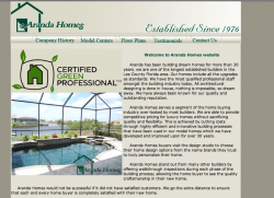

I'd give a little space between your text and the edges of the border and images. p {margin-left:20px; margin-right:20px; } in your CSS for example. You had a nice margin on your original image that seems to of gone now.
One thing that kind of bothers me, though it doesn't pertain to your design...
In your head it says "Established since 1976" I would remove the word "since" because I tend to think of the word established as a one time use verb.
Just sounds weird to me.
In your head it says "Established since 1976" I would remove the word "since" because I tend to think of the word established as a one time use verb.
Just sounds weird to me.
Register on MacRumors! This sidebar will go away, and you'll see fewer ads.