Like many others, I have long loathed the appearance of OS X with all it's ugly stripey-ness. Consequently, I have been "fixing" the UI for several years now with a delightful combination of UNO and Agua.
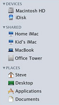
Apple has addressed both of these issues in Leopard, and I am very happy that I will no longer need to use these system-replacements. Apple has done away with all the stripes in the UI as well as the icons, and I believe they have created a new, very Agua-like (which is very OS 9-like) default folder icon for Leopard.
The new folders seem to be much more "solid" than current folders, like the Agua icon set. Additionally, they appear to have a gray line-drawing "stamped" into them, rather than an all-out super-imposed icon. (Like the Applications folder) All-in-all, I feel it creates a much more consistent, unified presentation of the folder icons.
Check out the screenshots:


(Screenshots taken from Leopard videos on Apple's website)
Apple has addressed both of these issues in Leopard, and I am very happy that I will no longer need to use these system-replacements. Apple has done away with all the stripes in the UI as well as the icons, and I believe they have created a new, very Agua-like (which is very OS 9-like) default folder icon for Leopard.
The new folders seem to be much more "solid" than current folders, like the Agua icon set. Additionally, they appear to have a gray line-drawing "stamped" into them, rather than an all-out super-imposed icon. (Like the Applications folder) All-in-all, I feel it creates a much more consistent, unified presentation of the folder icons.
Check out the screenshots:
(Screenshots taken from Leopard videos on Apple's website)