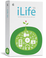
Does anyone else just hate the new graphics Apple is using for its iLife, iWork boxes and various elements throughout the site. They don't look that good to me, and what is this obsession with green everywhere. My favorite graphic is held by the Logic 7 box. I realize that Jobs likes colors and that these are consumer type Apps, but come on these are kinda ugly.
Become a MacRumors Supporter for $50/year with no ads, ability to filter front page stories, and private forums.
New "flower power" Packaging
- Thread starter AdamZ
- Start date
- Sort by reaction score
You are using an out of date browser. It may not display this or other websites correctly.
You should upgrade or use an alternative browser.
You should upgrade or use an alternative browser.
I like the new iLife box, its vibrant in a green sense. 
The previous iLife box looked a bit serious, this one looks fun.
The previous iLife box looked a bit serious, this one looks fun.
I think the new packaging is creepy, and I'm no big fan of this comtemporary use of green everywhere. But then I also figure it doesn't matter what's on the box, just what's in the box. Put the most amazing software ever developed into a box with blood and guts all over it, and I'd still buy it.  And no, I'm not saying iLife is the most amazing software ever. I can't see any reason to have it myself; it just "comes with," so it's harmless.
huh. I was about to start a thread about how GOOD the new packaging looked. I think it wooes in users by making the iLife suite in particular look friendly and creative, rather than WHITE and SILVER professional-style. Don't get me wrong, i LOVE the styling of the pro series, but i think most consumers may want something a little more friendly to create their home movies with.
The first thing I thought of when I saw that iLife 05 packaging was "Katamari Damacy".
perhaps I'm going nutty.
la la la la la....
perhaps I'm going nutty.
la la la la la....
I am more disappointed it didn't have another app added to the mix for drawing or web site creation. Plus iTunes is getting long in the tooth. The box artwork didn't bother me. I throw away the packaging anyways.
I can't say I like the artwork any less than before. It's just a little different and that's why it's Apple.
There's something very asthetically(?) pleasing about all of Apple's "packaging". From their software all the way up to the stores. The software boxes are very pleasing to the eye. So much so that we put all the boxes on our bookshelves because they look better than most books. When I walk into a store, everything about it is very comforting.
Living in a "red" state, there's never a "art for arts sake" mentality. But with Apple, there seems to be. And it's nice to have it around.
I hope whenever the next major OS is released, be it 11 or whatever, they are able to come up with something as pleasing to the eye as this one. I've always loved the aqua look.
When I first saw it I thought "Oh, god! Why that green" but now it has grown on me. I am more drawn to that kind of vector art (that's what I hope to do in the future) than most photoshop packaged images.
Assuming that was an intentional pun:virividox said:...but hey it might grow on me
Ha ha ha ha ha!
jayscheuerle
macrumors 68020
Very 50's look! (Opening of Monsters Inc.)
Personally, I wish they'd give the OS an entire overhaul that makes it more graphic, with less fake-realism (like gumdrops, brushed metal, etc.). This could look very classy as resolutions increase toward a print-like level.
Personally, I wish they'd give the OS an entire overhaul that makes it more graphic, with less fake-realism (like gumdrops, brushed metal, etc.). This could look very classy as resolutions increase toward a print-like level.
Register on MacRumors! This sidebar will go away, and you'll see fewer ads.


