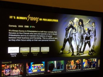
Not to complain, but there are some major frustrations with the new Apple TV(4) which I'm sure will get figured out. If you search for media "show me It's Always sunny in Philadelphia" Why wouldn't they give your first option to be one that you can watch for free?? (I HAVE Netflix, and I can watch season 1-9 for no additional cost, but I have to click over from iTunes (where they want me to buy the seasons instead of watch them for free. It adds a lot of extra clicks to find where you can watch it without having to buy it on iTunes first! What a waste of time!)
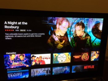
When Netflix launches, it took away the "full screen view" and instead of clicking on Comedy for example and scrolling through an entire screen of options, I now have to just scroll to the right on a single line list of options, through tons of stuff I wouldn't want to watch on a small line at the bottom of the screen and it wastes TONS of screen real estate, and takes much more time. "
So far... I miss my old Apple TV. The new one is faster, but thats about it. Until Netflix changes their menu to (PLEASE GO BACK) to their old, easy to view screen menu, and refines... I'd wait to get the new one if I were anyone else. It's exactly the same as my old one, but a tiny bit faster, and with a Lame Menu in Netflix. Not worth it yet."
I hope that helps some people out there- because this New Apple TV is actually making my TV watching experience worse, which is a bummer. From their demos, it looked like it just worked, and with any new product, it will take a little time to fix, but Netflix Just give us back the menu like it was before, and spare me the oversized graphics at the top of the screen and give me back some useable screen! in time I'm sure it will get better, but I can navigate the old Apple TV much easier and see what I want to see in a shorter time.
(Also, not netflix related. Some of my purchases are not showing up or their graphics. I'm sure things like this will get fixed, but till they do! Hold onto that $!)
When Netflix launches, it took away the "full screen view" and instead of clicking on Comedy for example and scrolling through an entire screen of options, I now have to just scroll to the right on a single line list of options, through tons of stuff I wouldn't want to watch on a small line at the bottom of the screen and it wastes TONS of screen real estate, and takes much more time. "
So far... I miss my old Apple TV. The new one is faster, but thats about it. Until Netflix changes their menu to (PLEASE GO BACK) to their old, easy to view screen menu, and refines... I'd wait to get the new one if I were anyone else. It's exactly the same as my old one, but a tiny bit faster, and with a Lame Menu in Netflix. Not worth it yet."
I hope that helps some people out there- because this New Apple TV is actually making my TV watching experience worse, which is a bummer. From their demos, it looked like it just worked, and with any new product, it will take a little time to fix, but Netflix
(Also, not netflix related. Some of my purchases are not showing up or their graphics. I'm sure things like this will get fixed, but till they do! Hold onto that $!)
Attachments
Last edited:


