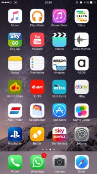
Yes, I'm with OP, and I know what he is talking about, and for me it's just a way of Google saying, "I'm not going to follow your new design, so I'll just put a little edge on the bottom making it look like 3D" in other words ******* your new flat design Apple.
You'd think that Apple would redesign any app icons to fit their own design ethics. It wouldn't be hard to make a Google icon and I'm sure Google want their apps on the millions of Apple products out there, so why don't Apple refuse Google's apps until they conform? Don't get me wrong, this is no great issue for me but it does seem strange. There are one or two other icons which don't fit the Apple iOS7 design ethic, the Instagram and PhotoFusion ones for starters.


