Got a tip for us?
Let us know
Become a MacRumors Supporter for $50/year with no ads, ability to filter front page stories, and private forums.
Notes for UI designers who have lost their way
- Thread starter davigarma
- Start date
- Sort by reaction score
You are using an out of date browser. It may not display this or other websites correctly.
You should upgrade or use an alternative browser.
You should upgrade or use an alternative browser.
Second one is better. Much cleaner and the focus is more on the content and not on the app window and controls.
I agree. And not to mention that it takes just a few minutes max to figure out what can and cannot be pressed.Second one is better. Much cleaner and the focus is more on the content and not on the app window and controls.
What about Jaguar do I like over Monterey:
Permanent scrollbars
Notched Corners
The lack of Album Art
Tight excel/numbers styled format
Search field placement
I also think it is neat that itunes 6.0.5 text field looks like an ipod 1/2/3 screen in color, font etc.
What I like about Monterey over Jaguar
Play/Pause/FF/RW key style & placement
Replay/Shuffle key style & placement
No star ratings
Generally, I prefer the Jag Itunes vs Monterey Itunes. I am not into the flat minimalist thing that has been around since Yosemite/ElCap. I dont find it useful; conversely it is a huge waste of screen space. I dont feel as a user/customer that I should have to unpack a flat unintuitive UI to re-find functionality. That is not innovative nor is it fun - at all. I remember when Steve Jobs spoke about making media fun and easy - accessible and at your fingertips. Monterey itunes is not that. It's flat. There's a stupidly oversized pic of album art and artist header on there. wow. Way to be, Apple.
Yes, the users of 10.2 era MacOS have grown up and become more saavy at UIs but that is not a reason to ignore and supplant ease of use for someone's over inflated and misplaced concept of digital feng shei. My little opinion anyhow
Last edited:
I totally get it, but in seeing the two UI styles side-by-side I realize that while 10.2 iTunes focuses very much on the app, in Monterey, the app tries as much as possible to get out of the way so you can focus on the content.
I don't necessarily think it has to be one or the other; for a movie/media player, or a web browser, or an email client...yes, you'd definitely want a UI that's more content-centric. However, for a file browser or media creation/editing app like a word processor, you'd want a UI that's more forward in terms of presenting controls.
I don't necessarily think it has to be one or the other; for a movie/media player, or a web browser, or an email client...yes, you'd definitely want a UI that's more content-centric. However, for a file browser or media creation/editing app like a word processor, you'd want a UI that's more forward in terms of presenting controls.
The thing about that is the Monterey UI epitomizes clunky to me. All of the album info could exist conveniently within one window but how it is, you have to scroll down which is wholey unnecessary to me. scroll bars are hidden away - why would you do that when youve designed a UI that necessitates it? That is illogical to me and this sort of form over function ideology is through out it. That is just poor design IMO and I know Apple could do better because they have. Anyhow, my 2 cents.
I prefer a list of songs, such as the standard iTunes layout with sections allowing you to see artists, album, etc. Album art/info should only come up when actually playing a song.
One of the reasons Nightingale/Songbird has mostly replaced iTunes for me. And you can theme it, add extensions. Try that with iTunes.
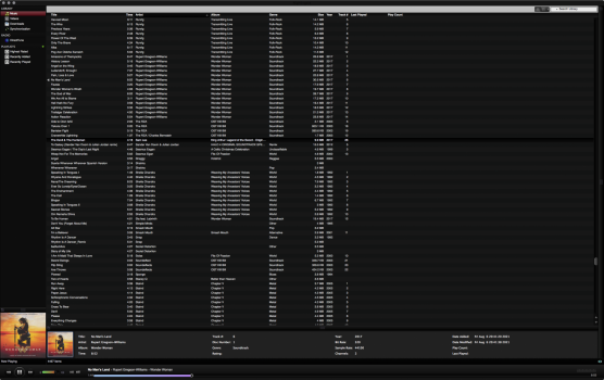
And oh yeah, Nightingale/Songbird also has a Mini Player as well.

One of the reasons Nightingale/Songbird has mostly replaced iTunes for me. And you can theme it, add extensions. Try that with iTunes.

And oh yeah, Nightingale/Songbird also has a Mini Player as well.

Last edited:
I prefer a list of songs, such as the standard iTunes layout with sections allowing you to see artists, album, etc. Album art/info should only come up when actually playing a song.
One of the reasons Nightingale/Songbird has mostly replaced iTunes for me. And you can theme it, add extensions. Try that with iTunes.
View attachment 1909606
And oh yeah, Nightingale/Songbird also has a Mini Player as well.
View attachment 1909608
I’m more on the same page as @eyoungren on this, although as I look at the two UXs in the original post, the first makes me think, “Awww, look it’s teething,” whereas for the latter I feel a low-level anxiety just looking at it. The latter UI reflects Apple’s emphasis on treating music-as-a-service. (I’m not a fan of content-as-a-service and never have been.) Where I depart with Erik is I’m still using iTunes, while I’ve only trialled Songbird and Amarra Symphony, only to come back to iTunes 10.6.3.
I’ve stuck with iTunes 10.6.3 across every Mac I have (yes, including when running on High Sierra and, as far as I know, is also possible to be run in Mojave) — save for the iBook G3 clamshell (which can only make it to iTunes 9.2.1).
And why 10.6.3?
It helps me to manage my never-ending archival and curatorial work in a consistent manner.
It’s the UI maturation of that “teething” iTunes in Jaguar (which would have been, like, iTunes 3, if memory serves?). iTunes 11 and onward began to drift toward a content-as-a-service UX — which is great for casual consumers who are down with that, but it doesn’t work for me.
It handles a music library which is over 92 days and nearly 30,000 tracks in length (at present). (Separately, I’ve another library of nothing but a couple of weeks’ worth of music videos; switching between the two libraries is a cinch.)
I can find nearly everything I need without having to think about it. Managing metadata, although technically incomplete with the iTunes interface, is more than robust enough to cover most of the bases I need.
I can completely shut off/shut out the iTunes store and other Apple features (which I’ve never used and probably never will).
I can use scripts (invaluable for library maintenance).
It doesn’t flinch with 24-bit/96kHz audio, of which I have a growing collection.
It’s a remarkably stable build, and I’d have to dig through the Console to find the last time it crashed on me (when I wasn’t actually trying to bring it down).
And here below, it has a (mostly) dark interface (which I keep running as such for when I’m DJing in a darkened venue).
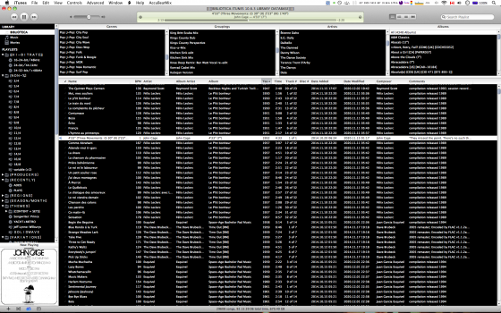
I'd still be using iTunes (not the current version) if I could get it to monitor the music folder for additions and deletions without using a script. Nightingale does that natively.I’m more on the same page as @eyoungren on this, although as I look at the two UXs in the original post, the first makes me think, “Awww, look it’s teething,” whereas for the latter I feel a low-level anxiety just looking at it. The latter UI reflects Apple’s emphasis on treating music-as-a-service. (I’m not a fan of content-as-a-service and never have been.) Where I depart with Erik is I’m still using iTunes, while I’ve only trialled Songbird and Amarra Symphony, only to come back to iTunes 10.6.3.
I’ve stuck with iTunes 10.6.3 across every Mac I have (yes, including when running on High Sierra and, as far as I know, is also possible to be run in Mojave) — save for the iBook G3 clamshell (which can only make it to iTunes 9.2.1).
And why 10.6.3?
It helps me to manage my never-ending archival and curatorial work in a consistent manner.
It’s the UI maturation of that “teething” iTunes in Jaguar (which would have been, like, iTunes 3, if memory serves?). iTunes 11 and onward began to drift toward a content-as-a-service UX — which is great for casual consumers who are down with that, but it doesn’t work for me.
It handles a music library which is over 92 days and nearly 30,000 tracks in length (at present). (Separately, I’ve another library of nothing but a couple of weeks’ worth of music videos; switching between the two libraries is a cinch.)
I can find nearly everything I need without having to think about it. Managing metadata, although technically incomplete with the iTunes interface, is more than robust enough to cover most of the bases I need.
I can completely shut off/shut out the iTunes store and other Apple features (which I’ve never used and probably never will).
I can use scripts (invaluable for library maintenance).
It doesn’t flinch with 24-bit/96kHz audio, of which I have a growing collection.
It’s a remarkably stable build, and I’d have to dig through the Console to find the last time it crashed on me (when I wasn’t actually trying to bring it down).
And here below, it has a (mostly) dark interface (which I keep running as such for when I’m DJing in a darkened venue).
View attachment 1909959
However, Nightingale doesn't have a built in streaming tuner. You have to add stations manually and that requires knowing the direct URL - it won't process a PLS file. So, that's usually when I switch to iTunes. More recently, I've just taken to using SOMA FM's app since Dronezone is about all I stream.
I'm not crazy about how music is treated nowawdays. Almost like its audio gold or something. I come from the era were you dug through your mix tapes or CDs, found what you wanted and put it in. Or maybe you have it set on your 5-Disc CD changer to begin with. Find the song, play it - that's all I want. I don't need an app experience that has the artist's name in lights and an angelic choir signing their praises. I know what I'm looking for - just play it.
Second one is better. Much cleaner and the focus is more on the content and not on the app window and controls.
Yes. But as Harrington says, the pleasure of use has been lost. For years, that made us love the McIntosh. Now they are functional systems without any charm. Aesthetically we have lost
I would tend to agree with you.Yes. But as Harrington says, the pleasure of use has been lost. For years, that made us love the McIntosh. Now they are functional systems without any charm. Aesthetically we have lost
I'll just say that times change. I think the culture now is more about the artist, rather than the music itself. Display album images as large as you can get them shows other people which artists you're into - therefore making you a 'cool' person - or not, depending I guess.
I like iTunes 10 myself as well, but as someone who never listens to individual songs but only albums in their entirety, I do prefer iTunes 11.I’m more on the same page as @eyoungren on this, although as I look at the two UXs in the original post, the first makes me think, “Awww, look it’s teething,” whereas for the latter I feel a low-level anxiety just looking at it. The latter UI reflects Apple’s emphasis on treating music-as-a-service. (I’m not a fan of content-as-a-service and never have been.) Where I depart with Erik is I’m still using iTunes, while I’ve only trialled Songbird and Amarra Symphony, only to come back to iTunes 10.6.3.
I’ve stuck with iTunes 10.6.3 across every Mac I have (yes, including when running on High Sierra and, as far as I know, is also possible to be run in Mojave) — save for the iBook G3 clamshell (which can only make it to iTunes 9.2.1).
And why 10.6.3?
It helps me to manage my never-ending archival and curatorial work in a consistent manner.
It’s the UI maturation of that “teething” iTunes in Jaguar (which would have been, like, iTunes 3, if memory serves?). iTunes 11 and onward began to drift toward a content-as-a-service UX — which is great for casual consumers who are down with that, but it doesn’t work for me.
It handles a music library which is over 92 days and nearly 30,000 tracks in length (at present). (Separately, I’ve another library of nothing but a couple of weeks’ worth of music videos; switching between the two libraries is a cinch.)
I can find nearly everything I need without having to think about it. Managing metadata, although technically incomplete with the iTunes interface, is more than robust enough to cover most of the bases I need.
I can completely shut off/shut out the iTunes store and other Apple features (which I’ve never used and probably never will).
I can use scripts (invaluable for library maintenance).
It doesn’t flinch with 24-bit/96kHz audio, of which I have a growing collection.
It’s a remarkably stable build, and I’d have to dig through the Console to find the last time it crashed on me (when I wasn’t actually trying to bring it down).
And here below, it has a (mostly) dark interface (which I keep running as such for when I’m DJing in a darkened venue).
View attachment 1909959
it's clean, simple, also never crashed on me. Best of all, it has that amazing coloured text effect when clicking on an album. I've never understood why they got rid of that. It's just those little touches I love (although I also don't know why they removed Coverflow in 11)
I wanted to like both Songbird and Nightingale - but I've consistently found them to be both slow and extremely resource intensive, both in Linux and on OS X. What hardware have you been running it on? Are there any tips for settings/plugins/themes you have? Maybe it's another case of me asking too much out of my 2008 and 2006 MacBooks...I prefer a list of songs, such as the standard iTunes layout with sections allowing you to see artists, album, etc. Album art/info should only come up when actually playing a song.
One of the reasons Nightingale/Songbird has mostly replaced iTunes for me. And you can theme it, add extensions. Try that with iTunes.
View attachment 1909606
And oh yeah, Nightingale/Songbird also has a Mini Player as well.
View attachment 1909608
That's interesting…I wanted to like both Songbird and Nightingale - but I've consistently found them to be both slow and extremely resource intensive, both in Linux and on OS X. What hardware have you been running it on? Are there any tips for settings/plugins/themes you have? Maybe it's another case of me asking too much out of my 2008 and 2006 MacBooks...
I haven't had any issues. I believe I am running Songbird on my 2006 MBP, but Nightingale everywhere else (except my Power Macs). My music folder is on my NAS so each Mac using these apps points to the same folder.
It's a default install, with a couple of addons: Music following (there's an icon for the current song playing'), Equalizer in the info bar and the ability to save presets), Album art in the info bar, and a black theme. Oh, and a song notifier.
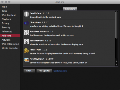
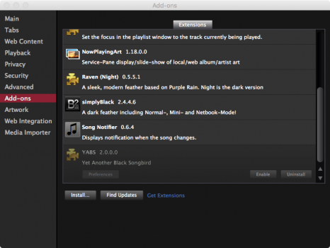
Nr 2 is so dull… that contrast-less design is not only ugly, its also bad design. One cannot even tell where the window ends
I loved the old UI of OS X ... it was such a ridiculous beautiful jump from OS 9 and Windows that it was magical. Everything is so flat now. It's not bad, but it's not as fun.
We got dark mode…without having to theme the UI, use hacks, or resort to XtraFinder for it. With Mojave and Catalina I'm actually okay with things. I can't say anything about the later versions as I haven't been there yet.I loved the old UI of OS X ... it was such a ridiculous beautiful jump from OS 9 and Windows that it was magical. Everything is so flat now. It's not bad, but it's not as fun.
I think disappearing scroll bars are a mistake, other than that, the newer more modern UIs are more scalable both up and down between phone and desktop and are higher contrast for those with poor eyesight.
The old flashy UI of early macOS was a bit of a show-off of what macOS could do in terms of rendering UI but it was far too busy both detracting from content and being more difficult to distinguish what's what at a very quick glance.
There's a reason signs, successful logos, etc. are easily readable in a small number block colours. Stripping out un-necessary detail makes them easy to scale up and down in size without becoming illegible, and easy to read for those with poor colour vision or poor vision in general.
The only thing I'd disagree with you about is scroll bars. Even when I was on Leopard/PowerPC I had a browser extension that removed them. I use the wired Mighty Mouse exclusively and with no scrollbars it's easy to check if a page scrolls or scroll simply by swiping on the roller ball. Of course everyone is different, so I appreciate that Apple has a toggle for it.I think disappearing scroll bars are a mistake, other than that, the newer more modern UIs are more scalable both up and down between phone and desktop and are higher contrast for those with poor eyesight.
The old flashy UI of early macOS was a bit of a show-off of what macOS could do in terms of rendering UI but it was far too busy both detracting from content and being more difficult to distinguish what's what at a very quick glance.
There's a reason signs, successful logos, etc. are easily readable in a small number block colours. Stripping out un-necessary detail makes them easy to scale up and down in size without becoming illegible, and easy to read for those with poor colour vision or poor vision in general.
What I'd love is to see is macOS including a variety of, or even just two, themes. Want good ol' skeuomorphism? You can enable it. Want everything flat? You can enable it. But no, we've been having one look-and-feel shoved down our throats. Personally, I've somewhat stopped caring about that though. I just use Mojave the way I use earlier versions.
Last edited:
The modern look is clean in the same way as handleless kitchen cabinets and you don't know whether to push it or what to open the bloody thing.
I like iTunes 10 myself as well, but as someone who never listens to individual songs but only albums in their entirety, I do prefer iTunes 11.
View attachment 1910291
it's clean, simple, also never crashed on me. Best of all, it has that amazing coloured text effect when clicking on an album. I've never understood why they got rid of that. It's just those little touches I love (although I also don't know why they removed Coverflow in 11)
Fair point on the UI, although with the list columns for artist, album, etc., available on iTunes 10 (as well as 11), listening to complete albums is just as easy.
Like you, I also love album art and have also finished metadata work on everything in my library to include sleeve art (including titles which didn’t have sleeve art, such as 7- or 12-inch singles with a generic cardboard sleeves). When I can afford to, I like getting 12-inch vinyl with sleeve covers for collecting.
When quickly trying to find an album to play, however, I let my fingers do the walking (and the navigating) by tabbing to the albums column and typing out the first letters of the album I want to listen to. Searching for an album by cover art when one has — ::looks up current library total:: — 4,348 albums, becomes too cumbersome by sight alone.
There's a reason signs, successful logos, etc. are easily readable in a small number block colours. Stripping out un-necessary detail makes them easy to scale up and down in size without becoming illegible, and easy to read for those with poor colour vision or poor vision in general.
Coming from an earlier career in working on and developing just that, yes and no.
A desktop UI presents a different use-case with unique design challenges from, say, developing iconography for branding (in this house, Paul Rand and Saul Bass show us the way) or for communications signage in places where consistency is a regulated given (such as with road signage). Similarly, a desktop UI presents a different use-case than a glass UI device (such as on a tablet, phone, or kiosk console).
While the need for UX elements and icons on a desktop UI to be legible and accessible is just as vital for this use-case, attempts by a software company (here, I’m referring to Apple, Microsoft, and Google) to make third-party icons uniform to the point of locking them into one mode only (such as with the icons in Big Sur onward) is to subtract from and deprive the end user of a quick, intuitive means to locate and select an icon or element for a desired outcome.
Separately, while UI elements in, say, Aqua, may have been developed to show off the capabilities of the CoreGraphics engine driving OS X whilst at the same time being “showy” (I won’t argue with that, except to add how they did it remarkably well for the moment when they created Aqua from scratch), there is utility in developing an end-user experience which lets the end user choose whether, say, scroll bars and modal buttons have colour or not or even how those features are to be displayed (allowing them the choice of wider or narrower scroll bars; a choice between a “dark” mode and other modes; capsular- or rectangular-shaped buttons; skeuomorphic elements, semi-skeuomorphic elements, or flat elements; and so on).
Different users have different needs based on factors well and beyond personal taste or quibbles with how a software company develops a UX — factors such as how their brain is wired (good example: neurodivergence); what sensory capabilities they have at their disposal (good examples here: colour blindness, depth perception, deafness); or even their memory of where and how they’ve found the same elements previously.
When a company changes their UI design approach to what the company attests is best (vis-à-vis limiting, confining, or altogether eliminating UI customization/configuration by end users), rather than responding to what end users say they need (such as what UI/UX designers have been tasked to do for much of the last forty years), then the company loses sight on the target objective they once set out to reach.
tl;dr: Good design shouldn’t drive the purpose and its users. Good design should serve the purpose and its users. And design depends on the purpose it will find itself in use.
^ yeah I'd say that's fair. And yeah Aqua was great in its day and looked impressive.
On balance though I do think the UI of MacOS is much nicer than it was with say... tiger or earlier.
On balance though I do think the UI of MacOS is much nicer than it was with say... tiger or earlier.
^ yeah I'd say that's fair. And yeah Aqua was great in its day and looked impressive.
On balance though I do think the UI of MacOS is much nicer than it was with say... tiger or earlier.
I’ve made mention of this elsewhere on here, but there’s much about Aqua’s semi-flattened final evolution with the Snow Leopard UI which, to this day, remains the best of nearly every aspect of using a Mac.
The other stable place in Mac OS X/macOS’s UI is the honed Marble UI/UX in Sierra/High Sierra (though I do use a utility to change UI text from San Francisco back to Lucida Grande — the latter being easier to glance at and read in both regular and hidpi displays).
Register on MacRumors! This sidebar will go away, and you'll see fewer ads.

