Become a MacRumors Supporter for $50/year with no ads, ability to filter front page stories, and private forums.
Based on the screenshots, it made "designing" the UI a lot easier.

"Should we add some borders or shadows to distinguish between various tappable areas?"
"What, no! Next thing you know, people will want graphics or something to go along with them!"

I personally cannot wait until design becomes so simple, intuitive, refined, beautiful, gorgeous, (insert denigrated aesthetic term) that our homescreens are white backgrounds with a list of unformatted text. Ahhh, that'll be something…

[url=http://i.imgur.com/VpYGPUSl.png]Image[/URL]

</misplaced anger>

cool :)

with iOS 7 its like we are at the technical drawing stage/look. Cant wait for iOS 10 where it'll be liquid form and when you touch it it'll smell like and feel like **** :D
 
I have yet to meet anyone who dislikes the ribbon. It did a great job in clearing the older menu mess.

Interesting. My experience has been the opposite. Even after nearly a decade, I still hear people curse them whenever they have to deal with a MS Office application. Burying all their commands in a mad jumble of half-hidden icons and eating up massive amounts of screen real estate, like a UI designed by a mechanical engineer.

But it's not really a big deal. Now that we have alternatives to MS, those who hated the ribbon and wanted to see everyone responsible for it roasted on a spit, now just use google or any of the others instead.
 
I guess if Microsoft was allowed to do it "their way" instead of Apple's way, this app would be hideous looking.

Microsoft did it 'their' way, hence why it looks amazing.

----------

Interesting. My experience has been the opposite. Even after nearly a decade, I still hear people curse them whenever they have to deal with a MS Office application. Burying all their commands in a mad jumble of half-hidden icons and eating up massive amounts of screen real estate, like a UI designed by a mechanical engineer.

But it's not really a big deal. Now that we have alternatives to MS, those who hated the ribbon and wanted to see everyone responsible for it roasted on a spit, now just use google or any of the others instead.

It's human nature to fear & reject change.

If anyone thinks drilling down through menu's to find options is still acceptable in 2014 then they need their head looked at. The ribbon organises everything logically and has existed for over 7 years now in Office Suites (since Office 2007). If people can't adapt to something infinitely better by now then that's their problem.
 
If anyone thinks drilling down through menu's to find options is still acceptable in 2014 then they need their head looked at.

Right. Why drill through menus when you can simply search & hit return since Tiger? ;)
 
Based on the screenshots, it made "designing" the UI a lot easier.

"Should we add some borders or shadows to distinguish between various tappable areas?"
"What, no! Next thing you know, people will want graphics or something to go along with them!"

I personally cannot wait until design becomes so simple, intuitive, refined, beautiful, gorgeous, (insert denigrated aesthetic term) that our homescreens are white backgrounds with a list of unformatted text. Ahhh, that'll be something

</misplaced anger>


hahahahaha.....this is great.
 
It's human nature to fear & reject change.

If anyone thinks drilling down through menu's to find options is still acceptable in 2014 then they need their head looked at. The ribbon organises everything logically and has existed for over 7 years now in Office Suites (since Office 2007). If people can't adapt to something infinitely better by now then that's their problem.

Change is not inherently good. Tell the people who work for several soon-to-close Australian car manufacturing plants that they're just rejecting change out of fear.

It's not unreasonable to reject change that obfuscates or reduces functionality. Look at Windows 8. Look at the Nadia Comăneci-grade backflipping that Microsoft have done since its release. And that is not all "fear". There is a very large dose of poor UI design in there, given it does not properly cater to the still ever present mouse/keyboard input. It's clumsy, awkward and hides functionality that was previously readily available. I have Windows-centric co-workers (high-level IT guys) who scramble for the latest and greatest. Many of them refused to install Windows 8.0 and insist it has only just become usable with 8.1. So, apparently their criticisms are unfounded, Windows 8.0 was perfectly usable by everyone, no complaints about Windows 8.0 were valid, and they were all just afraid of change?

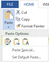
In the case of the ribbon, that UI element consists entirely of the vertical menu options being smeared horizontally across the screen, with clear, horizontally aligned words replaced by icons and buttons of varying and mixed sizes, some with labels next to them, some with labels underneath, some not labeled at all, some of which result in further unclear icons (e.g.: Paste results in three more Paste icons). What does a bucket icon mean in a word processor? Especially when the Ribbon "adapts" to the screen size, eliminating labeling and re-ordering/re-locating functions to often significantly different locations. Seriously. Resize your Word 2013 window some time, in small increments, and watch all the bits resize, lose clarity, shift around and even vanish. The user has to pay way more attention, look much more closely, and think a lot more about what they're wanting to do. Menus? You aim for the top, and on a small screen you might just have to scroll. But it's all where it always is.

ribbon-larger.png
ribon-smaller.png
Mighty Morphin' Ribbon.

word2013-paste.png
Apparently none of those three Paste icons means "Paste Special", which does not get its own icon.

It's the digital equivalent of getting your toolbox from the garage and laying out every single tool on the kitchen floor, even though you only need two screwdrivers. Having every single thing right to hand might convey power, but it does not convey ease of use or simplicity.

article-1370720-0B5F660000000578-87_468x348.jpg

Perhaps you'd prefer commands organized in a spinning wheel, like a roulette wheel? Menus are everywhere else in every other OS, including OS X for a reason. Because they work. Because they're clear, and because they're easy to aim for. And because the rest of the program uses them too. Right-click in the middle of your Word document and tell me that menus do not pop down and out.

But, sure. It's just fear.
 
Looks like a desktop app ported to a mobile platform. The whole mobile revolution is totally lost on Microsoft. It's not a desktop app with ribbons and a zillion buttons. If they didn't have serious market share and a proprietary file type on the desktop this would never have a chance. This is mediocrity and is the reason many people have had it with Microsoft products. They're also no fun and ugly as anything.

No. The whole point of stripping away what's not necessary is so they can create a mobile version of their product WITHOUT changing the look and feel or the user experience of it. This works well for the users who have been doing it forever so they don't need to relearn and it works for new users b/c it's simple.
This is made for the iPad, on which the screen real estate is substantial - even on the Mini.
MS DOES get mobile. It is NOT a port.
Where do you even see a "zillion buttons?" It is an office suite after all - for documents - it needs some level of advanced use.
And the line about proprietary file types doesn't hold much water b/c you can say the same about any company who holds the proprietary rights to anything you use everyday and which w/o they wouldn't be around.
I think this is just you being sour, trying to cover it is faux-facts.
 
I would like to ask in all sincerity -- what features would motivate one to want to pay a subscription fee for Office when iworks is free? Even on the desktop I can only really justify Excel over iworks but on the iPad, I am not sure what I would do that would make me want to pay monthly.

For a consumer? Lesser expensive and free options are fine. But midsized and large companies run on Office for the most part. So compatibility is #1. I once did some contract work for a small company that used OpenOffice. I'd send my proposal over in Word, he'd make some edits in OpenOffice, and what he sent to the client (who no doubt opened it in Word) was a mess in terms of formatting - and that reflected badly on me.

Speaking of formatting, that's the #2 biggest feature missing from iWork and other solutions. Professional documents require more flexibility with table layouts, line spacing, borders, shading, etc. Office has a steeper learning curve, but many of us can't live without the complete control of the look and feel that it provides.
 
Especially when the Ribbon "adapts" to the screen size, eliminating labeling and re-ordering/re-locating functions to often significantly different locations. Seriously. Resize your Word 2013 window some time, in small increments, and watch all the bits resize, lose clarity, shift around and even vanish. The user has to pay way more attention, look much more closely, and think a lot more about what they're wanting to do. Menus? You aim for the top, and on a small screen you might just have to scroll. But it's all where it always is.

This. Having worked in the IT field for many years, and generally being an early adopter, I wouldn't characterize myself as one who fears change. :) The ribbon is truly less productive for me. Several times I've wondered how to do some operation that ought to be simple, googled it, found instructions to "click the such-and-such icon in the ribbon," hunted for the accursed thing with no luck, then maximized my window, and voila! The icon in question appears!

Context-sensitivity is one thing, and a generally good thing. Playing hide and seek with options based on the size of the active window, not so much.
 
[url=http://cdn.macrumors.com/im/macrumorsthreadlogodarkd.png]Image[/url]


Microsoft's design manager for Office for iPad has posted an interesting piece discussing the company's design philosophy behind the software.

The software, released back in March, has been well received by both users and critics. It's seen more than 27 million downloads and has already seen a significant update to add features that weren't ready for launch.

Han-Yi Shaw writes about the scenarios that the team imagined Office for iPad users would find themselves in, as well as the user experience goals they had:

- Familiar Office experience, with no learning curve
- Unmistakably Office, optimized for iPad
- Immersive and removes distractions
- Document content, not UI, takes center stage
- Experience is always beautiful, fast, and fluid
The piece talks about how Microsoft redesigned The Ribbon -- the control strip at the top of all Office programs -- to mesh with Apple's design philosophies following the release of iOS 7. "That meant stripping out extraneous detail," said Shaw. "If there was a visual treatment or text label that wasn't absolutely necessary, we stripped it away."

The full piece is an interesting peek behind the curtain for designers and anyone interested in how software used by millions of people gets built.

Office for iPad is available from the App Store. [Direct Link: Word, Excel, PowerPoint]

Article Link: Office for iPad Design Manager Talks About Design Process

Certainly the final release version is plenty pretty; but I do think that the pre-iOS 7 version looks prettier.
 
The iPad Office apps are designed beautifully. Microsoft have been pulling some great work out of the bag over these past few years.
 
This. Having worked in the IT field for many years, and generally being an early adopter, I wouldn't characterize myself as one who fears change. :) The ribbon is truly less productive for me. Several times I've wondered how to do some operation that ought to be simple, googled it, found instructions to "click the such-and-such icon in the ribbon," hunted for the accursed thing with no luck, then maximized my window, and voila! The icon in question appears!

Context-sensitivity is one thing, and a generally good thing. Playing hide and seek with options based on the size of the active window, not so much.
You haven't noticed that you can design your own Ribbon tabs, now? (not on the iPad)

This was my problem when the Ribbon first arrived, it wasn't user-manageable. Now, it is pretty good in Office 2013.

----------

I'm lucky enough to have never needed to use office and to have always gotten away with some alternative - until yesterday when I *NEEDED* to print something out of office and absolutely could not figure out where the stupid print button was.
For your future potential use, many of the "File Menu" items like Print are back in a menu. Or, as I just mentioned, design your own tab or section of the ribbon for these commands that are "missing".

You can't do this on the iPad version, though. Not sure if you ever will be able to, it's limited on functions/commands, anyway.
 
I think we're all going to find a LOT of software for Mac / PC / iPad etc. going the way of subscription.

Remember the days of buying a program on disk... using it for a long while and eventually deciding to get the next updated version-- (2 years later !)

Now, Adobe CS is Subscription based, AVID MC is going that way it seems, MS Office is that way now... It's the ONLY way to have a continuous revenue stream for these companies.

It's Sad, but soon, with the cost of the hardware, the cost of monthly data and the cost of subscription based software... who will be able to afford today's technology ?!?!

It is truly sad. But alternatives will come around I hope. It will be a sad day when we have a monthly technology bill that has like 50 items in it.. Right now its bad enough with utilities and other streaming services like Netflix and Spotify (although those are more worth it to me). I thought it was the dark ages of gaming when in app purchases came about and everything starts going pay 2 win.. now normal apps are going pay 2 edit or whatever you want to call it... What happened to the good old days of computing :(
 
Personally speaking, I do like flat design in many regards, however looking at the images, there is no doubt in my mind that the initial design is superior.

The button surrounds on the ribbon clearly show which parts are interactive, and make it much easier on the eye and organised. It's clear and functional, the new design looks nice too, it just looks a little too bare though.

Regarding the ribbon popover, the original is clearly far better I think. Again, it's just easier on the eye and has a clarity that the new one does not. The different shades and borders look more not only make it look more attractive and accessible, it makes it obvious which elements are buttons.

The new popover is just white with text, it's just bland. Why does flat have to equal white and boring? They could still incorporate shading and borders with a flat design, the new direction is still nice but it doesn't have that same user friendliness.
 
The whole subscription thing is just bad. I know a lot of companies are starting to do it, but it's still bad... and even worst in a long run once everything will be in the cloud and with subscription. If you will stop to pay, you'll loose everything.

So for now, I just avoid them like the plague... there's enough alternatives.
You don't lose everything. If one has multiple devices and needs to use Office, the pricing is not bad. But if I had my preference, I'd prefer purchasing rather than renting.
 
You don't lose everything. If one has multiple devices and needs to use Office, the pricing is not bad. But if I had my preference, I'd prefer purchasing rather than renting.

Agreed, I still don't like the idea of software as a subscription. However the upside of Office 365 is that you can install the full client software and you get constant updates of the cloud version.
 
I would like to ask in all sincerity -- what features would motivate one to want to pay a subscription fee for Office when iworks is free?

Getting to use Office was feature enough for me. I'm not in the slightest interested in iWork. I haven't even installed it on any of my Macs.
 
For a consumer? Lesser expensive and free options are fine. But midsized and large companies run on Office for the most part. So compatibility is #1. I once did some contract work for a small company that used OpenOffice. I'd send my proposal over in Word, he'd make some edits in OpenOffice, and what he sent to the client (who no doubt opened it in Word) was a mess in terms of formatting - and that reflected badly on me.

Speaking of formatting, that's the #2 biggest feature missing from iWork and other solutions. Professional documents require more flexibility with table layouts, line spacing, borders, shading, etc. Office has a steeper learning curve, but many of us can't live without the complete control of the look and feel that it provides.

I used OpenOffice on my windows computer before switching to a Mac. I agree that the interoperability between that an MS-office was not great and certainly could not support a small company. I don't know how that has changed since oracle bought them.

With iWorks I have personally had no issues moving documents back and forth between Word and Pages. But then, even my work related documents are not heavily formatted. I will look at this more carefully to see where formatting would be limiting in Pages vs Word on an iPad.

Thanks for the insight.
 
Register on MacRumors! This sidebar will go away, and you'll see fewer ads.