Become a MacRumors Supporter for $50/year with no ads, ability to filter front page stories, and private forums.

Eriksrocks

macrumors member
Original poster
Jun 12, 2012
79
2
I feel crazy for complaining about this, but it blows my mind that I haven't seen this mentioned yet in any of the reviews or discussion.

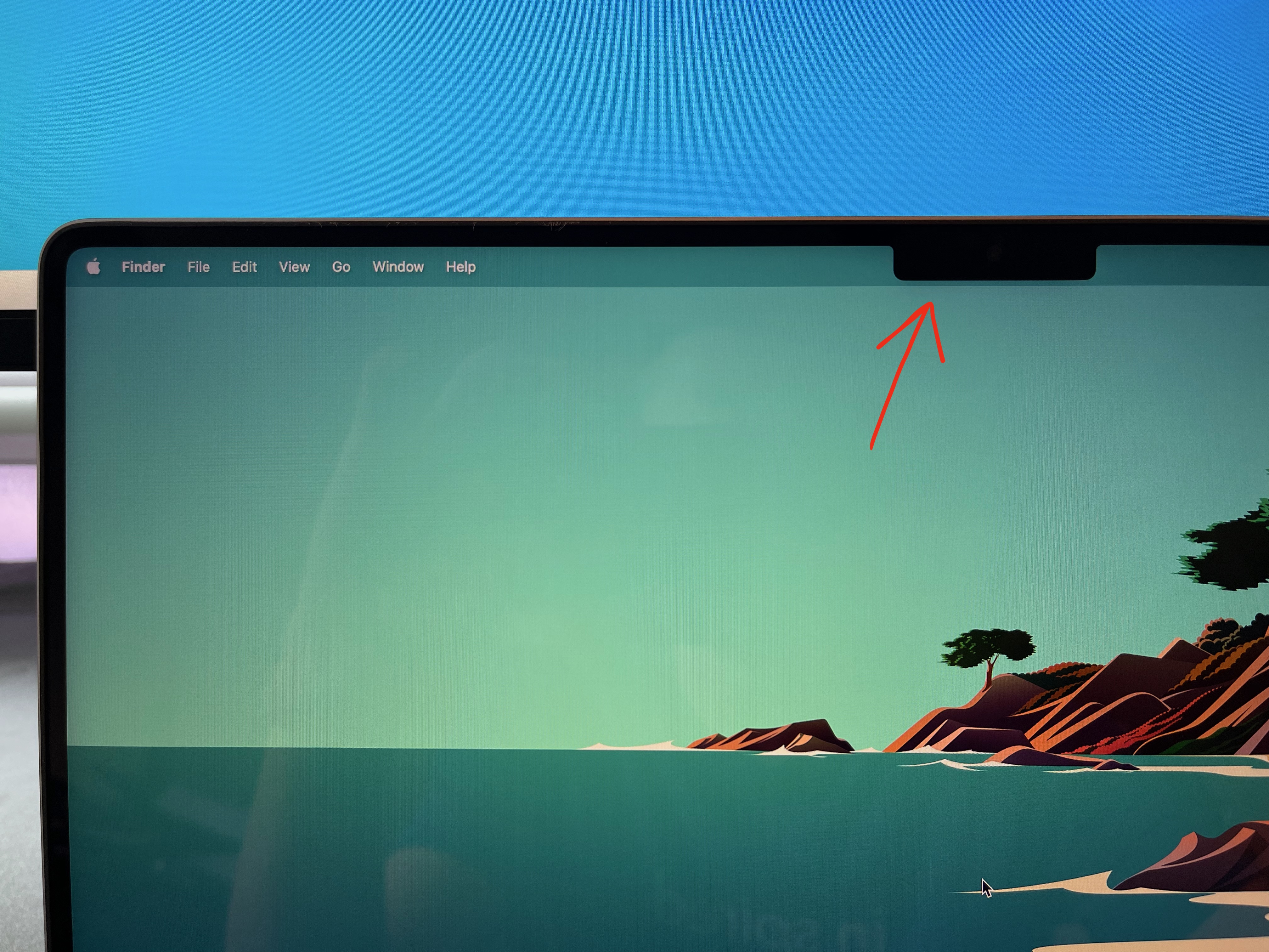
On the new MPB (at least the 16"), the expanded menu bar is actually taller than the height of the notch, so there is a tiny sliver of menu bar that rests beneath the notch:
fNyzB16.jpg


I never really looked closely in any of the marketing images or reviews, but before I picked up my 16" MBP today I had expected the bottom of the menu bar to be flush with the bottom of the notch. Now that I go back and look closely at the images on Apple's website, it does indeed show that the menu bar is slightly taller than the notch.

This is a really weird design decision to me and I can't really understand why they chose to do it like this. Is it bothering anyone else?

EDIT: I should add that so far the notch in general doesn't really bother me; I just wish that the menu bar was contained completely within the vertical height of the notch so that the bottom of the notch is flush with the bottom of the menu bar. This would give us maybe ~10 pixels of screen space back as well.
 
  • Like
Reactions: DeanL
There are a whole lot of threads that have already discussed this. The reason is most likely having to do with making certain the screen underneath the menu bar is a full 16:10 ratio
 
  • Like
Reactions: TGM85
Yea it seems like poor design, the notch seems to be an afterthought. There is also a lot of wasted space above the icons on the menu bar.
 
I feel crazy for complaining about this, but it blows my mind that I haven't seen this mentioned yet in any of the reviews or discussion.

On the new MPB (at least the 16"), the expanded menu bar is actually taller than the height of the notch, so there is a tiny sliver of menu bar that rests beneath the notch:

fNyzB16.jpg


I never really looked closely in any of the marketing images or reviews, but before I picked up my 16" MBP today I had expected the bottom of the menu bar to be flush with the bottom of the notch. Now that I go back and look closely at the images on Apple's website, it does indeed show that the menu bar is slightly taller than the notch.

This is a really weird design decision to me and I can't really understand why they chose to do it like this. Is it bothering anyone else?
I personally have no issue with it. I think it’s a fine aesthetic choice. If the menu bar were completely flush, it wouldn’t look as continuous or menu bar-like to me. The tiny curves on the bottom would give two little “hooks” separating two completely separate bars, and to me a setup like that would just look too weird.
 
  • Like
Reactions: DesertNomad
There are a whole lot of threads that have already discussed this.
Gotcha, I searched but couldn't find any. Maybe there were some comments buried in one of the general "notch" threads that I missed.

The reason is most likely having to do with making certain the screen underneath the menu bar is a full 16:10 ratio
If that was the case, they could have just made the display slightly shorter, so that you still have a 16:10 ratio under the notch while keeping the notch flush with the menu bar.
 
If the menu bar were completely flush, it wouldn’t look as continuous or menu bar-like to me. The tiny curves on the bottom would give two little “hooks” separating two completely separate bars, and to me a setup like that would just look too weird.
Fair point. I'm guessing this is the reason they did it.
 
  • Like
Reactions: yitwail
Meh. The notch is a separate entity from the menu bar, so I don't see it as odd.
 
Alternative theory:

The partition of the menu bar is a highly contentious issue over which much violence has occurred. The best hope for peace is the two-state solution, but that requires a connection between the remaining parts of the menu bar to be viable.
 
I tried a third party app to make the menu bar black, and I liked it, but a guy in the thread I created convinced me (easily) to do something else instead.

I used a photo with mostly black at the top as my desktop picture. It completely hides the notch and awkwardly large menu bar from view, and I'm totally happy. Unfortunately no dynamic desktop but I will get by.

Screen Shot 2021-10-27 at 3.54.48 PM.png


Lol, after taking this screenshot, I realized...the notch is not going to show up in a screenshot ?
 
I feel crazy for complaining about this, but it blows my mind that I haven't seen this mentioned yet in any of the reviews or discussion.

On the new MPB (at least the 16"), the expanded menu bar is actually taller than the height of the notch, so there is a tiny sliver of menu bar that rests beneath the notch:

fNyzB16.jpg


I never really looked closely in any of the marketing images or reviews, but before I picked up my 16" MBP today I had expected the bottom of the menu bar to be flush with the bottom of the notch. Now that I go back and look closely at the images on Apple's website, it does indeed show that the menu bar is slightly taller than the notch.

This is a really weird design decision to me and I can't really understand why they chose to do it like this. Is it bothering anyone else?

EDIT: I should add that so far the notch in general doesn't really bother me; I just wish that the menu bar was contained completely within the vertical height of the notch so that the bottom of the notch is flush with the bottom of the menu bar. This would give us maybe ~10 pixels of screen space back as well.
I must say, this is my one and only complaint with the notch, especially because iPhones are not like that.
 
Why is everything on these forums always negative moaning???!!!

Its just what people do. It doesn't matter what the product is or how great it is there are always going to be people that find flaws in it and complain about it. Its human nature.
 
The reason for this is so there's a visual indication that the menu bar continues from left to right, if the menu bar was cut perfectly by the notch in the middle it might be visually confusing if the toolbar buttons go to the right side of it + it's prob hard to line it up

You need a margin, generally things on the edge of other things tends to not look as good as having space, armchair graphic designers think lining up everything is "good design", reminds me of the new Google logo and how people have no idea what they're talking about
 
  • Like
Reactions: DesertNomad
Register on MacRumors! This sidebar will go away, and you'll see fewer ads.