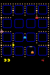
Project-79 said:Well, in the original “purple” wallpaper, the squares fit snuggly under the apps. You can’t see them unless you’re scrolling between pages. While the black “pixelated” wallpaper seems to give the illusion that the apps are glowing blue. I’d prefer that the apps not be glowing. That’s what I meant to say.
Done. Got rid of the blue glow but kept the old layout to avoid names overlapping the dots (as much as possible). I also moved the extra lives and cherries up to become flush with the page number dots. I liked the idea of the icon "jail" so I put that in too. This one basically contains the best of both backgrounds. I'll also add this into the first post.


