Got a tip for us?
Let us know
Become a MacRumors Supporter for $50/year with no ads, ability to filter front page stories, and private forums.
Please review this design
- Thread starter MacFanUK
- Start date
- Sort by reaction score
You are using an out of date browser. It may not display this or other websites correctly.
You should upgrade or use an alternative browser.
You should upgrade or use an alternative browser.

Other than the font being really thin, I like it.
Though, the subject matter...is there seriously a market for doing that!?
Though, the subject matter...is there seriously a market for doing that!?
Other than the font being really thin, I like it.
Though, the subject matter...is there seriously a market for doing that!?
Thanks, how thick do you think I should go with the font?
There must be I guess. I'm just paid to do their web development lol
")
Just pick something like Arial or geneva with a bit more pixels width for thin letters like i's and t's
Just pick something like Arial or geneva with a bit more pixels width for thin letters like i's and t's
Thanks, I've updated the original image using Arial.
If anyone has any other comments I'd really appreciate it as this is the early stage of the design so any improvements can be made easily.
A couple of suggestions. You may want to think about making the gray a little darker, it's hard to see the type. Also, I'm not sure I'm diggin the lines through your mast head. Seems to be a focal point and you may not want to put lines through it. It kind of throws me off.
Sorry to be obvious, but check your spelling and grammar throughout the site. I've just picked up "...it's exceptional resistance..."
Personally, I like the lines through the header. It makes me think of bathroom tile and think it adds a nice touch.
But i also agree about making the grey text a little darker to make it stand out more.
But i also agree about making the grey text a little darker to make it stand out more.
Thanks for the comments. I can understand why some may not like the tile effect but it will be a jquery slideshow and I think it will look good in the finished design.
As for the spelling, it will be checked when the website's built but thanks for the heads up
As for the spelling, it will be checked when the website's built but thanks for the heads up

I think you nailed the design to the image that sector needed. GJ. Yeah you can work on the wording etc, though I'd imagine the CM admin will be tweaking all that stuff as they progress.
Only thing is that I think the original 4 part logo was far better and more professional than the rather toyish and primary school looking updated version.
Only thing is that I think the original 4 part logo was far better and more professional than the rather toyish and primary school looking updated version.
I love the main image, it really works with the rest of the page. It also makes what would otherwise be a rather obvious image to expect on the site, that little bit more interesting.
I'm not keen on the second logo though. The wording against is better, as it looks very pixelated in the first. I'd try for a in between. Keep the original blue doors, but blend this with the improved typeface. Also, is the .co.uk after the name really essential?
I'm not keen on the second logo though. The wording against is better, as it looks very pixelated in the first. I'd try for a in between. Keep the original blue doors, but blend this with the improved typeface. Also, is the .co.uk after the name really essential?
Thanks again for the comments. I sent the design to the company and the only comment they've really made is they'd rather have a few smaller images rather than one large tiled image. What do you guys think it'd look like if I turned the tiled image into a kind of gallery where when you hover over a square, a larger image appears or do you think I should argue a case for the large image?
Thanks again for the comments. I sent the design to the company and the only comment they've really made is they'd rather have a few smaller images rather than one large tiled image. What do you guys think it'd look like if I turned the tiled image into a kind of gallery where when you hover over a square, a larger image appears or do you think I should argue a case for the large image?
But really how many pictures of toilets can you have before it get to be all the same? I really like the big titled image but hey if the client doesn't like it what choice do you really get.
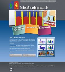
Okay. I like your very first design the best.
I went ahead and added some comments over your screenshot:
http://i299.photobucket.com/albums/mm288/dcallstar51/review.jpg?t=1282776416

I went ahead and added some comments over your screenshot:
http://i299.photobucket.com/albums/mm288/dcallstar51/review.jpg?t=1282776416
Register on MacRumors! This sidebar will go away, and you'll see fewer ads.