Become a MacRumors Supporter for $50/year with no ads, ability to filter front page stories, and private forums.

53kyle

macrumors 65816
Original poster
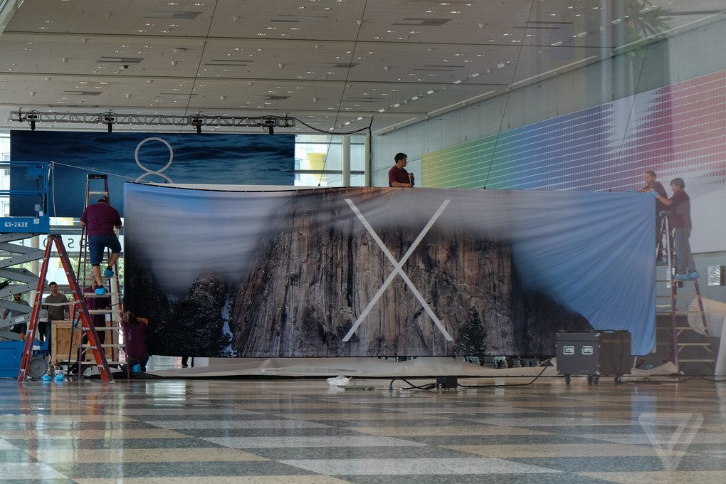
There were rumors a while ago, although I can't find them anymore, about the default iOS 9 wallpaper being "blue and green." Anyways, the iOS, OS X, and watchOS banners went up at Moscone Center, and the iOS banner was made up of blue and green shapes. So, could that be based on the iOS 9 wallpaper?
 

Attachments

  • image.jpg
    image.jpg
    510.2 KB · Views: 933
I'm more concerned at iOS being in the same circular icon as watchOS while OS X isn't.

Don't bring the watch style icons to iOS, Apple. Please.
Huh, I didn't notice that. It's gonna be a royal pain for the developers who have to redesign all of their icons now...then again, it would actually make it easier to port their apps to watch, I guess...
 
I doubt it has much to do with anything, it's just the overall theme for this year's wwdc; tons of colorful app icons is nothing new. I've been waiting for these type of banners to go up, but maybe they are not this year. They were already up on Friday last year.

DSCF8420_verge_super_wide.jpg
 
I'm more concerned at iOS being in the same circular icon as watchOS while OS X isn't.

Don't bring the watch style icons to iOS, Apple. Please.

I actually think the circle watch app icons look better than the iPhone icons.

I just don't think they'll look good on larger screens than the watch screen, I really wouldn't be too happy if iOS 9 had circular icons

On the Watch, they absolutely do. On a larger screen like those on iPhone and iPad? I don't think so ... personally, I don't think they'd look great. Especially if they used the same UI for navigating them!
Honestly, it wouldn't look THAT bad. I took out my old, jailbroken iPod so that I could get a good representation of how it would look, but I forgot to turn of the theme I had enabled.
 

Attachments

  • image1.png
    image1.png
    405.4 KB · Views: 2,085
  • Like
Reactions: Dennison
Huh, I didn't notice that. It's gonna be a royal pain for the developers who have to redesign all of their icons now...then again, it would actually make it easier to port their apps to watch, I guess...

They don't have to redesign. As long as they follow Ive's icon template for iOS 7/8, Apple will just automatically apply a filter on all icons to turn them into circles.
 
They don't have to redesign. As long as they follow Ive's icon template for iOS 7/8, Apple will just automatically apply a filter on all icons to turn them into circles.
True, but there are many apps which will have important parts of their icons cut off. For instance, all of the GameLoft games have a logo in the corner of the icon which will be cut off.
 
Register on MacRumors! This sidebar will go away, and you'll see fewer ads.