I rolled back to iOS6 earlier this week, but this is a shot from when it was first released and I had it on my phone.

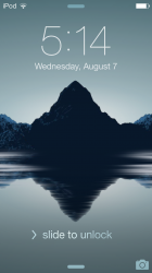
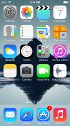
I love the new look of the lock screen, but I think it would be even better if there was the option to remove the slide to unlock, and the two arrows on the top and bottom. The home screen is nice as well, except that dock sticks out like a sore thumb.
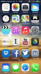
Why does the Whatsapp icon look flatter here, and in many other screenshots of iOS 7? When I used the beta last month the Whatsapp icon was the same as it always is.
You can actually remove the two arrows under the notification center and control center preferences by disabling the 'access from lockscreen' option.
This configuration provides a simpler lockscreen interface and also prevents you from accessing the notification and control center accidentally
except that dock sticks out like a sore thumb.
Pure awesomeness.
http://25.media.tumblr.com/0a93a02ce6445dbd3e55935a88ef2a5f/tumblr_morrdqMuug1ro3i3xo1_1280.jpg
Am I the only one here who hates the look of IOS 7?
Horrid flat icons, horrid insipid colours... horrid.
Okay Ben... will do.


")