Got a tip for us?
Let us know
Become a MacRumors Supporter for $50/year with no ads, ability to filter front page stories, and private forums.
Post your non-jailbroken iOS home screen - Some NSFW
- Thread starter batting1000
- Start date
- Sort by reaction score
You are using an out of date browser. It may not display this or other websites correctly.
You should upgrade or use an alternative browser.
You should upgrade or use an alternative browser.


So funny that you say this.
I have been bouncing around with themes and widgets, but I always come back to stock.
Then I think to myself, there's obviously a reason that "stock" looks like it does.
A lot of thought and effort went into it for a reason.
Cheers
So funny that you say this.
I have been bouncing around with themes and widgets, but I always come back to stock.
Then I think to myself, there's obviously a reason that "stock" looks like it does.
A lot of thought and effort went into it for a reason.
Cheers
Yeah it just looks right.
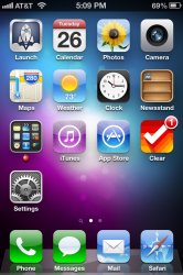
Mine is like this for a while.
Folders etc on 2nd page. 'Launch' has saved me having all my apps on screen one and I find it's better now.


Folders etc on 2nd page. 'Launch' has saved me having all my apps on screen one and I find it's better now.
How did you post your wallpaper with an iPhone also?
Is there a website?
Thanks


Could you post that lockscreen wallpaper please?
Could you post that lockscreen wallpaper please?
Sure thing!!

I also use it on my Galaxy Nexus

how did you get that apple logo as a letter on the folder on your dock?
Thanks so much! It looks awesome!
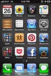
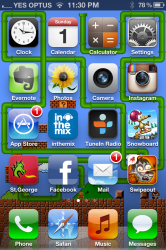
Found a setup that I like. I like the stock look so I just put the rest of the apps in alphabetical order.
Page two: All the nice looking icons of the apps I use often / daily
Page three: The other nice looking icons (the apps I din't use as often in folders)
I only have Real Racing 2 and Infinity Blade because I don't play games that often
what is the circle in the upper left corner that some people have ilke in your home screen????
Thanks so much! It looks awesome!
No problem. If you like mk4's like that one, I'll put a few more up later.
what is the circle in the upper left corner that some people have ilke in your home screen????
AssistiveTouch. I use it so I don't have to use any of my buttons, extends their life.
http://techc0re.wordpress.com/2012/02/18/ios-tip-never-use-your-buttons-again/
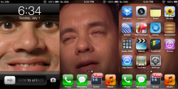
Here's mine
Hi Everyone!!!!
I just signed up on the forums just to post on this thread.
I really like Macrumors and the users seem to be pretty cool as well. #
So here is my iPad home screen via Dropbox.
http://db.tt/FBegghBI
Thanks.
Hi Everyone!!!!
I just signed up on the forums just to post on this thread.
I really like Macrumors and the users seem to be pretty cool as well. #
So here is my iPad home screen via Dropbox.
http://db.tt/FBegghBI
Thanks.
No problem. If you like mk4's like that one, I'll put a few more up later.
If you could do that, that would be awesome! Thanks in advance.
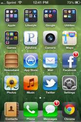
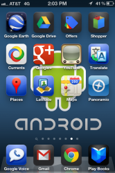
And just for grins, here's my "Google iPhone" home screen layout. Normally, I keep the stock iOS Camera app or Camera+ in the fourth dock spot, but since there is no native Google Music app for iOS, I put Google Play Books there instead.
The other Google apps I rarely use, so they all live on their own screen anyway. Changed my background just for this screenshot.
The other Google apps I rarely use, so they all live on their own screen anyway. Changed my background just for this screenshot.
Attachments
And just for grins, here's my "Google iPhone" home screen layout. Normally, I keep the stock iOS Camera app or Camera+ in the fourth dock spot, but since there is no native Google Music app for iOS, I put Google Play Books there instead.
The other Google apps I rarely use, so they all live on their own screen anyway. Changed my background just for this screenshot.
Intriguing.
")
If you could do that, that would be awesome! Thanks in advance.
Here you go


Register on MacRumors! This sidebar will go away, and you'll see fewer ads.