Got a tip for us?
Let us know
Become a MacRumors Supporter for $50/year with no ads, ability to filter front page stories, and private forums.
Post Your Screen And Results - Official Proof Thread
- Thread starter ghsDUDE
- Start date
- Sort by reaction score
You are using an out of date browser. It may not display this or other websites correctly.
You should upgrade or use an alternative browser.
You should upgrade or use an alternative browser.
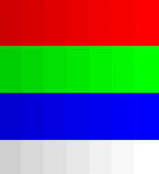
Nope, you've still got a bad image. The RGB values for the first two red chips (on the right) are the exact same value. Same for the first four green chips, and the first two blue chips are only 1 unit off, which in most cases is not human-perceptible. In other words, those chips will always look the same (and appear clipped) no matter what display you view them on, because they are the same.
Try this image:

In this image, I can clearly distinguish every chip for each of the R, G, and B scales (13" 2011 Air with Samsung display). I have my display calibrated using a Spyder 3 Elite calibrator. The display looks pretty good calibrated, but I find the reds on this panel a bit weak, they look a bit "peach-ish" instead of deep, solid red. But not bad.
Try this image:
In this image, I can clearly distinguish every chip for each of the R, G, and B scales (13" 2011 Air with Samsung display). I have my display calibrated using a Spyder 3 Elite calibrator. The display looks pretty good calibrated, but I find the reds on this panel a bit weak, they look a bit "peach-ish" instead of deep, solid red. But not bad.
Are you saying, "look at the image. Highlight sections of each color spectrum where there appear to be no differences in color temperature, i.e. that blend too well"?
Exactly.
Because people are saying the Samsung's are better on this test.
I can see the entire spectrum on my iMac...but what I have highlighted all look the same on my Air.
OP, did you not read this?Nope, you've still got a bad image. The RGB values for the first two red chips (on the right) are the exact same value. Same for the first four green chips, and the first two blue chips are only 1 unit off, which in most cases is not human-perceptible. In other words, those chips will always look the same (and appear clipped) no matter what display you view them on, because they are the same.
You're using a terrible image.
OP, did you not read this?
You're using a terrible image.
Did you go to the official link provided then?
And they aren't the same...I went on my iMac and EVERY box looks different in color. But on the Air they look the same...so there's no way the image I'm using is flawed.
You THINK they look different. It's an optical illusion. Have you actually checked the RGB values as HiRez did?
You THINK they look different. It's an optical illusion. Have you actually checked the RGB values as HiRez did?
Well everyone posted that image from another site in another thread and people "claimed" with their Samsung's they saw a difference.
I don't really care anymore, I was just trying to help.
Nope, you've still got a bad image. The RGB values for the first two red chips (on the right) are the exact same value. Same for the first four green chips, and the first two blue chips are only 1 unit off, which in most cases is not human-perceptible. In other words, those chips will always look the same (and appear clipped) no matter what display you view them on, because they are the same.
Try this image:
View attachment 295627
In this image, I can clearly distinguish every chip for each of the R, G, and B scales (13" 2011 Air with Samsung display). I have my display calibrated using a Spyder 3 Elite calibrator. The display looks pretty good calibrated, but I find the reds on this panel a bit weak, they look a bit "peach-ish" instead of deep, solid red. But not bad.
I don't think there's anything wrong with the OP's image...now that I understand what he's trying to do.
If you go to this link:
http://www.pbase.com/jackcnd/image/75285375/original
On any computer, the image looks normal. You see the full spectrum on each color band. However...if I download that image to my computer, and render it directly in Preview, there IS a difference between the image on the 17" MacBook Pro and that of the MacBook Air.
On the Air, using the Red band as an example, the far right three appear to be one rather than three distinct shades. A quick sample in Photoshop shows that they do have different values: the far right is 254, one to the left is 248, to the left of that is 240. So they are different, though not by much. On the Pro, and on my iMac which i'm using for the Photoshop sampling, I can easily make out these shades. On both the 2010 and 2011 Air I cannot.
Now this obviously has more to do with the quality of the display used on the Air vs. the iMac and the Pro, rather than the manufacturing. I don't think LG/Samsung makes any difference here. I think there's just more colors supported on the higher resolution screens is all. If I had to guess, every MacBook Air owner would see this blending effect, and it's just a symptom of the fact that the Air's screens have always paled in general comparison to the main machines. Maybe more pixels than the 13", but the quality certainly is not superior.
Reports on first page suggested SM and LG are on par on "problems" with the clipping.
And I've read SM panels have problem with the other side of the spectrum, they're problem free on my LG panel and I can see all the 2nd darkest bar before the last one which is black on all colors.
And I've read SM panels have problem with the other side of the spectrum, they're problem free on my LG panel and I can see all the 2nd darkest bar before the last one which is black on all colors.
OK, I think I finally figured out what's happening here...kind of anyway. It seems there's some browser rendering issue with Lion Safari. When I view the images in Safari on my Air (2011 13" Samsung display), I see clipped chips. But, when I view the same images in Google Chrome, on the same Air, I see all the chips. My best guess is it's a ColorSync thing, probably the images have a ColorSync profile, which Safari is honoring or interpreting, while Chrome is ignoring ColorSync. And because I was using Digital Color Meter to measure with, it was showing me whatever Safari was rendering in terms of RGB numeric values.
So try viewing these files in Chrome or maybe Firefox and see if you can see all the chips. I don't think it's an Air hardware problem, I think it's a Safari issue (whether it's strictly a "problem" or not I don't know yet, maybe it's a bad ColorSync profile attached to the image).
So try viewing these files in Chrome or maybe Firefox and see if you can see all the chips. I don't think it's an Air hardware problem, I think it's a Safari issue (whether it's strictly a "problem" or not I don't know yet, maybe it's a bad ColorSync profile attached to the image).
OK, I think I finally figured out what's happening here...kind of anyway. It seems there's some browser rendering issue with Lion Safari. When I view the images in Safari on my Air (2011 13" Samsung display), I see clipped chips. But, when I view the same images in Google Chrome, on the same Air, I see all the chips. My best guess is it's a ColorSync thing, probably the images have a ColorSync profile, which Safari is honoring or interpreting, while Chrome is ignoring ColorSync. And because I was using Digital Color Meter to measure with, it was showing me whatever Safari was rendering in terms of RGB numeric values.
So try viewing these files in Chrome or maybe Firefox and see if you can see all the chips. I don't think it's an Air hardware problem, I think it's a Safari issue (whether it's strictly a "problem" or not I don't know yet, maybe it's a bad ColorSync profile attached to the image).
I can confirm this.
Safari on Lion clips the last three shades of both red and green on my 2010 MBA 13", but on Chrome and Firefox, I can clearly see all of those shades.
Preview on Lion also clips the image the same way, so does Photoshop CS5. I have actually tried to replicate similar shades on Photoshop CS5 on a blank canvas and they are all visible.
Also to note, the shades created in CS5 actually show up fine under both Preview and Safari, so it might be something to do with that particular image.
Confirm+1OK, I think I finally figured out what's happening here...kind of anyway. It seems there's some browser rendering issue with Lion Safari. When I view the images in Safari on my Air (2011 13" Samsung display), I see clipped chips. But, when I view the same images in Google Chrome, on the same Air, I see all the chips. My best guess is it's a ColorSync thing, probably the images have a ColorSync profile, which Safari is honoring or interpreting, while Chrome is ignoring ColorSync. And because I was using Digital Color Meter to measure with, it was showing me whatever Safari was rendering in terms of RGB numeric values.
So try viewing these files in Chrome or maybe Firefox and see if you can see all the chips. I don't think it's an Air hardware problem, I think it's a Safari issue (whether it's strictly a "problem" or not I don't know yet, maybe it's a bad ColorSync profile attached to the image).
I can tell the whole spectrum in Chrome.
Can see it all in chrome too - LG panel.
I can see the other one posted too
As i said previously in this thread or another thread, we are making assumtions about what is better. And yet most of us, if we are honest don't understand or have the knowledge to detect the real differences and then apply them to real world situations. Then to top it off our eyes are different and we percieve things differently, 1 persons idea of a nice bright screen might be too much for another, that goes for colour and saturation.
I do a lot of photo work and all i can say is the colour accuracy and contrast on this panel is awesome and my photos are looking better on the air than many other computers.
LOL! Opening the page in Firefox, can see all the color blocks fine. Blame Safari!!!
Same in Chrome.
(EDIT: Although, others have concluded this way before I did... )
The Air's display LG or Samsung is not the source of the clipping problem,
as shown by viewing in Chrome vs Safari.
Safari is not 'the problem' as it displays the image the same as iPhoto, preview,Photoshop etc.
Safari is in fact a color managed browser where Chrome is not.
The original RGB scale image if downloaded and info is checked via info in OSX shows
it is tagged with a sRGB color profile, the web standard.
http://www.pbase.com/jackcnd/image/75285375/original
Safari uses the color tag and Chrome does not.
To read more about this (maybe too much)...
http://www.gballard.net/psd/go_live_page_profile/embeddedJPEGprofiles.html
and Safari related...
http://www.gballard.net/photoshop/srgb_wide_gamut.html
Could someone well versed in Color Management summarize
why the red and greens in the test image end up clipped in Safari
on the Air and not on a Macbook Pro?
Would a 'better' monitor profile than the Apple provided Air default change that in Safari?
It seems for the average user it might be better just to turn color management off in OSX?
Last edited:
Can somebody please explain how they make the association between the LTH and LP codes with Samsung and LG, respectively?
I remember with the late 2010 Airs people were usually talking about two different sorts of numbers that come up when looking in system preferences under displays and then going to item #17. The discussion back then was between 9CF0 and 9CDF. Now my new display is an LP one, and also 9CDF.
Is it true that 9CDF=LP=LG and 9CF0=LTH=Samsung?
I remember clearly that the *rumor* at the time was that 9CDF was superior to 9CF0. With the current generation it appears to be the other way around.
Can somebody please explain how they make the association between the LTH and LP codes with Samsung and LG, respectively?
It came from another thread..
To identify your display
open terminal , paste
ioreg -lw0 | grep IODisplayEDID | sed "/[^<]*</s///" | xxd -p -r | strings -6
LP = LG Phillips
LTH = Samsung
Last edited:
It came from another thread..
To identify your display
open terminal , paste
ioreg -lw0 | grep IODisplayEDID | sed "/[^<]*</s///" | xxd -p -r | strings -6
LP = LG Phillips
LTH = Samsung
Right, but I wanted to know HOW they know the above are true associations.
Also, isn't it bizarre that with the late 2010 Macbook Airs, there was some consensus that the LTH displays were inferior to the LP ones!!??

On my desktop I use a HDTV monitor with the sRGB profile
and Chrome and Safari images match.
Switching to the sRGB profile on the Air does not help with the clipping.
MAybe all that is needed is a correct sRGB profile for the Air,
effectively to eliminate the Air profile being used?
Then Chrome, iPhoto, PHotoshop, and Safari would all display the same image...
I am literally using a 6 year old laptop and i can differentiate between all of them. The screen itself is thicker than the entire MBA and I can see all of the colors clearly.
Is this really a problem with a top of the line device in 2011?
Is this really a problem with a top of the line device in 2011?
CASE CLOSED:
Attached is a crop of the same image with all color management data removed by pngcrush.
Just like magic now it views the same in Safari and Chrome...
So it's not an issue with the display.
It's just how the Air's color profile is handling sRGB images.
Maybe that could be improved or maybe it was done to optimize how skin tones etc look in sRGB images.
I'll leave that to a Color pro to explain,
but it seems the LG displays do display the full color range
and others are reporting they have a greater max brightness too.
.
Attachments
Last edited:
Register on MacRumors! This sidebar will go away, and you'll see fewer ads.