Become a MacRumors Supporter for $50/year with no ads, ability to filter front page stories, and private forums.
3. Fakes that are trying to tell us something. Everyone uses the old iHome box in the elevator as the primary example of a total fake, but I often wonder how much the person who faked that knew about the :apple:TV. It's strikingly similar.
Not sure there are that many, if any, of the latter in real life. The "set top box running Mac OS (X)" rumour has been around for many, many, years. Apple TV wasn't even Apple's first commercial attempt, Pippin preceded it. The iHome thing was the logical extension of a large amount of speculation after it became widely known Apple was releasing a low-end Mac, a rumour that despite coming from the highest sources at the time, was widely disbelieved by the Mac community who made up all manner of "alternative" explanations that had clearly been products misunderstood by mainstream journalists as a "low end Mac".

I don't know, I'm ignoring most of the rumours about tomorrow's event because until it happens, all we have to go on is speculation. Though I'd like to see:

* A version of the iMac with a large "forehead", with Teh Steve arguing it was Apple's response to all the people who said they didn't like the chin.
* The Mac nano, an iPod sized/shaped Mac that replaces the Mac mini.
* A Powerbook G5.
* Mac OS X for generic PCs.

That would make for an awesome Stevenote, albeit a somewhat controversial one...

Dude, you're out of your head. Apple is NO WHERE NEAR ready to release a PowerBook G5!!! They're just too dang hot. The rest, though, is pretty much a given, at least in the next six months. Along with the iHome II.
 
* A version of the iMac with a large "forehead", with Teh Steve arguing it was Apple's response to all the people who said they didn't like the chin.
Something like this? :p
imac_forehead.jpg
 
Black Mac

iamc-mt_07.jpg


I'd buy one of these. Black appears to be the new white at Apple. I always thought aluminum was reserved for pro products?
 
Something like this? :p
imac_forehead.jpg


Eeeeww! :p
It looks so wrong and unbalanced. It's weird how the position of the screen matters. Most screens have the buttons, speakers and logos on the bottom, and that's a good thing. The iSight looks like a p**phole in there. :eek:

I'm confident the real new iMac will be way better looking than all those mockups.

Yeah, it's really weird how we get accustom to they way things look and anything different immediately looks bad. I remember I didn't like the way the new shuffle looked at first, but now that new colours have been introduced the old one looks awful and I love the new one.
 
I've been wrong in pretty much every prediction I've made in the past, but I'll still have a stab at this one.

I still think that, despite the rumours, we'll not see a brushed metal iMac. Maybe a new brushed metal Mac, but not named iMac.

Apple took major steps to rebranding their hardware with the release of the MacBook, MacBook Pro and Mac Pro. There's also the Mac mini and finally the iMac. The only one of those that doesn't fit in the naming scheme is the iMac. Really, they should have renamed it simply the Mac, but that has confusion potential and the iMac brand name is very strong - much stronger than that PowerMac or iBook brands. I'll still not be surprised to see them ditch it tomorrow, though. As for the brushed metal, it makes no sense to go with brushed metal for the iMac. They've for a long time used white plastic for consumer computers and metal for pro computers. They continued this distinction with the MacBook, iMac, MacBook Pro and the Mac Pro. It makes no sense for them to abandon this distinction now.

Unless, of course, they're introducing some whole new computers. The Mac mini is desperately in need of a refresh, but I think more likely they'll ditch it entirely and come out with a cheap consumer level PC aimed at those $500 boxes Dell and the cheapy computer manufacturers sell. If they position that as the new consumer level Mac they could make the iMac brushed metal, but then they lose the brand familiarity of the iMac.

I think we'll see one or all of the following:

* A refreshed Mac mini (least likely)
* A new iMac with slimmed down form factor, but not brushed metal. Quite possibly rebranded simply to "Mac". If it *is* brushed metal, a range of colours ala the iPod Nano.
* A new, $500 - $800 Mac with keyboard, mouse and monitor.
* New Mac Pros, quite possibly with new form factor and beefed up specs.

I'd not be surprised if they actually toned down and cheapened the iMac, and introduced a new mid-level semi-pro machine at the current iMac price point, in brushed metal. Perhaps calling that one the Mac (or Mac Home, or Mac Office, or something equally trite), and keeping the iMac name for the cheaper models in plastic.

Making the iMac brushed metal would cheapen the distinction of the whole line and add confusion and uncertainty. As I say above, though, they could perhaps get away with brushed metal if it was released in a range of colours.
 
Way off...

Let me start by saying that all of these mockups are way off and quite frankly, unoriginal.

If the leaked iMac keyboard pr0n is to be trusted, the new iMac will have a combined brushed aluminum/plastic enclosure just like the iPod/iPhone.

As for the design, it will most certainly feature a stand where the lcd monitor can be adjusted just like your laptop's screen. The keyboard design drops big hints that the revision will be more of a crossover between a laptop and desktop designs for the sake of an über-slim display.

I expect Apple to discard the stand found in the current iMac and Cinema Displays and move towards an integrated CPU-in-base design, like the iMac G4.

We'll see in 24 hours!
 
I don't know why people keep knocking the mocked-up metal iMac with the wire base. It's awesome, and was done with much consideration.

I realize it's a fake, but it is precisely in line with the design direction in which the company has been moving. The move to black marketing and packaging materials has been steady and is nearly complete. The look of the iPhone merges the colors of current metal Macs and black iPods with an evolutionary design twist.

An iMac that follows suit makes perfect sense and is how the company generally works, if history is any guide.
 
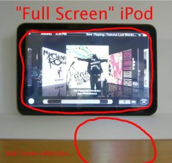
lmao, that is one of the worst fake images. The top bar looks so bad, that is Myriad (Pro). Apple doesn't use Myriad Pro ANYWHERE on the iPhone interface. Look, that font doesn't even match the font on the CoverFlow.
Why is there a full screen button on there? How much more fake-ness can you get? Maybe that takes out the white border (very funny).

That's the best you can do to debunk that "photo"? How about the really weird (some would say suspicious) reflections...see my attached image for some explanation.
 

Attachments

  • 892836780_c89a9d99ef_b.jpg
    892836780_c89a9d99ef_b.jpg
    177.8 KB · Views: 181
That's the best you can do to debunk that "photo"? How about the really weird (some would say suspicious) reflections...see my attached image for some explanation.

You hit the nail on the head there, its just a 5.5G black iPod and they extended the screen in Photoshop. Then forgot to add the light reflections.

Not that I thought it was real in the first place :)
 
Note that matted prints and photos tend to have a larger bottom-margin than top. For some reason that is more pleasing to the eye, whereas a print matted totally centered can actually SEEM to be too low or below-center.
 
these mockups are just dumb. but i will say apple maybe changing their design queues a little, i'd say that most people would of thought that the iphone would've been all white.
 
I remember that first time it was posted and every time I see it I roll round with laughter. It's mainly due to the grin on Steve Jobs' face in the reflection too. :D
That's the best you can do to debunk that "photo"? How about the really weird (some would say suspicious) reflections...see my attached image for some explanation.
Oh der. The new iPod won't emit the light needed to reflect artwork of songs that have already been listened to, only those playing or coming up. :rolleyes:
 
Worst movie ever.

I beg to differ. You have to be open to David Lynch's approach to films which is more of a transcription of a dream rather than telling a story. If you're expecting a linear sort of plot with everything couched in reality, then you've gone to the wrong film.

Anyway, my reference was more about the hairdo of the film's protagonist, not about the merits of the film itself.


10745~Eraserhead-Posters.jpg
imac_forehead.jpg
 
Register on MacRumors! This sidebar will go away, and you'll see fewer ads.