Become a MacRumors Supporter for $50/year with no ads, ability to filter front page stories, and private forums.
I'd rather get comments about the material in the presentation vs the tools used to for it.

Yes, that would be nice. Unfortunately the way you present sometimes has just as big an impact as the content. It's just business reality 101. I wish all my audiences were enlightened and could look past my choice of format and consider only the content.
 
I would add that too many fancy transitions becomes too flashy and distracts! You have to have both substance and presence!

THIS! Animations should support and enhance the content and not distract from it. I hate it if every little thing is animated and everything flies in.
 
[If you have] have an iPhone, get Keynote Remote from the App Store (the app used to be $0.99, I believe it is currently free) and then walk away from your iPad, using the iPhone as a slide controller. Feedback I've received on this setup is that the use of the iPhone impresses people even more than the iPad.
This is the setup I use. Plug my iPad into the projector, fire up Keynote, then walk away and control the presentation with my iPhone. If I am presenting where they insist on using their computer, I walk around with my iPad, using it as a promoter showing me the speaker notes. Love the portability.
 
Can you put up a screenshot of what you actually mean !!
Certainly. While this won't be quite as useful as seeing it in action, I think it will give a good idea of what I'm talking about.

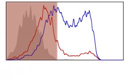
I've attached three photos to this post, all taken from a presentation. They aren't of the slide, itself, but of graphics within the slide. Here's my first example of what I was talking about:
attachment.php


Here, I had a slide with multiple graphs, although I'm only showing two in this image. I'll note that I prefer to reveal only one or two graphs at a time, resizing them to a smaller location on the slide when I am done discussing them (which allows the audience to still refer back to it, yet it doesn't take primary focus). The scaling can be accomplished through an animation effect or, more easily, through the use of creating a new slide and using Magic Move. In this particular case, the two graphs in the above image needed to be directly contrasted, so I revealed them at the same time. Rather than waving a laser pointer at the graph that I wanted to discuss, I highlighted the one that I wanted to discuss, and then created an animation to move the location of the highlighting box when I moved on to the next graph.

What is the highlighting box?
attachment.php


Simply a rounded rectangle that is made 100% transparent and then outlined (in iWork '09 this was the "stroke" setting; I have yet to make a presentation from scratch with Keynote 6.0, so I'm not sure if the terminology changed there). While my preference is for these rounded rectangles, you can, of course, use other shapes and conformations. You can also choose your own line thickness, line style, and color for your "highlighter."

I think this should give you an idea of how you can replace a laser pointer through the use of shapes that are then animated around the slide. I have one final example:
attachment.php


I wanted to discuss the data on one part of the graph, and then move on to the other part. Here, I have "highlighted" the left part of the graph by creating a red rectangle and then adjusting the opacity. When I was ready to move on to the other side of the graph, I simply animated the box to move (and possibly scale - I can't remember).

I have utilized arrows in a similar manner.

Compared to a laser pointer, this method requires a bit more synchronization. You need to lay the animations beforehand, which requires that you know the order that you were going to discuss things. I usually do a few rehearsals in my mind, and if I find that I have a tendency to want to go in a different order than I created my animations, then I change the animations to fit the order that I fall into. It takes more work to lay the animations, however I have always received a great response with this method and think that it is worth it. As a side benefit, nobody has to see how shaky your hands are when you're at the podium - something that a laser pointer always gives away!

One final note: I tend to avoid the flashy animations, but occasionally it is necessary to use a flashier animation for the introduction of your highlighter/pointer, to bring it to the audience's attention. Of course, you should explain what's going on ("as I have highlighted here..." "as this arrow indicates..."), but you want to make sure that the audience sees it, too. A bit of motion usually helps with that.

My philosophy is that digital presentations present new opportunities for us. Too many people use digital slides as if they were presenting on a chalkboard, or with a slide projector. With digital we are capable of color and animations. The human brain is designed to tune in to motion. While it can be difficult to strike a tasteful balance in its utilization, it is to our benefit to use motion and animation in our presentations. Keynote makes it much easier to implement such things.
 

Attachments

  • Highlight Box.jpg
    Highlight Box.jpg
    34.5 KB · Views: 228
  • Highlighting.jpg
    Highlighting.jpg
    132.1 KB · Views: 212
  • Shading.jpg
    Shading.jpg
    67.1 KB · Views: 222
Certainly. While this won't be quite as useful as seeing it in action, I think it will give a good idea of what I'm talking about.

I've attached three photos to this post, all taken from a presentation. They aren't of the slide, itself, but of graphics within the slide. Here's my first example of what I was talking about:
Image

Here, I had a slide with multiple graphs, although I'm only showing two in this image. I'll note that I prefer to reveal only one or two graphs at a time, resizing them to a smaller location on the slide when I am done discussing them (which allows the audience to still refer back to it, yet it doesn't take primary focus). The scaling can be accomplished through an animation effect or, more easily, through the use of creating a new slide and using Magic Move. In this particular case, the two graphs in the above image needed to be directly contrasted, so I revealed them at the same time. Rather than waving a laser pointer at the graph that I wanted to discuss, I highlighted the one that I wanted to discuss, and then created an animation to move the location of the highlighting box when I moved on to the next graph.

What is the highlighting box?
Image

Simply a rounded rectangle that is made 100% transparent and then outlined (in iWork '09 this was the "stroke" setting; I have yet to make a presentation from scratch with Keynote 6.0, so I'm not sure if the terminology changed there). While my preference is for these rounded rectangles, you can, of course, use other shapes and conformations. You can also choose your own line thickness, line style, and color for your "highlighter."

I think this should give you an idea of how you can replace a laser pointer through the use of shapes that are then animated around the slide. I have one final example:
Image

I wanted to discuss the data on one part of the graph, and then move on to the other part. Here, I have "highlighted" the left part of the graph by creating a red rectangle and then adjusting the opacity. When I was ready to move on to the other side of the graph, I simply animated the box to move (and possibly scale - I can't remember).

I have utilized arrows in a similar manner.

Compared to a laser pointer, this method requires a bit more synchronization. You need to lay the animations beforehand, which requires that you know the order that you were going to discuss things. I usually do a few rehearsals in my mind, and if I find that I have a tendency to want to go in a different order than I created my animations, then I change the animations to fit the order that I fall into. It takes more work to lay the animations, however I have always received a great response with this method and think that it is worth it. As a side benefit, nobody has to see how shaky your hands are when you're at the podium - something that a laser pointer always gives away!

One final note: I tend to avoid the flashy animations, but occasionally it is necessary to use a flashier animation for the introduction of your highlighter/pointer, to bring it to the audience's attention. Of course, you should explain what's going on ("as I have highlighted here..." "as this arrow indicates..."), but you want to make sure that the audience sees it, too. A bit of motion usually helps with that.

My philosophy is that digital presentations present new opportunities for us. Too many people use digital slides as if they were presenting on a chalkboard, or with a slide projector. With digital we are capable of color and animations. The human brain is designed to tune in to motion. While it can be difficult to strike a tasteful balance in its utilization, it is to our benefit to use motion and animation in our presentations. Keynote makes it much easier to implement such things.

Awesome post! Thank you so much for explaining this stuff. THIS is what I consider great animations in a presentation and I will use this for sure next time I have to present. Animations that have a purpose and highlight information and help the audience understand the information presented better.

This is what should be done and not making every point fly in. :)
 
This is the setup I use. Plug my iPad into the projector, fire up Keynote, then walk away and control the presentation with my iPhone. If I am presenting where they insist on using their computer, I walk around with my iPad, using it as a promoter showing me the speaker notes. Love the portability.

Ideal usage, thanks for sharing. I didn't think about using the iPad still for presenter notes when the setup is preloaded on a PC. I'll be implementing this suggestion.

----------

What is the highlighting box?
Image

Simply a rounded rectangle that is made 100% transparent and then outlined (in iWork '09 this was the "stroke" setting; I have yet to make a presentation from scratch with Keynote 6.0, so I'm not sure if the terminology changed there). While my preference is for these rounded rectangles, you can, of course, use other shapes and conformations. You can also choose your own line thickness, line style, and color for your "highlighter."

I wanted to discuss the data on one part of the graph, and then move on to the other part. Here, I have "highlighted" the left part of the graph by creating a red rectangle and then adjusting the opacity. When I was ready to move on to the other side of the graph, I simply animated the box to move (and possibly scale - I can't remember).

One final note: I tend to avoid the flashy animations, but occasionally it is necessary to use a flashier animation for the introduction of your highlighter/pointer, to bring it to the audience's attention. Of course, you should explain what's going on ("as I have highlighted here..." "as this arrow indicates..."), but you want to make sure that the audience sees it, too. A bit of motion usually helps with that.

My philosophy is that digital presentations present new opportunities for us. Too many people use digital slides as if they were presenting on a chalkboard, or with a slide projector. With digital we are capable of color and animations. The human brain is designed to tune in to motion. While it can be difficult to strike a tasteful balance in its utilization, it is to our benefit to use motion and animation in our presentations. Keynote makes it much easier to implement such things.

Thanks for taking the time to illustrate your post. Exactly the point. Given that the average adult attention span was recently quoted in WSJ as just over 9 minutes, it's an aid to our listeners to enhance, not detract or overwhelm, our presentations with well placed animation.
 
Register on MacRumors! This sidebar will go away, and you'll see fewer ads.