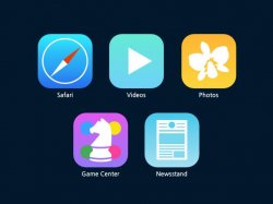
Safari: has got a more iOS 6-like icon again. Except for the Calendar app, i find these plain white backgrounds just stale.
Videos: has got a similar style as the Music app, because it's the same type of app (media).
Photos: same as for Videos. The icon resembles an orchid, known as the most beautiful flower in the world (even more beautiful than the sunflower we know from previous icons 'Photos' had), which makes it a prime motive for this app.
Newsstand: has got a similar style as the iBooks app, because it's the same type of app (reading). They're both also media which is why they share that look with Music, Videos etc.
Game Center: Imagine a Super Mario level with a plain white background - same horrible scene, isn't it? Little bit more colour.
Attachments
Last edited:
")