Become a MacRumors Supporter for $50/year with no ads, ability to filter front page stories, and private forums.

heeroyuigo

macrumors member
Original poster
Mar 10, 2022
32
22
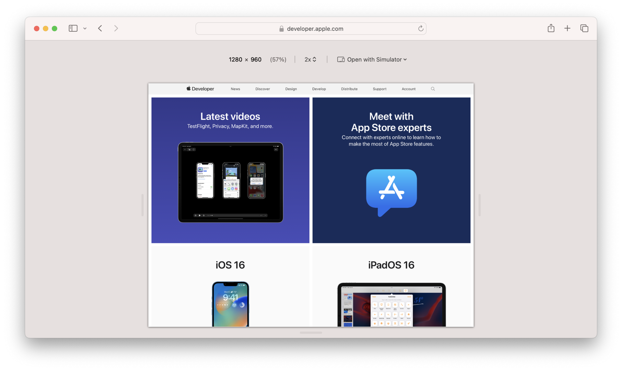
Hmmm, Apple's new Safari 17 (on Sonoma, at least) is a nice bit of "stupidity" (to be kind)... the new adaptive design dev menu requires Xcode installation and +3GB just to preview in a page format.
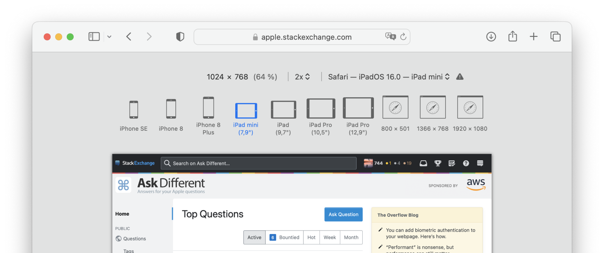
No more predefined sizes (iphone, iPad, Mac, vertical, horizontal) or even typing in the desired pixels (just the sides to be moved).

https://developer.apple.com/documentation/safari-developer-tools/installing-xcode-and-simulators

Before
BiQfv.png


Now
ResponsiveDesignMode@2x.png
 
I'd say I hit responsive mode maybe a dozen times a day and flick through the typical device sizes to check all looks good - I've caught some really blunders with that in the past!
 
  • Like
Reactions: chamlaw
What on earth was Apple thinking?? I use Responsive Design Mode daily to check my work. What a needless step in the wrong direction which I'm sure will impact the productivity and workflows of many many developers.
 
  • Like
Reactions: MichaelThwaite
If I might chip in... the presets look a bit dated.

I mean, obviously having them is better than not, but maybe they're updating them to a more modern selection of resolutions?

For example:

SE3, iPhone 15, iPhone 15 Plus, iPad 10th gen, iPad mini 6, iPad Air 5, iPad Pro 11", iPad Pro 12.9"

would be a better fitting selection since more people use those kinds of devices.
The "before" capture was for Safari 16, and is based on the main mass of Apple devices worldwide. Now no more predefined devices, no more rotation, no more manual changes via keyboard…
Xcode (3giga) required to view a web page (ratio).
 
Wow - do I understand this correctly? Are you saying that clicking the Develop > Enter Responsive Design Mode in Safari 17 no longer works without installing xCode? Did you need to do that for the "now" screenshot in the OP? What is listed in the "open with simulator" menu?

Still on Safari 15 in Monterey here and I also use responsive mode frequently to work on a complex web app.
 
  • Like
Reactions: capegreg
Wow - do I understand this correctly? Are you saying that clicking the Develop > Enter Responsive Design Mode in Safari 17 no longer works without installing xCode? Did you need to do that for the "now" screenshot in the OP? What is listed in the "open with simulator" menu?

Still on Safari 15 in Monterey here and I also use responsive mode frequently to work on a complex web app.
Yes, now it is an Xcode component (Simulator) -_- (not practical)

 
  • Like
Reactions: Boyd01
Trying to think of or understand the rationale behind this change. Could the rendering be more exact using a Simulator? If so, and I doubt it would be, does that really matter? Do we all use this basically to test breakpoints?

Regardless, they have done this to lighten the workload of the Safari developer tools team (let's say between 1 and 100 people, bit i have no idea) and have instead decided to waste the time, energy, bandwidth and electricity of every user of this feature across the entire world.
I'm not going to install Xcode to control responsive web pages -_-‘ ...

You have to open Simulators and Safari to get the development window -_-

I'll go to edge/chrome/firefox for responsive too
 
Yeah this is garbage Apple! I'm not installing Xcode just to get a bunch of pre-defined breakpoints to do a quick check. Guess I'll have to use Chrome's dev tools for now. I realize it wasn't perfect, but the old method was nice to do a quick check and make sure everything is working as expected.
 
Sorry, I'm a little confused here. Are these screenshots of the new simulator? If so, I have to admit that's an improvement. One problem with the older responsive mode in Safari is that it only shows a rectangular window with the site content and not the actual user interface of the phone. This new simulator appears to show how the rounded corners on the phone cut off part of the page in full screen mode. That would definitely be an improvement.
 
Sorry, I'm a little confused here. Are these screenshots of the new simulator? If so, I have to admit that's an improvement. One problem with the older responsive mode in Safari is that it only shows a rectangular window with the site content and not the actual user interface of the phone. This new simulator appears to show how the rounded corners on the phone cut off part of the page in full screen mode. That would definitely be an improvement.
Yes, the screenshots that show the device frame are part of the simulator whereas the old method was just shown in a window in Safari. Is the simulator more robust, sure I would hope so for having Xcode installed! But for a lot of people it isn't needed.

Safari 17 basically does the same thing as before, as you can open the web dev tools and manually resize the window or type in the dimensions you want to use. However, they took away the quick predefined breakpoints. I used those all the time to just do a quick test to make sure something I coded looked and worked correctly. Click iPad confirm.....click iPhone confirm. It was just really easy to make sure you are on the right track when coding something. Now it's just a bit more of a pain as you have to manually resize and remember the breakpoints of the various devices. Not the end of the world.....but definitely something Apple could have just quickly updated and left in place while giving the option for those that need the full Xcode simulator installed to use that.
 
Thanks. Personally, I've been working on a complex web app for several years with about 16,000 lines of code but have almost never used breakpoints when debugging, so that wouldn't be an issue for me. 3gb of developer tools doesn't seem like a big deal either, although it would concern me that the installation might mess up other command-line tools I've installed.

Anyway, just based on your screenshots, this looks pretty nice to me and will be an incentive to skip Ventura and go right to Sonoma whenenever I finally upgrade from Monterey. That won't be anytime soon though, upgrading MacOS always breaks a lot of my old software and I end up wasting the better part of a day troubleshooting. :)
 
This. + you can Enter the Resolution.
&
You are still able to use your desired quick resolution check from Preset on Chrome.......

1696498429830.png
 
  • Like
Reactions: Boyd01
This is a huge regression and a single reason I just have to switch back to Chrome now.
What was Apple (not) thinking? As if any regular webdev is going to install XCode just for this??
 
I am more than sad. This idiotic move just ruin my workflow and I need to test responsive stuff on Chrome, because it is not longer seems as mobile fore responsive webdev... I am lost, I can't to fully switch to the Chrome or another browser because history and keychain and this is just pure pain... Anyone see some extension for this situation or something helpfull please?
 
  • Like
Reactions: TRT1968
Trying to think of or understand the rationale behind this change. Could the rendering be more exact using a Simulator? If so, and I doubt it would be, does that really matter?
This is absolutely why, and the answer is absolutely yes.

I've had issues with my page in the old Responsive mode where, on deploying to prod and viewing on my iPhone, it just looks different. This is deeply frustrating!

This new system is better in that regard. You see the page rendered on an iPhone, not just rendered at the size of an iPhone.

Obviously there are drawbacks. Primary one for me is that, even with XCode installed, this just doesn't work for me! My list of simulators is blank. 🤦‍♂️

But assuming that starts working at some point, I think this is mostly a positive change.
 
  • Like
Reactions: Boyd01
Might be more accurate, but we need both ways! It's so much faster to do it the old way. You need to get close, quickly and THEN if there's an issue, use the simulator method.
 
Register on MacRumors! This sidebar will go away, and you'll see fewer ads.