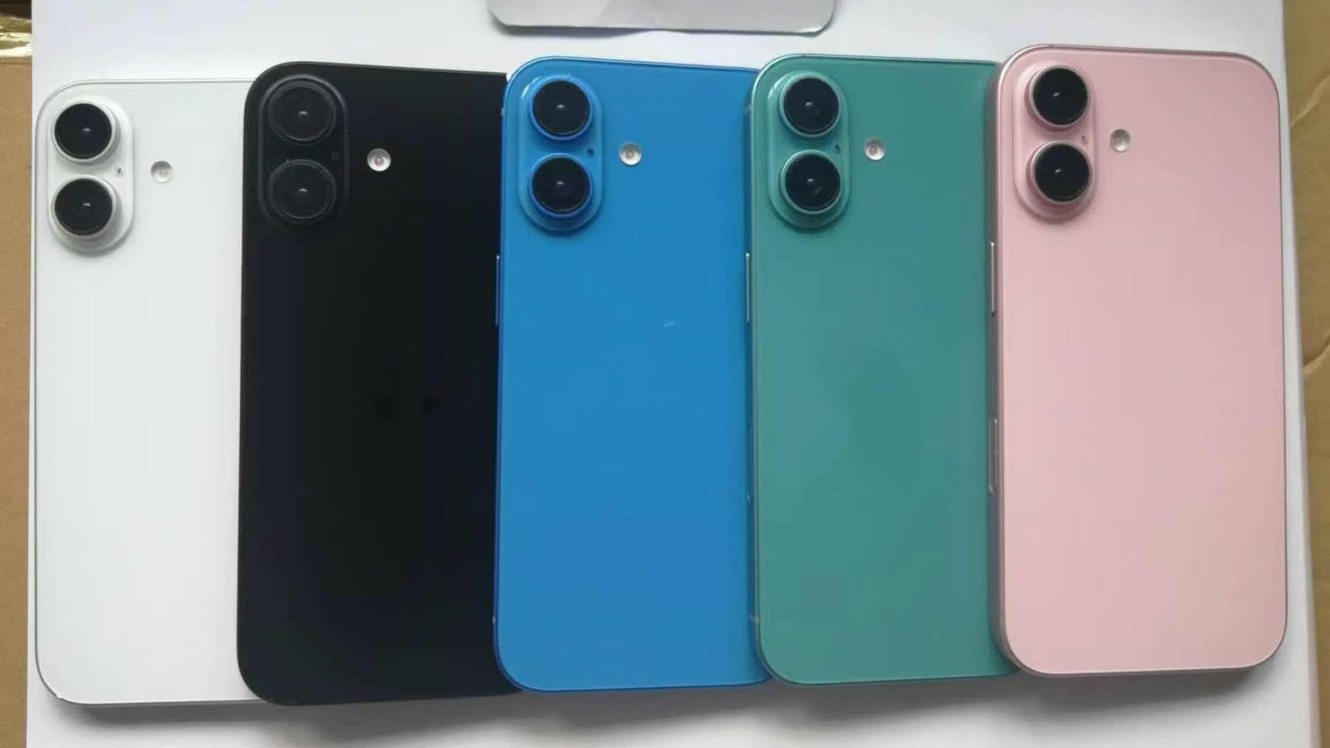
Leaker Sonny Dickson today shared an image displaying a selection of iPhone 16 dummy models that reveal Apple's planned new color options and the rumored redesigned camera bump coming to its iPhone 16 and iPhone 16 Plus devices.

The picture showcases five new colorways for the iPhone 16 and iPhone 16 Plus, and they match the descriptions previously predicted by Apple analyst Ming-Chi Kuo: White, Black, Blue, Green, and Pink.
The new colors suggest Apple is going for a less muted, less desaturated color palette for the standard iPhone 16 models this year, although there could be differences in materials used compared to the dummy models shown. As a reminder, the current iPhone 15 and iPhone 15 Plus devices are available in Blue, Pink, Yellow, Green, and Black.
For the 6.1- and 6.7-inch iPhone 16 models, Apple is also planning a new vertical camera lens arrangement that is a departure from the prior diagonal lens setup. The new orientation, evidenced in the dummy units, will presumably allow the standard iPhone 16 models to capture Spatial Video for the Vision Pro headset, something only the iPhone 15 Pro models are currently capable of doing. Prior iPhones have used a square-shaped camera bump to accommodate the diagonal lenses, but Apple is able to slim down the camera bump with the new lens arrangement.
The iPhone 16 and iPhone 16 Plus are anticipated to include an A18 chip, 8GB of RAM, a new "Capture" button on the right side for photo and video, the Action button previously exclusive to iPhone 15 Pro models, and more. All four devices in the iPhone 16 series are expected to launch around mid-September.
Article Link: Revealed: iPhone 16 Colors and Redesigned Camera in Leaked Image

