Become a MacRumors Supporter for $50/year with no ads, ability to filter front page stories, and private forums.
Eric5h5 said:
I work with CMYK, and what it basically comes down to is that RGB colorspace and CMYK colorspace aren't the same, especially with blue. Mixing cyan and magenta to get blue on a printed page just doesn't allow you to get that bright "computer monitor" blue, no matter what you fiddle with. Cannot be done. Sorry. The only choice, as others have said, is to try some special ink (but then it's not CMYK, of course). Oh, and don't use RGB for proofs anymore. ;)

--Eric

Are you referring to a 5 color process?
 
CMYK gamut is not RGB gamut

Blues & greens are less intense for a start...

If you're working for press in Pshop and insist on doing most of your work in RGB, then at least use the 'Proof colour' setting under the View menu. It does not affect the file but merely represents the CMYK output...

Its keyboard shortcut is Apple–Y
 
Chip NoVaMac said:
Are you referring to a 5 color process?

That, or custom inks. We had a logo that went from a custom process blue to CMYK and despite a lot of fiddling it was never the same, so eventually "close enough" had to suffice.

--Eric
 
Eric5h5 said:
That, or custom inks. We had a logo that went from a custom process blue to CMYK and despite a lot of fiddling it was never the same, so eventually "close enough" had to suffice.

--Eric

Ah, the new "pleasing color" standard. Just found out firsthand about it during the Holiday tab that I did in CMYK.
 
Blue Velvet said:
Blues & greens are less intense for a start...

If you're working for press in Pshop and insist on doing most of your work in RGB, then at least use the 'Proof colour' setting under the View menu. It does not affect the file but merely represents the CMYK output...

Its keyboard shortcut is Apple–Y
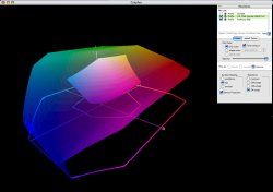
I've attached a screen grab showing the comparison between ProPhotoRGB (common photography RGB space) and SWOP (US standard CMYK printing space), in case anyone is interested.
 

Attachments

  • Gamuts.jpg
    Gamuts.jpg
    72.2 KB · Views: 62
Just a hint. In PhotoShop's color picker wndow there is an out of gamut warning that shows up when you are picking a color outside of the color space you are working in.

Also, don't trust your inkjet printer for color either. It probably won't match the final output anymore than your monitor will.

Get a color proof from your printer prior to printing. That is the only way to get a decent idea of the output. And even then it won't be 100% accurate. Always take the time to be on press when you have something printed. You can make some subtle but worthwhile changes.
 
Col. Panic said:
Always take the time to be on press when you have something printed. You can make some subtle but worthwhile changes.

Haha!

While ideal in theory, some of us would then never get any work done, especially when the press might be 200 miles away... a small but busy studio can send out 10-20 jobs per week depending on the jobs' scale...

Which is where constucting your artwork correctly and proofing accurately at your end comes in. And also having a good working relationship with your printer... never choose a printer on price alone, reliability is just as important.

Edit: I must be getting old.

I'm continually struck these days how young designers are very poor in their understanding of printing processes and reprography... When I went to college, repro was a major part of my course and heaven help you if you didn't know how the printing process worked... I see the term DPI bandied about all the time when talking about artwork when really it should PPI (pixels per inch). DPI refers to the half-tone on press and the screen frequency...

OK, I'll shut up now... I'm sounding like my grandmother.

*mutters – young whippersnappers... now where did I put my teeth?*
 
Col. Panic said:
Just a hint. In PhotoShop's color picker wndow there is an out of gamut warning that shows up when you are picking a color outside of the color space you are working in.

This is the simplest way to not run into this problem again. Take a sample from time to time and you'll never color yourself into a corner.
 
Blue Velvet said:
Haha!

While ideal in theory, some of us would then never get any work done, especially when the press might be 200 miles away... a small but busy studio can send out 10-20 jobs per week depending on the jobs' scale...

Which is where constucting your artwork correctly and proofing accurately at your end comes in. And also having a good working relationship with your printer... never choose a printer on price alone, reliability is just as important.

Edit: I must be getting old.

I'm continually struck these days how young designers are very poor in their understanding of printing processes and reprography... When I went to college, repro was a major part of my course and heaven help you if you didn't know how the printing process worked... I see the term DPI bandied about all the time when talking about artwork when really it should PPI (pixels per inch). DPI refers to the half-tone on press and the screen frequency...

OK, I'll shut up now... I'm sounding like my grandmother.

*mutters – young whippersnappers... now where did I put my teeth?*

This maybe a bit of topic but sure would make for a interesting thread, In my workplace I have to preflight artwork ads( usually 100-150 over thursday/friday) sent in from many different repro houses/ad agencies for inclusion into a pdf to eps workflow and the number of RGB/ low res files/ fonts not embeded I receive is astounding.

I would have to agree with you Blue Velvet I think the actual theory is lacking somewhat, I don't class myself as a old fart yet! (31 this year) but my college days were certainly filled with the how and the why and not just the do.
 
Blue Velvet said:
While ideal in theory, some of us would then never get any work done, especially when the press might be 200 miles away... a small but busy studio can send out 10-20 jobs per week depending on the jobs' scale...

Point taken. Maybe always was a bit too aggressive (I only need to go once every week or two so it works for me). But for the amount of time leekohler is putting into getting his color correct I think it would be worth a trip to the printer. I am not sure many people not in the business know they can actually be on press for proofing.
 
the difference is caused by the color spaces having a different gammet.

try hue and saturation as well as taking all the yellow and some of the black and magenta out of the image except the goggles. you dont want any yellow. and pull back on the magenta.
 
Register on MacRumors! This sidebar will go away, and you'll see fewer ads.