Got a tip for us?
Let us know
Become a MacRumors Supporter for $50/year with no ads, ability to filter front page stories, and private forums.
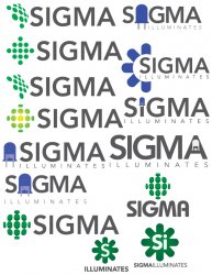
Round One: Logo Ideas
- Thread starter bntz313
- Start date
- Sort by reaction score
You are using an out of date browser. It may not display this or other websites correctly.
You should upgrade or use an alternative browser.
You should upgrade or use an alternative browser.
Ooh, it's hard to choose, they all look pretty good. I think the blue ones look best, and I like the LEDs with the most detail because you can be really sure as to what it is exactly. It's between the one with the blue LEDs surrounding the S, or the one with the detailed blue LED before the S.
EDIT: Didn't notice the one with the LED in the A, that is cool too.
EDIT: Didn't notice the one with the LED in the A, that is cool too.
I like the LEDs with the most detail because you can be really sure as to what it is exactly.
I would definitely stay away from the blue one with the detailed LED design, as this makes the logo dated incase LED light design changes in the near future.
In my opinion, I would definitely go with the green design with the rounded LED-styled pixels. That is less likely to be subject to change as oppose to the actual schematics of an LED.
These are the newer ones, with the colors they wanted (roughly)
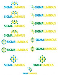
I think the no brainer IMO is the extreme bottom one. Hate to rain on the opinions of others, but that one really stuck out with a balanced sense of positioning.
You may need to do some tweaking on the lime green though for reproduction purposes. Try it in B&W as well.
He's saying that your logos are outdated, without offering any advice on how to improve what you've done. Happens all the time in this forum. I'm sorry you have to deal with it.
I still don't get it
Because those are outdated right off the bat.
Here you can pick up ideas for a fresher logo
http://www.behance.net/?content=projects&search=logo
Because those are outdated right off the bat.
Here you can pick up ideas for a fresher logo
http://www.behance.net/?content=projects&search=logo
and your expertise on this subject matter is? Cause I notice on another thread you supply the same link, but still didn't explain how one could improve.
-I'm all for constructive criticism, though!
-I'm all for constructive criticism, though!
Hey bntz313. I have some experience with logo design from when I used to work at a TV station/media outlet. We completely revamped the logo design for the station.
I honestly like the original ones better. they are more simplistic/elegant to me..the second batch of designs just look lame to me. I know your client probably wanted that color scheme but it looks pretty gaudy.
Looking at the initial designs you posted, I like Left: 4 and 5; Right: 1, 2, and 3. I think Right 1 is my favorite with the LED design from Left 6.
Why dont you try using the ones I mentioned with the blue/yellow color scheme from you second designs post?..
Hope that helps! Let use know what you do...
Wirelessly posted (Mozilla/5.0 (iPhone; U; CPU iPhone OS 4_2_10 like Mac OS X; en-us) AppleWebKit/533.17.9 (KHTML, like Gecko) Version/5.0.2 Mobile/8E600 Safari/6533.18.5)
Ok, but please explain?
Why do people offer a opinion but, do not explain? Why even say anything.
If you don't like it fine, I can totally handle that, but then why not tell me why?
ezekielrage_99 said:you'd be famous in 1980
That is a good call.
Ok, but please explain?
Why do people offer a opinion but, do not explain? Why even say anything.
If you don't like it fine, I can totally handle that, but then why not tell me why?
Your first post, 4th one down stands out from all of them.
One thing I'm surprised about is that you're publically revealing these logo concepts for a genuine company. I mean, wouldn't they be a bit underwhelmed if they found this topic? I'd recommend getting feedback from people face to face, meet up at a cafe or send it by email.
Not bringing you down or anything, but I wouldn't feel safe with my work being available online for anyone to copy and do what they want with it...
It's easy to criticize, hard to start with a blank screen. Don't let 'em get you down.
1st set: #5 left
2nd set: bottom
Altho I'm not wild about the colors in the revs, maybe you could use a foil or metallic or fluorescent in your print versions to make the graphic pop a little. The whole color mix is a little too busy--use 2c in the graphic, 1 in the text, or make the Luminous smaller or tucked under. Right now they're all kind of equally fighting for attention.
Think LED: very bright, very localized intensity.
It'll come to you; good start.
The company just picked a bad color combination. The yellow is horrible against light backgrounds and just doesn't work without some kind of edging.
Other than that, I like your logos, but this guy a few posts above said it right - the first post, fourth one down, use that and polish it some more. That's your strongest one.
Other than that, I like your logos, but this guy a few posts above said it right - the first post, fourth one down, use that and polish it some more. That's your strongest one.
Wirelessly posted (Mozilla/5.0 (iPhone; U; CPU iPhone OS 4_2_10 like Mac OS X; en-us) AppleWebKit/533.17.9 (KHTML, like Gecko) Version/5.0.2 Mobile/8E600 Safari/6533.18.5)
Ok, but please explain?
Why do people offer a opinion but, do not explain? Why even say anything.
If you don't like it fine, I can totally handle that, but then why not tell me why?
The issue being the designs look antiquated, technically not bad while there's nothing wrong as such with the selections. They simply look old and dated with the approach taken.
I would refer you to this site, it would give you a better understanding where we are coming from. Brand New has the before and after, many of the before are very good designs however are dated stylistically compared to the revisions.
A very good friend of mine worked on Surcogen Logo, I'd consider something like this would work much better considering the approach and style.
Is this not coming a little too close to treading on the toes of Sigma Photo, who already make flashguns and I'm sure have at least been looking into LED lighting?
Register on MacRumors! This sidebar will go away, and you'll see fewer ads.