Become a MacRumors Supporter for $50/year with no ads, ability to filter front page stories, and private forums.
Think I’ll be switch permanently to Chrome after all these years. The weird tab set up is confusing, the inactive looks like the active and vice versa and often looks like it’s a private tab when it appears almost black. A couple of days ago while copying some code with two tabs open from my text editor i ended up putting the wrong code in the wrong tab as was confused as to which I’d previously been too… I honestly can’t believe this got released… it’s terrible.

I may try and use the compact version which is where I think the problem lies… they released a new version with the tabs and a big url bar as a fix for people who didn’t like it compact… but all it’s done is compound the issue.
 
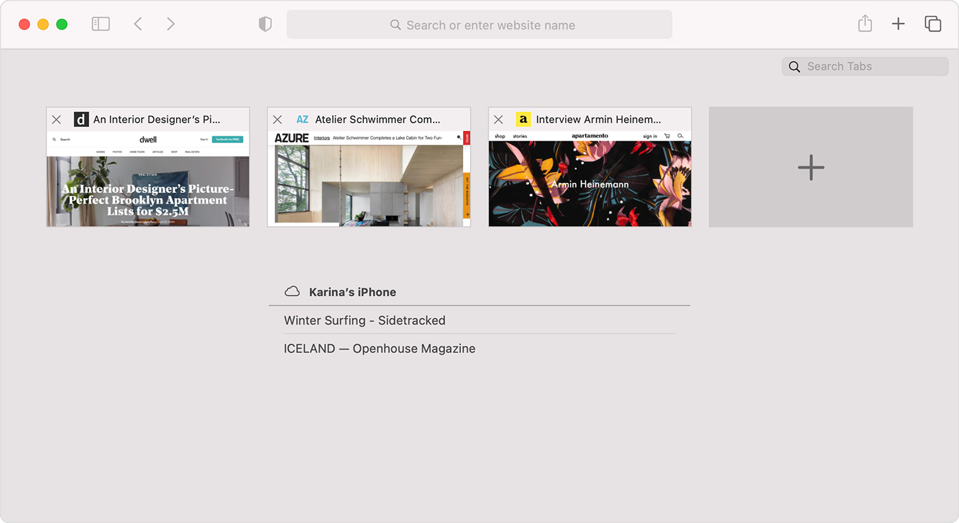
has icloud tabs been removed from safari 15? Previously in 14, you could click the tab overview and it would show tabs open on other devices in addition to the current tabs on the mac
Not working for me either. Handoff is busted too.
 
has icloud tabs been removed from safari 15? Previously in 14, you could click the tab overview and it would show tabs open on other devices in addition to the current tabs on the mac
iCloud tabs are in Start Page now.
 
iCloud tabs are in Start Page now.
He might be referring to this bug.

1633182251804.png
 
  • Like
Reactions: srbNYC and gank41
He might be referring to this bug.

View attachment 1854773
i mean this screen in the tab overview in safari 14 that showed open icloud tabs

macos-big-sur-safari-icloud-tabs-view-iphone-tabs.jpg


iCloud tabs are in Start Page now.
Yeah i saw that one but it was also like that on 14 too,Not a big fan of it since it adds a whole bunch more clicks (open new tab, then choose the device after you find which device that tab is on and then click)
 
I'm seeing this issue too with the tab boxes at the top of the page. Switching tabs makes them all render as completely white or completely black, with no text and only icons showing. The weird thing is that taking a screenshot doesn't show the effect. In the image they show up as normal.
Try reinstalling? I know, at least on Catalina, that reinstalling safari 15.0 seemed to solve this sort for some people. Of course I was running on Big Sur and it was hard to get an installation package until they dropped this beta.
 
ios 15 is Apple's terrible software. There are many errors, and none of them has been fixed yet. This update also allows you to install different bugs. Apple is not as productive and controlled as it used to be.

That’s an inexperienced opinion.

Comparing to some fantasy golden past is illogical. There was never a golden past for any software.

Apple these days has macOS, iPadOS, iOS, watchOS, tvOS, etc across several families of devices.

That has increased the complexity of software engineering.

In the fantasy golden past Apple had much fewer systems and devices to work with.

For comparison, Microsoft only has a few variants of Windows and they are all 💩💩💩 except for gaming. Linux is still only good for specific users. All software has bugs. It’s impossible not to have bugs.
 
Been using STP (safari tech preview) since Big Sur came out on my former Intel MBP and then M1 air and had no issues compared to when I moved back to Safari 15.0. STP is more stable I swear.
 
Is it just me, or is the shading of the new-style tab (buttons) counterintuitive. I find that with two tabs open, the lighter background-tab actually feels like it is the one in focus simply because it's clearer, and the darker tab feels like it should be representing the background page ...I say "representing" because of course, as they are now buttons rather than tabs there is no actual visiual connection. It's driving me mad!
I keep trying to click on the "tab" thinking it is the URL address bar. It's driving my bonkers. Then I looked in preferences and discovered you can make the tabs into dual purpose tabs and URL address blocks. This kind of makes sense. I dunno.. see how it works this way.
 
Safari is all messed up and not just the tab colors. I've never seen it act this wonky.
 
Last edited by a moderator:
  • Like
Reactions: iammikeDOTorg
Will not be installing Safari 15 any time soon. The sidebar designed by a clown in iPadOS 15 Safari is bad enough without ruining my Mac as well.
Oh my god. You’re the first person besides myself to mention something about the SideBar change. It used to run up to just the Favorites Bar, and would allow it to only stay open on the Start Page. Now it runs up to the top of the app and is either on or off full time. This breaks like 5-6 years of consistency.
 
Why does it take so long to fix a relatively simple bug like bookmarking YouTube? If it was Chrome, Edge, etc. it would've been fixed already but, realistically, a silly bug like that would've never been introduced in the first place.

Is it fixed in this beta yet ?
 
Safari 15:

- old tabs reopen
- Tab Groups are not syncing between devices
- stability issues and rare crashing

Experience all of the above on latest Big Sur.
‘Old tabs reopen’.
I’m glad you called that out. My experience:

I installed safari 15 on big sur & iOS 15
Hated both (mostly because of safari on both platforms).
Reverted back to Big Sur with safari 14 (had to reinstall Big Sur 😡 and DFU install 14.8).

Then Safari displayed tabs I had open from about a year ago in the iCloud tab list and had absolutely definitely closed ~1 year ago.

I expected iCloud to not have any records of these still.


This doesn’t exactly fill me with trust about what exactly Apple is doing with data on iCloud.

How much is it keeping? And why?
 
  • Like
Reactions: ivan86
Is it just me, or is the shading of the new-style tab (buttons) counterintuitive. I find that with two tabs open, the lighter background-tab actually feels like it is the one in focus simply because it's clearer, and the darker tab feels like it should be representing the background page ...I say "representing" because of course, as they are now buttons rather than tabs there is no actual visiual connection. It's driving me mad!
The UI in Safari 14 on Big Sur was simply perfect.

In Monterey/Safari 15, they made it soooo much more confusing with these tabs above the favorites bar, and the quick tabs now take at least twice as much screen real estate because there is twice the padding. Such a poor UI choice, I can't believe it.
 
Is anyone else encountering an issue where links that should go into a new tab (whether from the target on the link or doing cmd click) end up opening a new empty tab? I really don't want to switch to Chrome as my main browser.
 
Register on MacRumors! This sidebar will go away, and you'll see fewer ads.