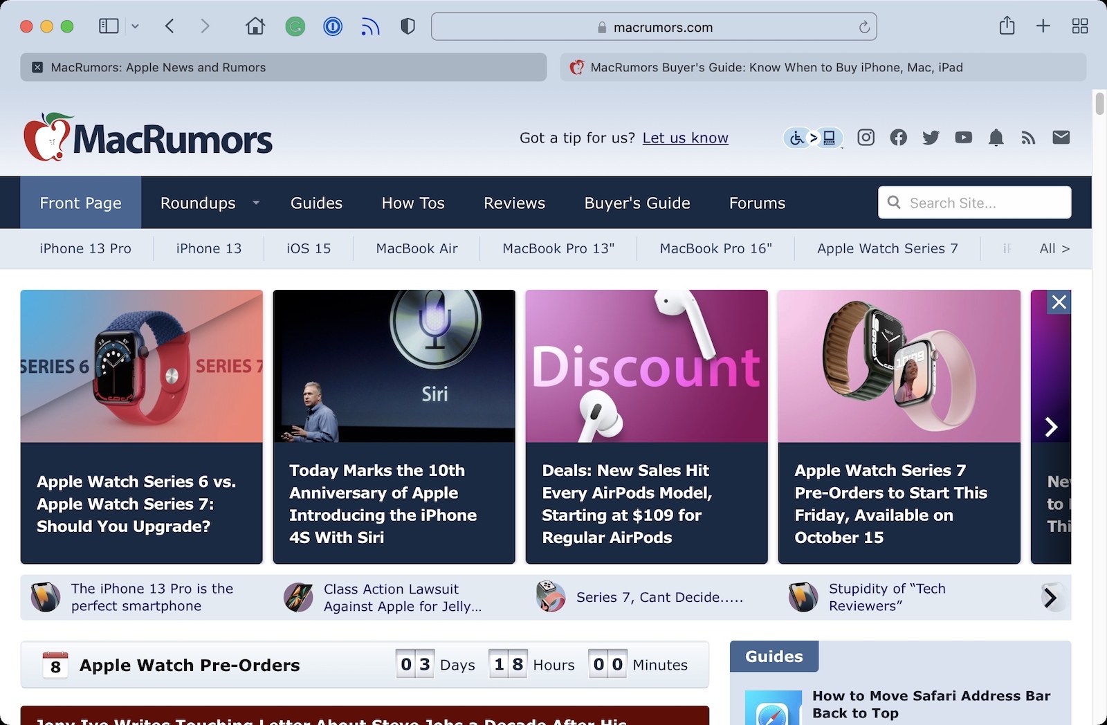
Safari 15's controversial new design on the Mac has led to complaints about the way the browser indicates which tab is active.

As illustrated by Daring Fireball's John Gruber, there was never any ambiguity about which tab is active in previous versions of Safari, as an active tab is shown with lighter shading that matches the browser's toolbar.
In Safari 15, however, tabs have a new button-like design with a rounder and more defined appearance. Apple has also inverted its shading of tabs, with an active tab now having darker shading and inactive tabs having lighter shading. The change has annoyed Gruber and other users, as evidenced by this Reddit thread with nearly 1,000 upvotes.
"The design is counterintuitive," wrote Gruber. "What sense does it make that no matter your settings, the active tab is rendered with less contrast between the tab title and the background than background tabs? The active tab should be the one that pops."
In a Safari 15 window with two tabs open, especially from the same website, Gruber said determining which tab is active is basically a guessing game. Gruber acknowledged that it is easier to discern the active tab when more than two tabs are open, but he said the confusion with exactly two tabs should have been reason enough to scrap the design change.
"I can't tell you how many times I closed the tab that I needed because of this," one Reddit user expressed in frustration.
Unfortunately for users who do not like the new design, Apple has not made any changes to the shading of tabs in either the Safari 15.1 beta or the latest version of the experimental Safari Technology Preview browser.
Article Link: Safari 15 Users Say New Tab Design is Counterintuitive
Last edited:


