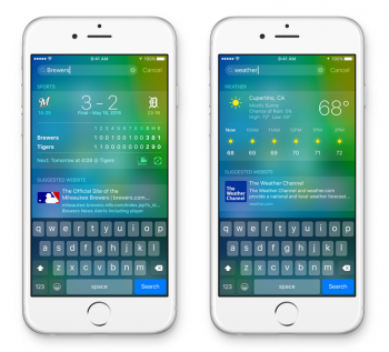
I really like the typeface, haven't seen an apple watch yet in person so its the first time actually seeing it in the beta in both iOS9 and el capitan and although it is subtle it just looks really nice. Probably my favorite feature of both the updates.
Got a tip for us?
Let us know
Become a MacRumors Supporter for $50/year with no ads, ability to filter front page stories, and private forums.
San francisco typeface
- Thread starter Will0827
- Start date
- Sort by reaction score
You are using an out of date browser. It may not display this or other websites correctly.
You should upgrade or use an alternative browser.
You should upgrade or use an alternative browser.
I like it a lot. I wasn't sure how I'd like it, but now I can't get enough of it lol
Has it been applied systemwide in iOS 9 beta 1?
It's very obvious on keyboard but elsewhere? Everything feels the same.
Yes, seems to be everywhere. I notice it the most in the Twitter app
Yes, seems to be everywhere. I notice it the most in the Twitter app
Can you post a few screenshots of that please?
Can you post a few screenshots of that please?
First one is iOS 9
Second one is iOS 8 which I found on Google
Attachments
Can you post a few screenshots of that please?
Attachments
Yep, there's a two-finger gesture which you use on the keyboard itself to move the cursor and select textSorry if this has been asked elsewhere - will text editing be improved? For example will we be able to more easily move the cursor? I find the current long hold method very hit and miss.
Thanks.
The lockscreen clock isn't in Helvetica for me, everything is in San Francisco. Are you sure you still have Helvetica?I'm loving it but I can't help to notice some inconsistencies here and there, for example here you have the scores with SF but the weather (and the calendar date and the lockscreen clock) still use Helvetica Neue.
The lockscreen clock isn't in Helvetica for me, everything is in San Francisco. Are you sure you still have Helvetica?
Mine is, although it's not easy to tell the difference. The "1" is easy to tell that it's in San Francisco.
Oh, sorry, this statement was from what I've seen, I don't have the beta.The lockscreen clock isn't in Helvetica for me, everything is in San Francisco. Are you sure you still have Helvetica?
Yep, you have to look closely.Mine is, although it's not easy to tell the difference. The "1" is easy to tell that it's in San Francisco.
Honestly, from the screenshots of people running it on OS X and iOS before the "official" versions were put out, I thought it was awful. After using it myself in El Capitan and iOS 9, I have to say that I quite like it. If you haven't tried it yet on your own devices / Macs, I would hold your judgment until you do.
Register on MacRumors! This sidebar will go away, and you'll see fewer ads.


