Become a MacRumors Supporter for $50/year with no ads, ability to filter front page stories, and private forums.

Tozovac

macrumors 68040
Original poster
Jun 12, 2014
3,222
3,455
I'm reading so many complaints about the readability/usabilty of liquid glass.

I myself am a little fearful about a repeat of iOS 7 which had so much (unnecessary IMHO) change at once with to little options to resort back to something closer to before. This will especially affect my most-non-tech-savvy and older relatives who will be ringing my phone off the hook as soon as the update to iOS 26.

With Apple’s seemingly undying concern about accessibility on the screen, it’s still a shock to me how they overlook the bigger picture Accessibility issue of mass overhauls like this on a large fraction of their user base for which these changes are more negative and disrupting than positive but anyway…

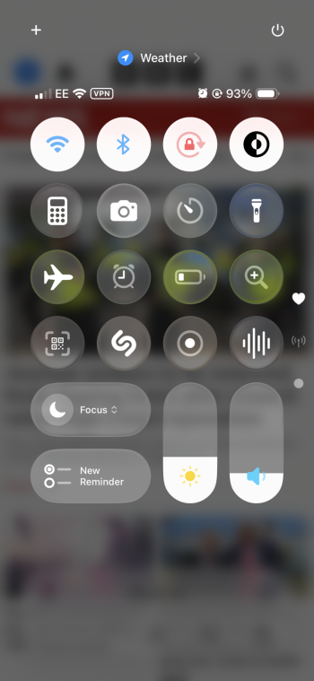
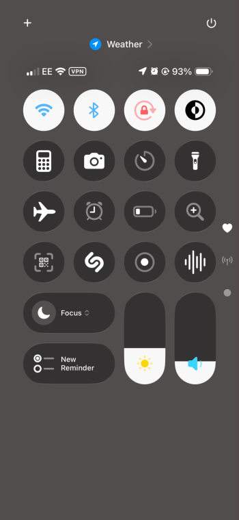
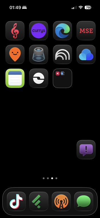
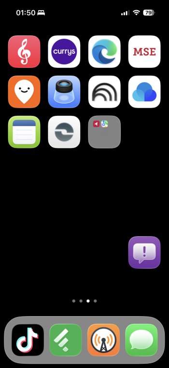
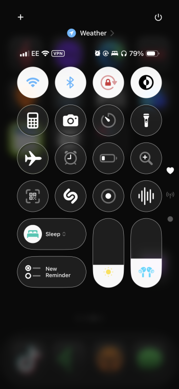
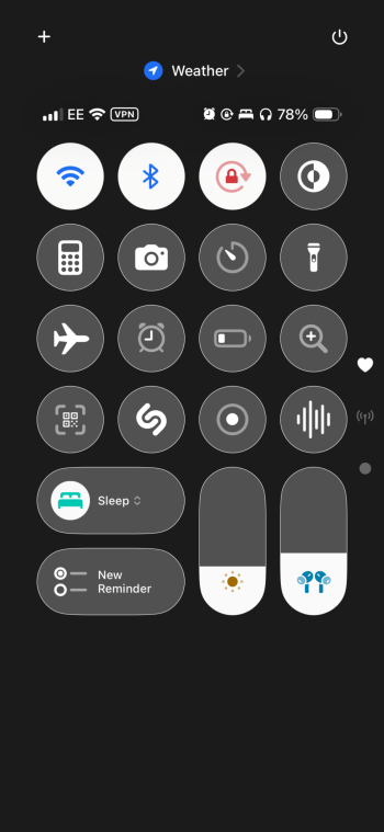
Would anyone be willing to share some screenshots of iOS 26 de-liquid-glass'd to the max?

I'm curious to see some examples, and assume others might too...Maybe things aren't as bad as some suggest in various threads here?

Such as some screenshots with the following Reasonableness Accessibility options changed:

- Reduce transparency
- Increase contrast
- Button shapes
- Bold text
- Slightly reduced white point
- Others?

Before/After's would be awesome too! :)
 
Last edited:
Are you making fun of people who need to toggle certain accessibility settings? Oh how kind, thank you for coming out of your cave to play.

That’s why I posted. I’d like to help from others (not yourself) to see if most of what everyone’s complaining about might be helped with a few settings adjustments. I myself started running with bold font, button shapes, reduce transparency, reduce white point, etc. after I found iOS 7’s “improvements” to be too many steps back in readability, legibility, usability, etc. and it helped improve the interface for me tremendously.
 
Last edited:
I took a screenshot but it came out weird and dark, maybe an issue with ios26..

Anyways, my homescreen on ios26 looks ~ identical to the way my homescreen looked on ios18.

I have it set to “default” instead of “clear” and the Liquid Glass effect is barely noticeable, I only see very slight edge effects on icons and in the control center, and it’s kind of a cool effect when I pull down from the top of the screen. Other than that the whole thing looks just like ios18.

I can’t imagine anyone having any sort of accessibility issue.
 
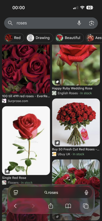
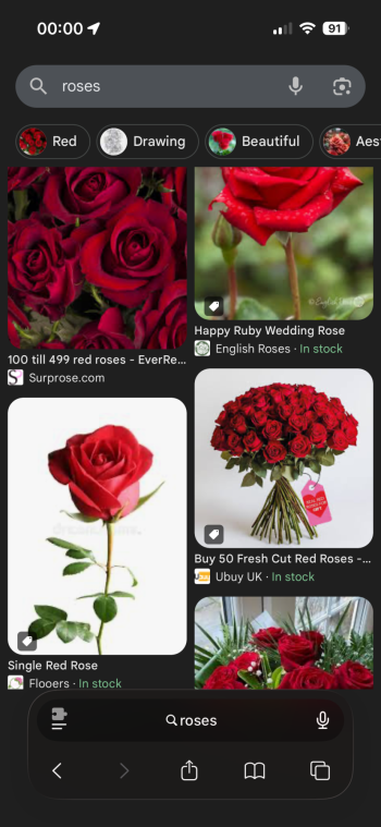
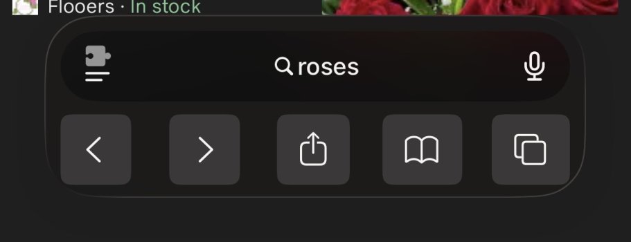
I took the plunge with the Public beta last night. I have to say that the glass effect isn't as bad as I feared. However, I've just had a play with the 'Reduce Transparancy' setting in Accessibility and got a great result. No other tweaks.

I hope these display correctly...

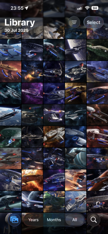
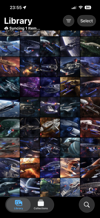
IMG_9275.pngIMG_9276.pngIMG_9279.pngIMG_9280.pngIMG_9273.pngIMG_9274.pngIMG_9277.pngIMG_9278.png
 
With it being a beta, there are obviously still bugs when using Reduce Transparancy.

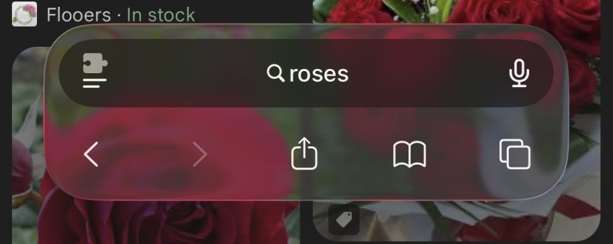
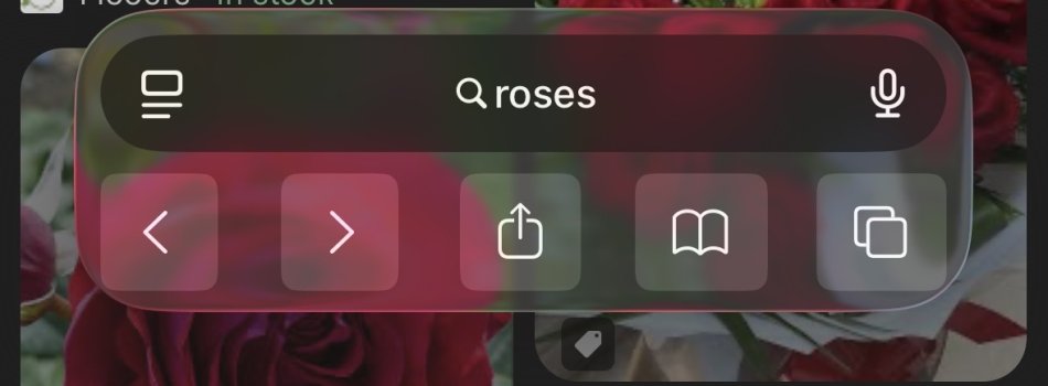
The Safari bar doesn't seem to know whether it's Light or Dark mode and switches between them quite randomly when scrolling.

Also, when selecting text, the preview button doesn't show the text beneath your finger.

Makes sense that they'll be concentrating on getting the main Liquid Glass look right before correcting any accessibility quirks further down the line.
 
I took the plunge with the Public beta last night. I have to say that the glass effect isn't as bad as I feared. However, I've just had a play with the 'Reduce Transparancy' setting in Accessibility and got a great result. No other tweaks.

I hope these display correctly...

View attachment 2539101View attachment 2539102View attachment 2539103View attachment 2539104View attachment 2539105View attachment 2539106View attachment 2539107View attachment 2539108
Reduce transparency isn’t iOS 18, but I like it a lot better, frankly. The brightness and volume shapes of the Control Center controls are hideous, but the rest looks good!
 
One last one from me, using Increase Contrast this time.

It puts a solid border around controls and folder icons, but not squircle app icons, giving what I think is an uneven effect on springboard, particularly in Dark Mode. I think it's about as non-glass as you can get at the moment though.

Some examples, mixing with Light Mode and Dark Mode:

IMG_9289.pngIMG_9290.pngIMG_9291.pngIMG_9292.pngIMG_9293.pngIMG_9294.png
 
I took the plunge with the Public beta last night. I have to say that the glass effect isn't as bad as I feared. However, I've just had a play with the 'Reduce Transparancy' setting in Accessibility and got a great result. No other tweaks.

I hope these display correctly...

View attachment 2539101View attachment 2539102View attachment 2539103View attachment 2539104View attachment 2539105View attachment 2539106View attachment 2539107View attachment 2539108
I see you are into Star Wars! Saruman is my favourite captain by far. Who’s yours? 🤓
 
  • Haha
Reactions: Lloigorr and mblm85
Wish someone has screenshots of each beta and the tweaks to Liquid Glass, which in 7 is more frosted glass.
 
Wish someone has screenshots of each beta and the tweaks to Liquid Glass, which in 7 is more frosted glass.
IMG_7365.jpeg

I happened to have this screenshot from the Music app on iOS from B6 so here’s a comparison to B7 (left to right). It only really shows the controls and toolbar at the bottom but they look unchanged. I have a screenshot from the Apple Music Home Screen on iPadOS from B6 that better shows Liquid Glass with the sidebar and controls. I’ll try and replicate for B7 as close as I can.
 
View attachment 2539274
I happened to have this screenshot from the Music app on iOS from B6 so here’s a comparison to B7 (left to right). It only really shows the controls and toolbar at the bottom but they look unchanged. I have a screenshot from the Apple Music Home Screen on iPadOS from B6 that better shows Liquid Glass with the sidebar and controls. I’ll try and replicate for B7 as close as I can.

Thanks. In this pic there is not so much change. However for me it’s noticeable when I open a folder. It’s more frosted in 7 than 6. Same for the video playback controls. More frosted.
 
Thanks. In this pic there is not so much change. However for me it’s noticeable when I open a folder. It’s more frosted in 7 than 6. Same for the video playback controls. More frosted.
IMG_7396.jpeg

Apple Music in iPadOS. Definitely looks the same here again. But I do feel like there are some parts of the OS where the LG is more frosted than B6. Mainly notification banners, they don’t seem as glassy in B7. On the lock screen, both notifications and the two action buttons seem more frosted with a light/bright background. Safari seems largely the same, possibly a bit more frosted when the LG is dealing with light/white backgrounds.
 
Thanks. In this pic there is not so much change. However for me it’s noticeable when I open a folder. It’s more frosted in 7 than 6. Same for the video playback controls. More frosted.
IMG_7403.jpeg

IMG_7405.jpeg

Here’s a comparison of the same notification. Top is at it appears when it pops down as a banner, bottom is from the lock screen shade dragging over the same home screen so the background is the same (bar the dimming from the lock screen shade). You can see the banner has more frosting whereas on B6 the banner notifications looked the same as on the lock screen. Hopefully a bug and it returns back to B6 style.
 
Thanks for this example. Could you please clarify what "frosting" is, in this case? Is it the translucence or the framing? Or...

For me at least, I prefer the "body" of the top view's notification (less distracting translucence) while I prefer seeing at least some discernible framing (white framing in the bottom view) to define the notification and separate it from the background.

It seems counterproductive to let a notification blend into the background (or let the background blend into the notification so much) under the guise of "trying to not distract the user..." But what is it they're tying to protect from being distracted away from...? The background, or the notification? Instead with all the blending/translucence, the biggest distraction is trying to clearly understand what's being presented, period.

It's like Apple's user interface group lost the plot/focus somewhere... Like when you repeat a word out loud or in hour head enough that it suddenly no longer looks like a real word and no longer makes any sense... I just googled and learned it's called Semantic Satiation. So has Apple seemingly overthought certain interface cues to the point they're not seeing what used to make logical sense.

The move to flat design and frameless windows in operating systems has been generally maddening. That's why I started a "Why is website design so awful" thread in another MacRumors forum area years ago, and after iOS 7 and the emergence of flat design. But the sentiment extends to mobile devices and laptop/computer OS's. In windows 11 on work computers for which I can't customize view settings, sometimes multiple windows on the screen overlap each other and it's very, very difficult to know where one window begins and ends...there's no hard border anymore, so overlapping windows all blend together especially the command bar up top. It's especially bad in Dark Mode when the background color matches the color of any active window. On mac's there was a time when different work areas within the Mail app, for example, had different shading and stronger borders, to clearly differentiate content from menus...folders from the message from the menus, etc. Now the current Mail app is all one shade of white and with limited framing to delineate different areas, which is even more distracting than before instead of being helpful in any way.
 
Last edited:
  • Like
Reactions: auxbuss
View attachment 2539275
Apple Music in iPadOS. Definitely looks the same here again. But I do feel like there are some parts of the OS where the LG is more frosted than B6. Mainly notification banners, they don’t seem as glassy in B7. On the lock screen, both notifications and the two action buttons seem more frosted with a light/bright background. Safari seems largely the same, possibly a bit more frosted when the LG is dealing with light/white backgrounds.

I just really don't understand the benefit of the nav panel on the left having transparency.

It does nothing but make things a little bit harder to see and read.


Screenshot 2025-08-20 at 09.34.29.png
 
Register on MacRumors! This sidebar will go away, and you'll see fewer ads.