Become a MacRumors Supporter for $50/year with no ads, ability to filter front page stories, and private forums.
I just really don't understand the benefit of the nav panel on the left having transparency.

It does nothing but make things a little bit harder to see and read.


View attachment 2539330
To be fair, this doesn't really show/tell the full picture. This only happens if you were to scroll all the categories over; but even then, I'm having a hard time making things look unreadable on my iPad.

Here's what the sidebar looks like when you open the Music app or go to a different screen...there's nothing behind it. I'm usually interacting with the sidebar right away, or scrolling the categories. I rarely do both at once.

1755705299334.png


When I scroll the categories over, I'm still able to see and read everything. Btw, this only applies to the Home, New, and Radio screens. You can't scroll anything behind the sidebar on the other screens, so they look similar to above.

1755705743268.jpeg


If you still don't like it, turn on Reduce Transparency. Remember, this setting can be applied on a per-app basis. So if you don't want it turned on everywhere, you can just turn it on for the Music app, for example.

1755707019864.jpeg


Long story short, you can't really just go by screenshots; it's better to experience it yourself before deciding if you like it or not. I've noticed that some screenshots of Liquid Glass can look busy or overwhelming, but somehow look fine in real life. I don't know how to explain that...maybe something to do with HDR not coming over in the screenshots, so they don't look as vibrant or contrasty than they actually are.
 
  • Like
Reactions: aperfectcircle
To be fair, this doesn't really show/tell the full picture. This only happens if you were to scroll all the categories over; but even then, I'm having a hard time making things look unreadable on my iPad.

Here's what the sidebar looks like when you open the Music app or go to a different screen...there's nothing behind it. I'm usually interacting with the sidebar right away, or scrolling the categories. I rarely do both at once.

View attachment 2539337

When I scroll the categories over, I'm still able to see and read everything. Btw, this only applies to the Home, New, and Radio screens. You can't scroll anything behind the sidebar on the other screens, so they look similar to above.

View attachment 2539338

If you still don't like it, turn on Reduce Transparency. Remember, this setting can be applied on a per-app basis. So if you don't want it turned on everywhere, you can just turn it on for the Music app, for example.

View attachment 2539344

Long story short, you can't really just go by screenshots; it's better to experience it yourself before deciding if you like it or not. I've noticed that some screenshots of Liquid Glass can look busy or overwhelming, but somehow look fine in real life. I don't know how to explain that...maybe something to do with HDR not coming over in the screenshots, so they don't look as vibrant or contrasty than they actually are.

I don't use HDR on macOS (color calibrated here for work), so that won't help unfortunately.
 
Just experimented with "Button Shapes". I'm not a fan.

First pic is Safari with with Reduced Transparency and Button Shapes off
Second is Reduced Transparency off but Button Shapes on
Third is both on
Fourth is mail with Button Shapes off
Fifth is mail with Button Shapes on.

View attachment 2539117

View attachment 2539118

View attachment 2539119

View attachment 2539120

View attachment 2539121
I wish one could have an option that adds the button outlines but doesn’t add button label underlines. Buttons aren’t hyperlinks, and underlined text tends to be harder to read.
 
  • Like
Reactions: maxoakland
when is your eye exam?
Y'know, people's eyes work differently. Some people are sensitive to different coloured lights. Some have eyes that over-contrast, some under. Some people are colour-blind. And yes, some have trouble with transparency.

Just because it doesn't affect you, doesn't mean it doesn't affect others. Have some empathy why don't ya?

And oh yeah… One day, if you live long enough, your body will start failing in ways you can't control. You might think you're immortal, but life is laughing its lungs out at you behind your back.

A great goal in life is not to be a dick. You might want to think about that.
 
Just experimented with "Button Shapes". I'm not a fan.

Even if their implementation looks wonky at times I'm still a fan. The "text-as-actionable" interface element introduced with iOS 7 has never worked robustly or reliably IMHO, and introduced more caveats and design limitations than user freedoms.

12 years later and I'm shocked how half-a55ed Apple's implementation of button shapes is.
  • Text as actionable makes no sense because it limits your ability to easily differentiate...um...info text from actionable. Too often I'd find myself double-thinking and/or questioning if text on the screen was information or actionable and I got irritated.
  • Or needing to tap 2 or 3 times to enact something due to a tiny tap area.
  • Underlined font makes no sense because it limits your ability to robustly use underlining elsewhere for info-only text.
It's as if the leader charged with implementing button shapes hated even the slightest resemblance of a skeuomorphic element, so a button couldn't possibly look non-flat and "pressable" on the screen... I imagine them saying "you...want...button shapes...HERE's your stinkin' button shapes." And then spending 10 minutes coding what we still get to this day.

But nevermind Apple trying to make something look liquid-glassy-like on the screen...nothing to see here...please move along lol.
 
Last edited:
I'm reading so many complaints about the readability/usabilty of liquid glass.

I myself am a little fearful about a repeat of iOS 7 which had so much (unnecessary IMHO) change at once with to little options to resort back to something closer to before. This will especially affect my most-non-tech-savvy and older relatives who will be ringing my phone off the hook as soon as the update to iOS 26.

With Apple’s seemingly undying concern about accessibility on the screen, it’s still a shock to me how they overlook the bigger picture Accessibility issue of mass overhauls like this on a large fraction of their user base for which these changes are more negative and disrupting than positive but anyway…

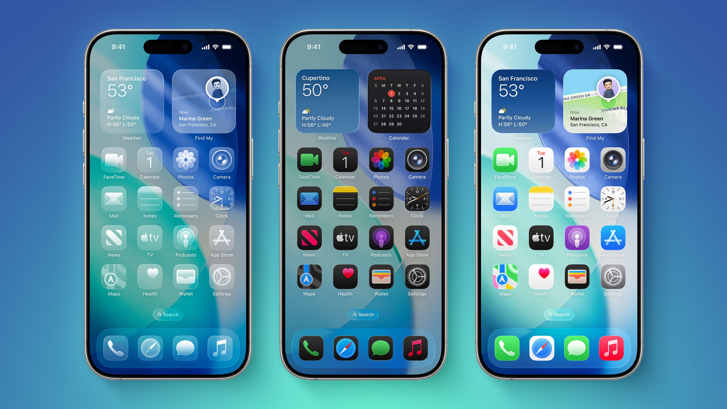
Would anyone be willing to share some screenshots of iOS 26 de-liquid-glass'd to the max?

I'm curious to see some examples, and assume others might too...Maybe things aren't as bad as some suggest in various threads here?

Such as some screenshots with the following Reasonableness Accessibility options changed:

- Reduce transparency
- Increase contrast
- Button shapes
- Bold text
- Slightly reduced white point
- Others?

Before/After's would be awesome too! :)
I have been using iOS26 for a few weeks now, and there is no need to freak out about the changes. It is not that big of a deal!!
 
  • Sad
Reactions: August West
I have been using iOS26 for a few weeks now, and there is no need to freak out about the changes. It is not that big of a deal!!
Great! For you it's no big deal.

For many of us (me included), one major issue I was concerned about with iOS 26 was the re-emphasis on translucence and blurring of text along the edges of the screen. My eyes uncontrollably want to put into focus anything that's slightly blurry at the edges, or under any translucence effect. I can't turn that off and as a result it's a very unnecessary distraction. So depending upon the severity of the effect, I've turned of transparency as needed on my phone or other devices. This might be similar to others getting truly seasick from parallax effect.

I'm tired of thinking this: There's a reason the paper on our desk and in our books and in printers isn't translucent. Or shiny and reflective. And we don't need to see thru it to know there's something useful behind it even if we're not reminded of it at all times. And there's a reason for the ongoing pushback away from touchscreens in cars in favor of tactile buttons. Not just because of their tactile nature that's easier to reach without looking, but because they're a standard time-tested interface element that's visually separated from it nearby surroundings, and often has a larger "tap area" compared to pressing text on a screen in a moving car.

Just because you can make magic and show "anything" on a glass screen doesn't mean things like button shape cues and a clear, simple, focused interface are no longer valuable...and doesn't mean we need over the top stellar effects added to basic controls just because it can be done...
 
Last edited:
Great! For you it's no big deal.

For many of us (me included), one major issue I was concerned about with iOS 26 was the re-emphasis on translucence and blurring of text along the edges of the screen. My eyes uncontrollably want to put into focus anything that's slightly blurry at the edges, or under any translucence effect. I can't turn that off and as a result it's a very unnecessary distraction. So depending upon the severity of the effect, I've turned of transparency as needed on my phone or other devices. This might be similar to others getting truly seasick from parallax effect.

I'm tired of thinking this: There's a reason the paper on our desk and in our books and in printers isn't translucent. Or shiny and reflective. And we don't need to see thru it to know there's something useful behind it even if we're not reminded of it at all times. And there's a reason for the ongoing pushback away from touchscreens in cars in favor of tactile buttons. Not just because of their tactile nature that's easier to reach without looking, but because they're a standard time-tested interface element that's visually separated from it nearby surroundings, and often has a larger "tap area" compared to pressing text on a screen in a moving car.

Just because you can make magic and show "anything" on a glass screen doesn't mean things like button shape cues and a clear, simple, focused interface are no longer valuable...and doesn't mean we need over the top stellar effects added to basic controls just because it can be done...
Most of the content you read/watch is on the same non-translucent backgrounds.
 
It seems counterproductive to let a notification blend into the background (or let the background blend into the notification so much) under the guise of "trying to not distract the user..." But what is it they're tying to protect from being distracted away from...? The background, or the notification? Instead with all the blending/translucence, the biggest distraction is trying to clearly understand what's being presented, period.

It's like Apple's user interface group lost the plot/focus somewhere... Like when you repeat a word out loud or in hour head enough that it suddenly no longer looks like a real word and no longer makes any sense... I just googled and learned it's called Semantic Satiation. So has Apple seemingly overthought certain interface cues to the point they're not seeing what used to make logical sense.
Exactly! The whole point of the notification is to communicate information. They're *adding* distraction away from that information by making it harder to read, bringing in extraneous elements from the background

The UI team completely lost the plot. They have no clue what the basic purpose of a UI is: to communicate and interact with information. They are talking about removing distractions from... what? That's the thing that's most baffling to me. Making a notification harder to read so it gets out of the way of your content? What content? The notification is content. Notifications exist because users want information from applications that aren't frontmost. If the user doesn't want to see those notifications, Apple should make it easy for them to turn them off.

And ironically, they have that option pretty buried because of the goal to show as little options and information as possible

Almost every change they've made over the past few years seems to be designed to make the UI harder to interact with. Hiding buttons until you move your mouse near them. Removing visual cues like scrollbars that communicate useful information

There are a few UI things I have liked from Apple recently, like the control center in MacOS and the Dynamic Island and those few things are the ones that go against the ridiculous trend Apple's been following lately

They need a new UI team. One that's actually competent at the basics of UI design. One that understands the value of communication, not just cool effects
 
  • Like
Reactions: klasma and Tozovac
Register on MacRumors! This sidebar will go away, and you'll see fewer ads.