Become a MacRumors Supporter for $50/year with no ads, ability to filter front page stories, and private forums.
Can someone on here do me a favour? Can someone have all the normal stockapps on the first page but a bit different on the dock down there?

I would want to see a screenshot with the apps in the dock at the bottom like this:

Clock Safari Facetime Mail then nothing more then that

:D?
 
I'm kind of disappointed about the UI. I'm nitpicky and the things I don't like is the new dialer pad, it looks cheap now. I also don't like the different color status bars. The app store is really ugly now. I liked the way it was, with a lighter theme, which looked much cleaner. This one is way too contrasty with the status and toolbar at the bottom being black. I hope they revert back to the original UI for the app store, itunes store, etc. The silver music player UI is okay, not bad, but if they do it there, then they should keep it consistent with other list views such as the message app, contact app, etc.

Please Apple, consistency is the key to having a good UI. What happened, did you hire a bunch of entry level UI designers?
 
You can tell Jobs doesn't have his hands in it anymore. He'd NEVER allow all these crazy random colors and silvers, etc.
 
You can tell Jobs doesn't have his hands in it anymore. He'd NEVER allow all these crazy random colors and silvers, etc.

The iPad music player has the silver color scheme for a while now. And there's a 99.999999% chance Steve Jobs oversaw the creation of iOS 6 as well. These things don't come together overnight.
 
The iPad music player has the silver color scheme for a while now. And there's a 99.999999% chance Steve Jobs oversaw the creation of iOS 6 as well. These things don't come together overnight.

I realize that but blue status bars, random orange in the music player. Buttons, UI stuff that doesn't "flow"? No friggin way
 
uhhh.. yes.

I haven't yet seen any Android home screen that's so differ than the next. Usually only differ is .... just differ widgets, placement of the same looking icons, and wallpaper. I'm yet to be wowed.

ae36758a-c9fa-ebae.jpg


Last time I checked, Android 2.x.x doesn't look like this:rolleyes:

Here is a GB screenshot. Compare the two. Top is from my Galaxy note and bottom is my Droid X.
ae36758a-cb20-7c85.jpg
 
Last edited:
No, there's either a text description of On/Off with an arrow leading to a configuration screen which includes a toggle (e.g. Bluetooth), or just a toggle alone (e.g. Airplane Mode). Never toggle AND arrow.
 
Image

Last time I checked, Android 2.x.x doesn't look like this:rolleyes:

Here is a GB screenshot. Compare the two. Top is from my Galaxy note and bottom is my Droid X. Image

But how much of this is cosmetic? I'm not trying to say you're wrong, I love the way the note screen looks, but i'm just curious. It looks like the functionality is similar between the two.
 
No, there's either a text description of On/Off with an arrow leading to a configuration screen which includes a toggle (e.g. Bluetooth), or just a toggle alone (e.g. Airplane Mode). Never toggle AND arrow.

Oh both at same time. It won't fit both tho. Not without it looking ugly as hell
 
But how much of this is cosmetic? I'm not trying to say you're wrong, I love the way the note screen looks, but i'm just curious. It looks like the functionality is similar between the two.

The note screen is running vanilla. The UI is much different. Going from stock gingerbread to pics will be like night and day. The dock us different, folders have been officially added, new status bar and notification drawer, pretty much everything has been improved. I'm not saying it was a huge change, I'm saying it is more of change than iOS has made.
 
uhhh.. yes.

I haven't yet seen any Android home screen that's so differ than the next. Usually only differ is .... just differ widgets, placement of the same looking icons, and wallpaper. I'm yet to be wowed.

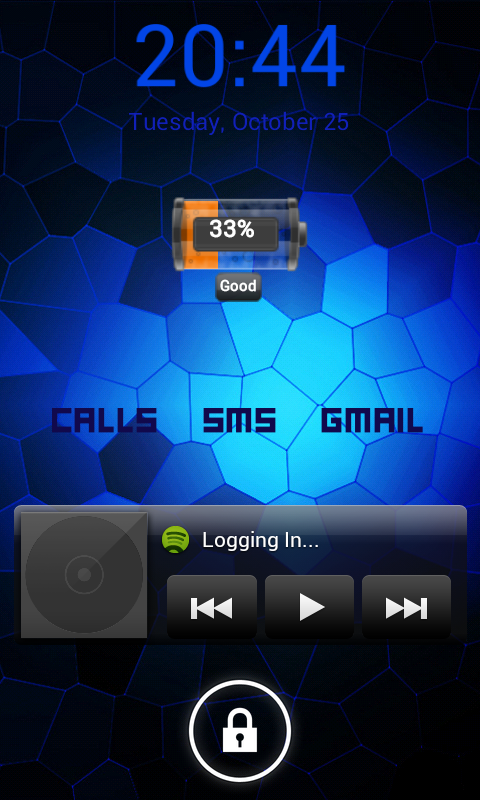
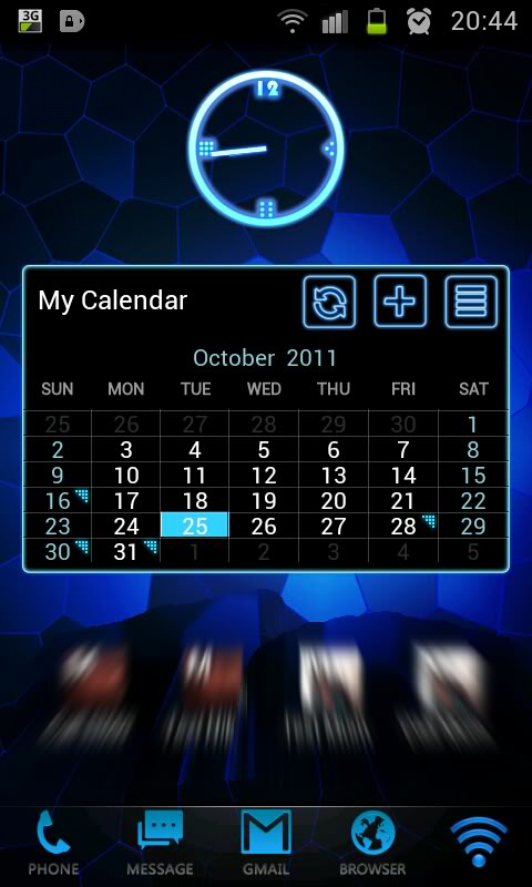
Not my current setup, but:

SC20111025-204424.png


2011-10-25205458.jpg


The "Calls SMS Gmail" widgets light up when there's a new call/sms/email.

The Spotify widget is to allow quick changing of tracks from the lockscreen.

The calendar widget changes to an agenda view when you press the top right button, and the "+" button can be used to quickly add an event.

The four contact widgets below the calendar on my homescreen can be used to quickly call and text my favourite contacts.

The launcher I was using at the time supported gestures, so I could swipe up anywhere on the screen to open the application drawer, and swipe down anywhere on the screen to open the notification drawer.

The application drawer is a massive plus for Android for me. I don't want all of the shortcuts to my apps cluttering up my home screens, that's like a prehistoric way of doing things.
 
The application drawer is a massive plus for Android for me. I don't want all of the shortcuts to my apps cluttering up my home screens, that's like a prehistoric way of doing things.

Yes, because a phone that is mobile, sends and receives emails, goes on the internet, and utilizes a touch screen is clearly prehistoric. I hope Samsung is paying you for all the lovemaking you are having with your phone.

I wish I had a picture of Jesus riding a Dinosaur while on his iPhone.
 
Yes, because a phone that is mobile, sends and receives emails, goes on the internet, and utilizes a touch screen is clearly prehistoric. I hope Samsung is paying you for all the lovemaking you are having with your phone.

A phone that has no decent place to store all of the apps I've installed and so dumps them on the home screen.. that's dated tech. What's the point in filling all the home screens with icons when you can just press a button and have another window pop up?

Widgets > grid of icons any day of the week.
 
Yes, because a phone that is mobile, sends and receives emails, goes on the internet, and utilizes a touch screen is clearly prehistoric. I hope Samsung is paying you for all the lovemaking you are having with your phone.

I wish I had a picture of Jesus riding a Dinosaur while on his iPhone.

palmvx.jpg


After a while, yes, icons do get prehistoric on a touch screen. Why click on an icon to get the data you want when it could be displayed on the home screen.
 
Register on MacRumors! This sidebar will go away, and you'll see fewer ads.