Become a MacRumors Supporter for $50/year with no ads, ability to filter front page stories, and private forums.

MacRumors

macrumors bot
Original poster
Apr 12, 2001
67,598
37,980


Skype today updated its iPhone and iPad apps to version 4.13, introducing a slight redesign that better fits the aesthetic of iOS 7. Though the Skype apps already used a "flat" iOS 7-style design, additional white space has been introduced for an overall cleaner look.

The app also includes improvements to accessibility with better Voice Over integration and enhancements to both audio and video calling.

skypeios7.jpg
Today we're pleased to release Skype for iPhone and Skype for iPad, version 4.13. In this release we've focused on bringing a refreshed look for iOS 7. In addition we've made improvements to accessibility, audio and video calling.
What New in Skype for iPhone and iPad 4.13:

Refreshed look and feel for iOS 7
Accessibility improvements, including:
-Improved accessibility of dialpad with touchtype support
-VoiceOver announces the senders name when messaging
-VoiceOver improvements for group chats
General fixes
Skype is a free app that can be downloaded for the iPhone and the iPad. [Direct Links: iPhone/iPad]

Article Link: Skype for iPhone and iPad Updated With iOS 7 Redesign
 
Great to see that other developers ensure that their apps are consistent with the iOS look.
I'm looking forward to the day that the pre-iOS7 icons don't stand out like a sore thumb.
 
And still no way to mute chat notification sounds separately from phone calls.
 
Good lord the iPhone redesign is aweful

What was apple thinking by making white backgrounds and blue text a good thing?

These high contrasting themes are horrible. I hear nothing but complaints from my friends

Good lord apple fix it
 
Good lord the iPhone redesign is aweful

What was apple thinking by making white backgrounds and blue text a good thing?

These high contrasting themes are horrible. I hear nothing but complaints from my friends

Good lord apple fix it

You forgot to add "In my humble opinion".

In a year, iOS7 will be embraced, and people will look back on iOS6 styling as quaintly old-fashioned.
 
I'm looking forward to the day that the pre-iOS7 icons don't stand out like a sore thumb.

By contrast, iOS 7 icons look just fine on iOS 6. ;0)

Is the text size of the chat bubbles affected by the option in system preferences? It looks very small to me on the screenshots as opposed to other elements.
 
Appearance wise, they may have made the blue a bit more neon, but other than that, there's really nothing iOS 7 about it. All the people thumbs are square, not circles... Booo!!!

Can't they get a designer on the team to tell them what design is? :rolleyes:
 
I refuse to use this as long as it has it ads.
At the very least, add an IAP to remove it.
 
I just think it's funny that they spelled the kid's name wrong in both pictures. First it's takahshi and then it's takhashi...when really, it should be takahashi. oh skype.
 
Good lord the iPhone redesign is aweful

What was apple thinking by making white backgrounds and blue text a good thing?

These high contrasting themes are horrible. I hear nothing but complaints from my friends

Good lord apple fix it

Your opinion about iOS7 has nothing to do with the thread.
 
Buy Skype credit and you wont have ads.

I solely use Skype to connect with people who are still on "MSN" so I won't get any use of my Skype Credit.
I'd prefer a cheaper purchase that just disabled ads and had no other functionality.
Thanks for the tip anyway.
 
Volcomfever you are right....but its worse

I just think it's funny that they spelled the kid's name wrong in both pictures. First it's takahshi and then it's takhashi...when really, it should be takahashi. oh skype.

It is spelt differently in all 3 panels.
The time is 9:49 for all panels
The original panal has a 'Nina' as the phone user but the final panel has a Japanese male in the insert (owner/caller photo)
 
Good lord the iPhone redesign is aweful

What was apple thinking by making white backgrounds and blue text a good thing?

These high contrasting themes are horrible. I hear nothing but complaints from my friends

Good lord apple fix it

Interesting. You probably don't know what a contrast is.
 
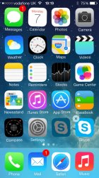
Anyone else got 2 skype icons since today's update? The first (slightly faded icon) won't even delete. It's like a standard iOS app you can't remove.
 

Attachments

  • image.jpg
    image.jpg
    230.7 KB · Views: 134
It is spelt differently in all 3 panels.
The time is 9:49 for all panels
The original panal has a 'Nina' as the phone user but the final panel has a Japanese male in the insert (owner/caller photo)

Wow even worse ha. Not sure how a company has a whole team (probably) dedicated to editing these marketing images and this falls through. Then again, maybe they don't have anyone doing anything.
 
Come on people, it doesn't matter how it looks, let's just appreciate that Microsoft at least tried to do something. Sure, they always get it wrong, but at least they try. Microsoft buying Skype was probably the most logical move ever. Two crap companies unite to make… The ultimate crap!


If iMessage and FaceTime worked with Windows, I would not need Skype. Until then, what the hell is the point of only being able to contact Apple users? As much as I like Apple, I don't really care what brand my friends are loyal to, I just want to communicate with them.
 
You forgot to add "In my humble opinion".

In a year, iOS7 will be embraced, and people will look back on iOS6 styling as quaintly old-fashioned.

Sounds like Stockholm Syndrome to me.
 
Sounds like Stockholm Syndrome to me.

Does it?

Funny, that, when it's so popular amongst adopters that you can't get one in a shop for love nor money.

Neophobia is the operative word here. It's perfectly understandable that certain people – some more than others – get stuck into particular ways of doing things, and it takes a little while for their brains to adapt.

Don't take my word for it. Bookmark this page and come back here in a year's time. iOS6 will largely be something of the past that most people don't care about any more.

The fact is that it is poorly designed. The UI is less intuitive, the contrast is bad, nothing goes together except the terrible bright-colour scheme. iOS 6 may be old, but at least it had some consistency.

The average consumer won't have any graphic design knowledge, so chances are lower that they'd complain. I am all for having 'new', I just think this is the wrong 'new' direction to be taking.

Those aren't facts.

The UI change was pretty much just changing icons. There were a few other changes, yes, but they're not exactly things that are experience-changing. If you want to, you can use iOS 7 just like you used iOS 6.
 
The thing I really miss is the inability to send chat messages while on a video call.

As for the design (and iOS7's design in general); yes, it's a regression in a lot of ways. However, the pre-iOS 7 design had a lot of time to mature before it got to the state you all remember it as.

The new design will be improved over time; both by Apple and by 3rd-party developers. Give it some time.
 
Register on MacRumors! This sidebar will go away, and you'll see fewer ads.