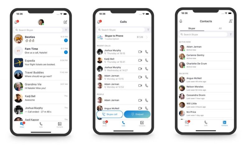
Microsoft is to simplify the user experience of its Skype mobile and desktop apps, with the aim of returning the platform's focus to core services like calling and messaging.
In announcing the decision in a blog post, Microsoft acknowledged that the Snapchat-style redesign it introduced last year "didn't resonate with a majority of users" and had "overcomplicated" the platform, and said it hoped the new changes would make the service faster to learn and easier to use.

As a result, the Highlights and Capture features are being removed from the mobile app, leaving options for Chats, Calls, and Contacts at the bottom of the interface. Microsoft says users can download any Highlights they have posted in Skype until September 30, 2018.
Meanwhile over on desktop, buttons for Chats, Calls, Contacts, and Notifications are being moved to the top left of the application window, which should make more sense for veteran Skype users. In addition, contacts are being "updated for simplicity" to make them easier to discover.

Visually, Microsoft says it has "toned down" the range of the gradients available in the light and dark themes, and it's also reintroducing the simplified Skype "Classic" blue theme, with subtle adjustments for contrast and readability.
Lastly, some decorative elements have been removed from the Skype interface to provide users with "a more elegant experience" that brings the focus back to content.
"This is only the beginning and you can expect many more updates over the next several months as we continue to simplify and improve the core experiences around calling, chat, and contacts," said Skype design director Peter Skillman. "While we have plenty of work left to do, we hope you find these changes simplify your experience and bring you closer to those who matter."
Article Link: Skype Redesign Ditches Snapchat-Like Highlights Feature to Focus on 'Simplicity'

