Become a MacRumors Supporter for $50/year with no ads, ability to filter front page stories, and private forums.
Has anyone tried Magnifique?
I'm using it and applied a theme called Aqua Inspirat 2.0, and it's absolutely beautiful.
I tried the iLeopard theme, where everything looks like iTunes, but it just looked too plain to me.
Aqua Inspirat 2.0 is perfect. Here's a screenshot of Safari:
Picture 4.png

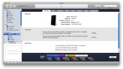
And one of iTunes (which is beautiful, by the way).
Picture 3.png
 
Couldn't agree with you more. Aqua Inspirat really is beautiful. I actually can't get over the itunes theme. it's really nice.
 
Has anyone tried Magnifique?
I'm using it and applied a theme called Aqua Inspirat 2.0, and it's absolutely beautiful.
I tried the iLeopard theme, where everything looks like iTunes, but it just looked too plain to me.
Aqua Inspirat 2.0 is perfect. Here's a screenshot of Safari:
View attachment 159338

And one of iTunes (which is beautiful, by the way).
View attachment 159340

This is on Leopard right?

Just so I know when I get my macbook (first mac!) how do I go about putting a theme on leopard (though it might be for naught as SL could be out by the time I get my macbook).
 
This has been posted before probably, but a "Classic" theme could actually be pretty sweet, if only for short lived novelty.

6188


My "wishes" for Snow Leopard is for Apple to just friggin use a consistent scroll bar! iTunes now has several of its own. The new iPhoto has a white one that looks identical to the graphite iTunes one in it's inactive state (arg! this really bugs me, it's like the iPhoto scroll bar is always inactive).

Really they should just update some of the things that haven't or have barely changed since 10.0, like the Aqua scroll bars and progress bars and such. I have a theme applied that changes those things to match the graphite/flat iTunes look, and it's a lot nicer.
 
I agree with most of your points, except...

Ain't happening, and I don't want it to happen, either. I hate how Windows quits apps every time I close the window. In OS X, I can keep the app running even with all the windows closed, so that the next time I open it, it's instantaneous. Having 4 buttons on the window, one closing the window, and the other quitting the window, is more confusing, and a bad idea even - what if you have 5 Safari windows, and you want to close one, but click the quit button by mistake.

Again, ain't gonna happen, and I don't want this to happen. It'll turn OS X into just another Windows-inspired UI. It's not bad, it's just different. Your wife will just have to get used to it.

All in all, you can't expect OS X to be Windows. If your wife wants OS X to be Windows, then she should use Windows, simple as that.

I hear you and respect your view, I am sure a lot of Mac users agree. I want to be clear though, I don't want to debate Mac vs. Windows, I just want to discuss how to make OS X better. That should have to take place with blinders on to other ways to do things. If Apple and Microsoft never used anything that was in the other OS, they would both have pretty crummy operating systems. They have both borrowed ideas from the other over the years.

I contend that not having a "Quit" button makes the OS harder to use. It is not just Windows, but Linux has a quit button for apps as well. The point is to have the least amount of effort required to achieve a desired result. Users frequently use a mouse and often that is the decision time to quit an application, say after saving or printing a file. Let's leave keyboard shortcuts out of the discussion, that is equal between Windows, Linux, and Mac. OS X's inability to close an application entirely with one action is a shortcoming. With the Apple way a user must 1) click the app menu, 2) navigate to the Quit option and 3) click the option to quit. That is THREE steps, whereas a quit button would be one. How is that better design? More work for you equals more fun? I understand you like to leave an application open so it is ready, but for most cases, that is unnecessarily consuming RAM. I don't think it would be confusing to have a 4th button in the upper right of the window, they already have 3, and the green "maximize" button seems pretty useless to me. All it does is maximize the height of an app and raise it a hair above the dock.

What apps in Windows close unexpectedly? Microsoft Office opens all documents in it's own app window. As long as a document is open, the app stays open. When you close the last document, the app is completely gone. Internet Explorer and Firefox (on Win or Linux) are the same as Safari in OS X except that when the last document/page is closed in IE or Firefox, the app closes and stops consuming. The tabs behavior is the same on all platforms.

As far as the menu bar being tied to the top of the screen, that was fine when I had a 13" monitor, but now with a 23" monitor a user can be forced to traverse quite a bit of screen real estate to reach the menu. This also is just plain more work for the user. I won't even mention the fact (because it is not the norm) of how ridiculous it is when you have two large monitors.

I think you misunderstand my point of view, I don't want OS X to be like Windows, I just want to see improvement. That means changing over time, which it has and I think these are the next things they should do with the UI. OS X has clearly evolved a lot since its inception and that will continue. I think some of the items have been around a long time in the Macintosh and the way computers get used warrant the changes. I can remember arguments between folks about the superiority and simplicity of the one button mouse as opposed to the confusing 2 (or more) buttons for Windows. That changed when Apple saw for years that a lot (or most?) users tossed their one button mouse for a 2 clicker. They did it elegantly with the Mighty Mouse which I think is very clever and nicely done. I think they can come up with some good ideas to fix these areas to if they want. I just hope they do.

As far as my wife, she only sees a computer as a tool and couldn't care less either way. On XP she only uses 3 apps; Thunderbird, Firefox, and MS Word 2007. I actually set her up with Firefox and Thunderbird and Open Office on Linux for a week and she (mostly) liked it. In Linux the first two are exactly the same as they are on Windows and she didn't mind at all. She had a little trouble with the Open Office writer app and just wanted Office 2007 back, so I had to revert. I just have a strong sense that she will be annoyed with the OS X Finder with the UNIX style file structure and will miss Word 2007 which she likes. I don't think she will adjust well at all using MS Office 2008 for Mac or with iWork and Pages. It will be an interesting test, my guess is she do fine with Safari and Mail, but will want her old word processor back. If that happens, I will just reboot to OS X when I use it.

I think I wrote too much. :) Thanks for reading.
 
...I don't think it would be confusing to have a 4th button in the upper right of the window, they already have 3, and the green "maximize" button seems pretty useless to me. All it does is maximize the height of an app and raise it a hair above the dock.

Yes, the "maximize" button is useless. Nobody uses it. :p:D

Whoa, that classic theme looks cool.
 
I don't think it would be confusing to have a 4th button in the upper right of the window, they already have 3, and the green "maximize" button seems pretty useless to me. All it does is maximize the height of an app and raise it a hair above the dock.

sigh......

Doesnt that button set the window to the size the app requires?

What use is maximizing, say, a browser if your just going to have a bunch of empty space on the sides.
 
I hear you and respect your view, I am sure a lot of Mac users agree. I contend that not having a "Quit" button makes the OS harder to use. It is not just Windows, but Linux has a quit button for apps as well. The point is to have the least amount of effort required to achieve a desired result. Users frequently use a mouse and often that is the decision time to quit an application, say after saving or printing a file. Let's leave keyboard shortcuts out of the discussion, that is equal between Windows, Linux, and Mac. OS X's inability to close an application entirely with one action is a shortcoming. With the Apple way a user must 1) click the app menu, 2) navigate to the Quit option and 3) click the option to quit. That is THREE steps, whereas a quit button would be one. How is that better design? More work for you equals more fun? I understand you like to leave an application open so it is ready, but for most cases, that is unnecessarily consuming RAM.
OS X was built from the ground up as a multitasking OS. Also, RAM certainly isn't a problem these days as it's cheap and comes in large sizes. Also, I seriously don't understand why people can't use Cmd+Q. The keyboard is easily used often as the mouse and for business use, most of the time, a lot more.
 
My contribution

Well, doesn't look as if anyone has posted anymore mockups, but I thought I should post mine.


I don't really like it myself, it doesn't look attractive to me, but I thought I should still post it anyway


The bars are transparent so the wallpaper effects the colour, but im not happy with it :)
I used different elements from apps like iPhoto etc.. and mixed and matched. I tried to redesign the finder but looks a bit too windows like.
 
I think after the release of Safari 4 today, its something we can expect to see system-wide.

A unified look, a la 'Uno', but with all traces of Aqua 'jelly' gone - matte blue, purple, gray or other, in its place.

The 'silver' of the Safari browser window now fade to [almost] white on top - and I think this is something which will be implemented into all windows. A gradient look.

Safari 4 looks identical to the rest of Leopard, except of course the apps which don't use the standard interface. I agree we'll see it just like that universally (and maybe Safari 4-ish tabs in the Finder?), but no major changes from what we're seeing in Leopard now. Perhaps the end of the jelly blue scroll bars, but Safari 4 still has them (probably because I'm running it on Leopard, thus it just uses the system resources).

jW
 
that darker theme is killer i love it

but really i just want it to look pretty much exactly like vista, i hope it will work as good as vista too;)
 
How does changing the look make it faster?:confused:

Or are we talking about the little actions and animations (like the ridiculous aero memory hog?)


Lots of ways, for starters, loading smaller images. For example, XP is has a way lighter interface (images of the bar are smaller, more lightweight-eeer lol) and besides the GPU in XP is almost left untouched, while in Vista the GPU and CPU has to be used for the shadow, transparency and blur effects. So the PC slows down. Thats how the GUI can DRAMATICALLY affect the OS and the PC user general experience, while you do get the eye candy, you also get the performance slowdown
 
Safari 4 looks identical to the rest of Leopard, except of course the apps which don't use the standard interface.

jW

Really? Is it just me, or does the Safari window have a more intense gradient? (whiter at the top)
 

Attachments

  • Picture 1.png
    Picture 1.png
    28.8 KB · Views: 116
  • Picture 2.png
    Picture 2.png
    11.8 KB · Views: 540
  • Picture 3.png
    Picture 3.png
    16.4 KB · Views: 526
OS X was built from the ground up as a multitasking OS. Also, RAM certainly isn't a problem these days as it's cheap and comes in large sizes. Also, I seriously don't understand why people can't use Cmd+Q. The keyboard is easily used often as the mouse and for business use, most of the time, a lot more.
I'm don't see how multitasking has anything to do with the issue. Leaving out a quit button doesn't make any application easier to use. I am pretty keyboard bound and that is what I have trained myself to do. Despite that I still frequently find myself needing to quit and app with the mouse (usually after saving a document or using the web browser). Forcing users back to the keyboard doesn't solve the extra work with the mouse device. People are conditioned to Open and Quit applications and perform man other functions with the mouse. Making it harder to use it is a shortcoming.
 
There is an article on Ars Technica which outlines the different way the user interface has been designed in OS X and Windows. It makes an interesting read and makes some of the ways that OS X works make more sense such as the close button.

Paradigms lost: The Windows 7 Taskbar versus the OS X Dock
Thanks, I read it. Very good article. I have read similar articles before on the UI stuff there. I am using Windows 7 on a machine at work and clearly they are moving to come up with a Dock-like feature, though the article explains the differences. Unfortunately for Windows 7 the new task bar doesn't do a very good job --though it is improved. The main problem is that the Taskbar icons move and slide along the bar as you open apps. That changes their position and it is pretty annoying. The Mac Dock is better and way prettier, although I wish Apple would tweak it a little.

I agree with Apple's approach with windows as documents, but it doesn't explain the lack of a quit button somewhere. The article also mentions my other point about the menu being fixed to the top in OS X and how the Windows approach is better for dual and large monitors.
 
I hear you and respect your view, I am sure a lot of Mac users agree. I want to be clear though, I don't want to debate Mac vs. Windows, I just want to discuss how to make OS X better. That should have to take place with blinders on to other ways to do things. If Apple and Microsoft never used anything that was in the other OS, they would both have pretty crummy operating systems. They have both borrowed ideas from the other over the years.

I contend that not having a "Quit" button makes the OS harder to use. It is not just Windows, but Linux has a quit button for apps as well. The point is to have the least amount of effort required to achieve a desired result. Users frequently use a mouse and often that is the decision time to quit an application, say after saving or printing a file. Let's leave keyboard shortcuts out of the discussion, that is equal between Windows, Linux, and Mac. OS X's inability to close an application entirely with one action is a shortcoming. With the Apple way a user must 1) click the app menu, 2) navigate to the Quit option and 3) click the option to quit. That is THREE steps, whereas a quit button would be one. How is that better design? More work for you equals more fun? I understand you like to leave an application open so it is ready, but for most cases, that is unnecessarily consuming RAM. I don't think it would be confusing to have a 4th button in the upper right of the window, they already have 3, and the green "maximize" button seems pretty useless to me. All it does is maximize the height of an app and raise it a hair above the dock.
The first thing you need to realize is that what is better for you, is not necessarily better for everyone else.

I have used a butt load of operating systems over the course of my 29 years in the industry. I have used every major and most minor PC operating system in that time. The first GUI I used was the original Lisa back in 1983. For my home systems, I used Macintosh systems almost exclusively from 1984 to 1996. From 1996 to 2008 I used Windows systems almost exclusively. Now I am back using a Mac for my home system.

That means Mac OS 7 was the last Mac OS I used extensively while Vista was the last Windows OS I used extensively. Using Mac OS X 10.5.6 for over a month now, I have had a chance to get used to it.

I don't think how Windows handles menu bars in inherently right or wrong. The philosophy is just different than what Apple choose to do. I personally prefer the path Apple choose on this. I like having the menu bar in the same place all the time. I like knowing what app is the active app just by taking a quick look at the upper left corner. The Windows way is more cluttered and less elegant. Windows way compromises how you can use windows in an application.

I don't find it hitting "CMD-Q" or navigating to the "Quit" menu item to be a burden. It is slightly slower than clicking on the quit button in Windows. To be honest, I don't want to be able close an application with a simple click in the window title bar. I have closed apps in Windows by accident many times. I don't mind the action being slightly more deliberate and less prone to mistake.

The green "Zoom" button, as far as I am concerned, is perfect. I don't want windows zooming bigger than they need to be and I like the fact that it will shrink a window that is bigger than needed. If I want my window to take the whole screen when the content does not justify it, I will resize it myself.

I do, however, wish I could resize windows manually on the Mac like I can on Windows.

I don't think you will see Apple adopting the Windows menu bar paradigm any time soon and I think getting a 4th button to close an application is just as unlikely. It makes no sense to put in a document window. Where would you suggesting putting it?

S-
 
Doesn't matter. It is still taxing. Mac OS X just makes better use of the hardware with its animations as it uses OpenGL to render them.

Now that vista has mature video drivers DWM runs A LOT smoother on intel graphics like the 950 then quartz runs on leopard on the same hardware. Quartz runs disgustingly bad on the intel macbooks in leopard. It ran decent on tiger and is butter smooth in vista but lags like crazy in leopard.
 
I don't think you will see Apple adopting the Windows menu bar paradigm any time soon and I think getting a 4th button to close an application is just as unlikely. It makes no sense to put in a document window. Where would you suggesting putting it?

S-

I definitely agree with what you say about the menu bar: I think it's a fundamentally different bit of operating system philosophy---neither is objectively better or worse, and both parties have good arguments. I personally prefer to Mac OS way, but I can see how it would be frustrating on large monitors.

However, a quick quit application button on windows might be nice---maybe it could replace the button on the right hand side that does useless things. That would work great for me.
 
Register on MacRumors! This sidebar will go away, and you'll see fewer ads.