Become a MacRumors Supporter for $50/year with no ads, ability to filter front page stories, and private forums.
Believe it or not, a lot of people do not like the crazy, over saturated color look that looks like My Little Pony threw up all over ios6. If they are going to stick with this 'flat' look, how about at the very least a more neutral color scheme as an alternate theme?

Forcing people to like ridiculous themes is something Microsoft is currently doing with Windows 8 and it's MetroUI. Try and remember that before you race to Apple's defense here please.


WTF are you using. A pink and light purple wallpaper???????

Some threads, I swear
 
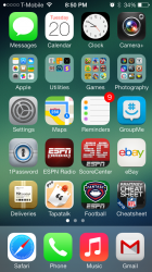
Amazing what changing a wallpaper can do
 

Attachments

  • IMG_7014.png
    IMG_7014.png
    960 KB · Views: 94
Amazing what changing a wallpaper can do

Just from that picture right there the reds and greens are too striking. Your own background clashes with the over saturated look Apple is going for.

With that said, why can't there be an option for phone and messages to be the color of that background?
 
Just from that picture right there the reds and greens are too striking. Your own background clashes with the over saturated look Apple is going for.

I think it looks fine. You're arguing opinions; no one will ever be right or wrong (as much as you clearly are trying to be right).
 
WTF are you using. A pink and light purple wallpaper???????

Some threads, I swear

The default dynamic blue bubbles background. It's pretty nice, but the icons drive me nuts.

----------

I think it looks fine. You're arguing opinions; no one will ever be right or wrong (as much as you clearly are trying to be right).

I'm arguing for an extra option. I said it on the very first page, before any replies. Are you capable of reading?
 
I'm arguing for an extra option. I said it on the very first page, before any replies. Are you capable of reading?

If you want options, go Android, Apple does not give us options, that's just the why they are, deal with it.
 
'm arguing for an extra option. I said it on the very first page, before any replies. Are you capable of reading?

I wasn't speaking to that. You were arguing that his background clashed with the icons' colors. THAT is entirely subjective.
 
I wasn't speaking to that. You were arguing that his background clashed with the icons' colors. THAT is entirely subjective.

Okay, and? What does your rambling have to do with wanting a theme? If you like My Little Pony go back to watching it, those of who can't stand the crazy colors would love another option as well.

----------

Wear some shades and...

Image

Well hopefully they'll jailbreak ios7 and then I can add a new theme if Apple won't. Until then I suppose you are right. :(
 
Believe it or not, a lot of people do not like the crazy, over saturated color look that looks like My Little Pony threw up all over ios6. If they are going to stick with this 'flat' look, how about at the very least a more neutral color scheme as an alternate theme?

Forcing people to like ridiculous themes is something Microsoft is currently doing with Windows 8 and it's MetroUI. Try and remember that before you race to Apple's defense here please.

it's so freaking hilarious to me when people act like Apple is a dictatorship that controls our lives.

They aint forcing $h*t on nobody.

Don't like it? Move on. Get a diff phone.

I like it a million times more than any iOS before it. As do others.

P.S. for the record, I'm GLAD they're following microsoft's metro team.
 

Yea. I'm with ya on that one. To me they look nothing alike.

they followed the philosophy (flat design). i'm very happy they went in that direction.

of course they executed the philosophy better, but there's no doubt that microsoft stepped into the flat design pool way before Apple did.

this is very much Apple's M.O. do what others do, but do it better.

there were touchscreen phones that could browse the internet and play music way before the iPhone. They just did it better. Much better.
 
I believe he was shocked because you guys are glad that Apple is following a horrible design scheme...
 
Okay, and? What does your rambling have to do with wanting a theme? If you like My Little Pony go back to watching it, those of who can't stand the crazy colors would love another option as well.

I don't see how this:
mylittlepony_splash_2048x1536_en.jpg


even remotely at all looks like this:
ios-7-screenshots.jpg


Other than the fact that there are bright pinkish/purplish colors?

But hey, I guess we all can't live in crazytown...:rolleyes:
 
I don't see how this:
Image

even remotely at all looks like this:
Image

Other than the fact that there are bright pinkish/purplish colors?

But hey, I guess we all can't live in crazytown...:rolleyes:

That's a bad example. Compare that MLP picture to some of the more obnoxious icons, and they look perfect together.

And btw, that menu at the bottom is one of my favorite things about ios7. It also blurs the bottom though, so again, not a good example of MLP vs THE ICONS THEMSELVES.
 
That's a bad example. Compare that MLP picture to some of the more obnoxious icons, and they look perfect together.

And btw, that menu at the bottom is one of my favorite things about ios7. It also blurs the bottom though, so again, not a good example of MLP vs THE ICONS THEMSELVES.

ios7_homescreen.jpg


Ok, still don't see it at all, unless you're talking about the fact that the iTunes logo, which has always been a pink color, is a similar color to that MLP image?

Can you provide anything in your "defense"?
 
Image

Ok, still don't see it at all, unless you're talking about the fact that the iTunes logo, which has always been a pink color, is a similar color to that MLP image?

Can you provide anything in your "defense"?

You don't see it at all? The putrid yellows, the crazy greens? The music icons and the green icons look perfect on that MLP picture.
 
mylittlepony_splash_2048x1536_en-1.jpg


I can see it somewhat with the music app, but that doesn't mean at all it looks like My Little Pony. In fact, after looking at it again when editing this post (to fix the images), they hardly fit in at all.

If we use your logic, let's apply that to other examples:

800px-1986ChryslerLeBaronTownCountryStationWagon.jpg


vdvt-ultra-modern-house-interior-living-room-wallpaper-01.jpg


See, I can make things look good and bad using random and unrelated images too.

I'm sorry, you've lost that battle. It's okay to not like the icons, but unless you have a better reasoning other than "personally I don't find them appealing" then you don't really have an argument.

Just like some else said above: Amazing what changing a wallpaper can do
 
Last edited:
Register on MacRumors! This sidebar will go away, and you'll see fewer ads.