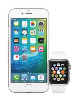
Neither look good, they're passable. I miss the days when icons had a tremendous amount of detail and required more craftsmanship. These vector graphics with pictograms and simple gradients bore me, one is worse than the other. iTunes in particular has seen so many redesigns over the years that I presume this new one will not stay with us for more than two years. People will complain about the new one as they have always done.
Got a tip for us?
Let us know
Become a MacRumors Supporter for $50/year with no ads, ability to filter front page stories, and private forums.
So that new music icon...
- Thread starter kmj2318
- Start date
- Sort by reaction score
You are using an out of date browser. It may not display this or other websites correctly.
You should upgrade or use an alternative browser.
You should upgrade or use an alternative browser.
Whatever one may say, but iOS 2-4 had a distinct identity & character which really really worked for its time! I just wish it was possible to go back & have a peak at what used to be!
Thank God you two aren't in charge of iOS design.
That's why I bought an iPhone 2G!I just wish it was possible to go back & have a peak at what used to be!
I took the screenshot on it, running iOS 3.1.3. Certainly a neat-looking OS for the time, but a bit slow on this hardware and missing many of the features we have today.
Looks like a new icon on the Watch too.
I'd really like that Watch icon to be the iOS and OS X version. The inverted color scheme looks great.
Thank God you two aren't in charge of iOS design.
Were @Bkfraiders7 and I in charge of iOS design, people would be mesmerized by the quality of our work to the point of being unable to look at anything but our icons. People wouldn't move or eat, workers wouldn't go to their jobs, and civilization would come to a slow, bitter end. It is truly devine that we're not in charge of iOS design.
I'd really like that Watch icon to be the iOS and OS X version. The inverted color scheme looks great.
The OS X icon is very similar, it just has a white border around the circle.
Ohhh, I'm not feelin the watch music icon.Looks like a new icon on the Watch too.
This alone makes me like it.Also if you look closely, you'll see that the new icon shape has been redrawn.
In context of the other icons and on springboard, it's defiantly clearer than i thought it would be.Oh it’s happening.

It took me a bit understand what was going on with the gradient, and get something that looked right.

I really like what you did so I went ahead and made iPad and iPhone friendly files.
https://www.dropbox.com/s/qil55j5jza4abn1/Alternate-Music-icon-iOS-8.4.zip?dl=0
I really like what you did so I went ahead and made iPad and iPhone friendly files.
https://www.dropbox.com/s/qil55j5jza4abn1/Alternate-Music-icon-iOS-8.4.zip?dl=0
Now THIS is super cute!
I wonder if the iTunes icon will change again in El Capitan because the current iTunes 12.2 icon doesn't match the El Capitan promotional images.
I don't see that happening, there's just no point. It looks like they just changed their minds. What's to be gained from changing it again?
Register on MacRumors! This sidebar will go away, and you'll see fewer ads.


