Become a MacRumors Supporter for $50/year with no ads, ability to filter front page stories, and private forums.
Yes, Siri is crazy good at searching the web

Hey, Siri: * asks Siri a question *
Siri: "I found this on the web..."

:rolleyes:
Google has these issues sometimes too

Just yesterday, I tried asking my Nest Hub what's going on in March Madness, and initially it just came back with "I don't know, but I found these results on search"

No assistant is perfect, but when it has its flaws, the ones with Siri are really made known at that moment
 
  • Like
Reactions: Tagbert
I'm all up for more customization options, though I'll assume that the power needed to render empty spaces will for sure limit this option to only the iPhone 17 Pro Max ;)
 
  • Like
Reactions: Saturn007
Tim Cook said they will break new grounds. Tim Cook delivers. Innovation at its best. Many might say Apple is more than a decade behind, but as MacRumors users let us know, Apple is often late, but when they finally offers a feature, they make it better than everyone else...

Really, truly expected this to end with a LOL emoji 😀 or a bright red

/s


It reminded of a tech version of The Onion!

Maybe, by 2040, Apple will permit users the customization we had back in the Palm Pilot days with Z Launcher. You could set up small, named tabs on, say, the left-hand side of the screen -- e.g., Games, News, Notes, Utilities -- and easily drag and drop app icons onto the tabs.

One tap and you'd enter your games world. Another tap, and you'd be in your News apps. It was fast, convenient, and user-customizable by side of screen, color, icons for the tabs, etc. Amazingly convenient.

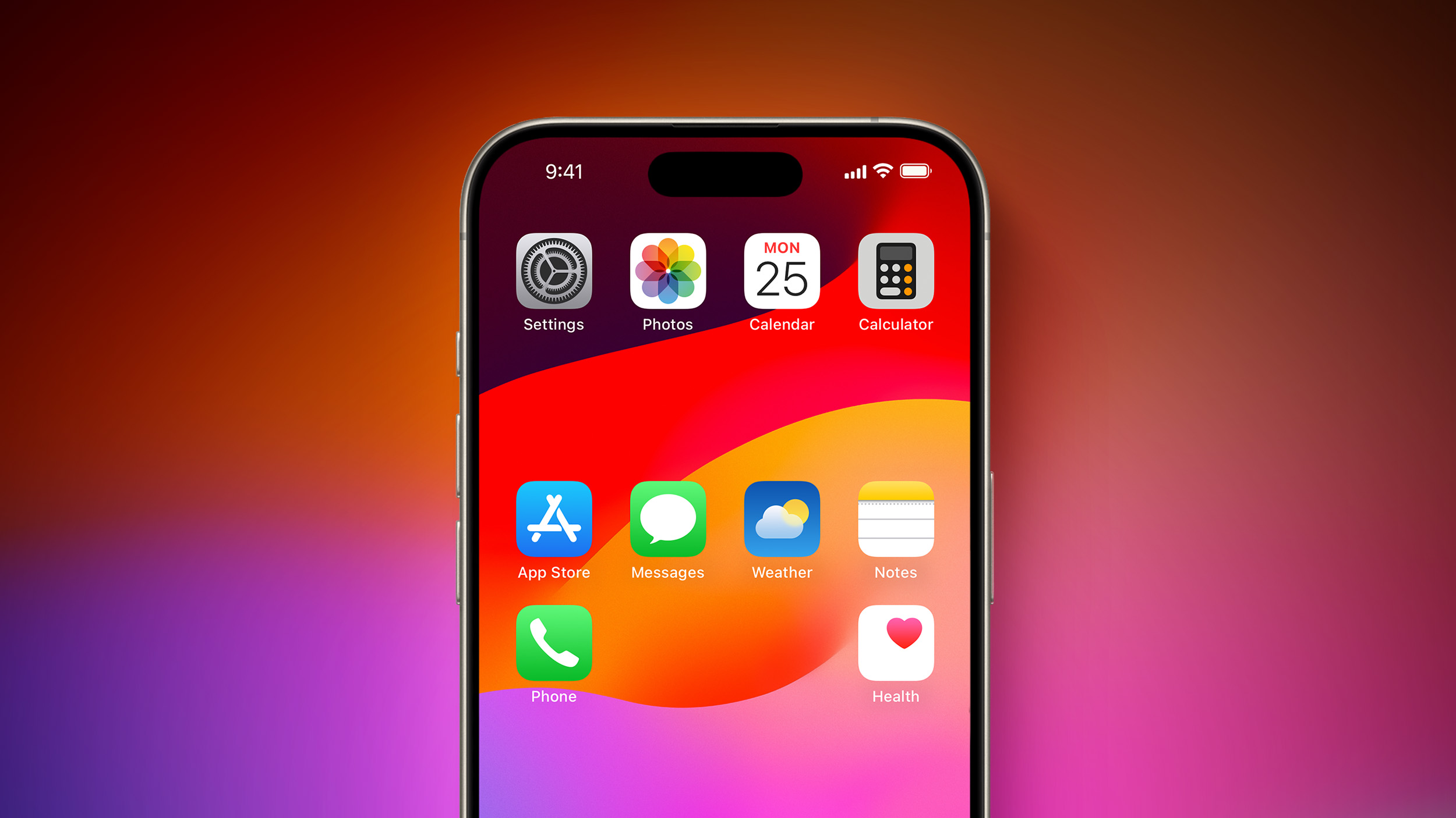
It also avoided the ridiculous spectacle -- and frustration -- of trying to drag iPhone app icons onto a particular Home Screen and being subjected to the Apple Shuffle! (Where the apps rearrange themselves and spill over onto another screen.)

There was never any issue, either, as happens with the iPhone, in which you inadvertently create a new folder (because an icon momentarily was within the boundaries of another) or when you, contrary to all expectations, ended up suddenly over on the previous Home Screen. None of the jiggly-wiggly, distracting nonsense, either.

Oh, sure, you'll say -- you can create a bunch of folders that function sort of like the tabs did. However, that's a lame equivalence. If you're inside an iPhone folder, you cannot see the other folders. In the Z Launcher approach, you always had ready access to the other tabs. Strikingly simple, yet powerful. Very Apple-like... well, the Apple of the old days when HIG meant something!

(HIG = Human Interface Guidelines)

The emphasis on transparency, consistency, and usability has been long lost or buried...
 
Woooow, what an achievement Apple. :) I have recently upgraded from iOS 13 to iOS17 and apart from having the search feature more accessible, I have not perceived any notable improvement that would make things easier for me.

However, one thing I have noticed is that the battery drains a lot quicker now, hardly lasting a whole day without using it much. I thought that was an issue that Apple was accused of doing on purpose and then subsequently got fined for doing so. It looks like, they are still doing it to have users buy a new iphone.

If it wasn't for the lack of support for iOS13 of some of the apps I use, I would have stayed on iOS13.

I really wish they would focus on the fundamentals again. Currently the worst experience is how typing text works, autocorrect getting in the way of moving the cursor where I want it to be, not being able to select text that is beyond the visible screen, still no proper auto correct. Moving the cursor swiping over the keyboard. Why didn't they just copy what the jailbreak community came up with. So much better than what Apple has been producing in the last few years. Just overall, a clunky experience and not fun to use.

Considering that typing message is one the more common tasks on a phone, this is just poor experience.

But yes, by all means, keep focusing on features like rearranging ones apps on the home screen. That will make my day. </sarcasm out>
You’re absolutely spot on. And the weird thing is they released a brand new autocorrect for iOS 17. But it’s just as crappy as before.
 
Jokes aside that this is a feature that should've been available for a decade or more, I am really looking forward to this and hope that it comes to fruition with iOS 18.

I keep an entirely blank home screen (aside from the app dock) and access all of my other apps from the App Library, but previously when I used Android I liked to have one extra row of apps at the bottom of the screen for quick access to some of my other most frequented apps.


iOS 18 will give iPhone users greater control over Home Screen app icon arrangement, according to sources familiar with the matter.

iPhone-Home-Screen-Gradient-Blank-Spaces-1.jpg

While app icons will likely remain locked to an invisible grid system on the Home Screen, to ensure there is some uniformity, our sources say that users will be able to arrange icons more freely on iOS 18. For example, we expect that the update will introduce the ability to create blank spaces, rows, and columns between app icons.

Bloomberg's Mark Gurman was first to report that the iPhone would get a "more customizable" Home Screen starting with iOS 18. It is already possible to customize the Home Screen and create blank app icons with apps such as Shortcuts and Widgetsmith, but Apple's own personalization options will be more convenient and official.

iPhone users have already been able to customize the Lock Screen since iOS 16, and we expect the Home Screen to receive similar treatment with iOS 18. The update will introduce additional customization options for the Home Screen, according to our sources, and this could result in the biggest Home Screen revamp in several years.

Apple will announce iOS 18 at its annual developers conference WWDC in June. Other features and changes rumored for the update include new generative AI functionality for Siri and multiple apps, RCS support in the Messages app for improved messaging between iPhones and Android devices, design changes, and more.

Article Link: Sources: iOS 18 Lets Apps Be Placed Anywhere on Home Screen Grid

God, that image triggers my OCD ..

One of the hardest parts of working with clients' Android phones is not cleaning up their home screens to not look like my cat just jumped on and off the desk. I do ask, if they have 3 or more icons for the SAME APP, if it's ok if I remove the dups and where would they like the remaining one that's left placed.

Does anyone at Apple (or the EU or DOJ) understand that I'm using an iPhone because I freaking HATE Android????

JFC
 
  • Disagree
Reactions: derekamoss
Milking the same boring layout that harkens back to the Jobs era.

Will there ever be any true excitement coming from Apple? Or have they become forever complacent?

I wouldn't call it boring? And, even if it is, why does a screen/icon layout need to be.. exciting?

As far as true excitement out of Apple? They're too busy killing off software, hardware, and features people use/love just to make exciting things like (checks notes) memojis, and $3500 VR Headsets that you can't connect to existing Sim hardware/systems... :rolleyes: You know, the stuff that takes real courage.
 
I'm going to laugh and laugh if they spend any time at all highlighting this groundbreaking feature at WWDC.

I remain deeply unconvinced that the fundamental interface introduced in iPhone OS 1.0 - a grid of icons - is the ideal presentation for a mobile phone home screen. It's been 17 years, surely we can do better.

For a touch-based UI, it probably is for the majority of users?

Of course, if Apple ever got Siri anywhere close to what most of us would hope for, you'd never need to worry about touch/grid/layout, you could just say "Siri, open Macrumors in Safari" or "Siri open the NASCAR app and play in-car audio for the 69 car" and it would actually work? Hell your home screen could be a blank black mirror 99% of the time.

Until then?
 
I have been enjoying a customizable home screen for years! 😉

But for real, happy it's coming to the folks who have wanted it for so long!
 

Attachments

  • Screenshot_20240325-124753.png
    Screenshot_20240325-124753.png
    227.5 KB · Views: 63
  • Like
Reactions: jakey rolling
I find it rather humorous with each update iOS comes closer to being like Android yet you’ll readily find people exclaim “if you want something like android then get an android phone” meanwhile iOS steadily draws closer to the customizability and flexibility that android offers.

Yes, and it's a bad thing. It's even worse when forced upon on us by the EU or US Courts.
 
Amazing, they finally hired some Google employees to show them how since android’s only been doing this for the past 15 years since almost day one! Now along these lines please follow it up with the next no brainer, let the phone owner remove the icon titles and WIDGET titles if they want to, or do we have to wait another 10 years or so for the next “huge” update?
 
Last edited:
This is great news. I do hope they give us the ability to adjust the icon size and have more icons per row/dock, back in the jailbreak days I loved to decrease the icon size and have five per row and on the dock.
 
Register on MacRumors! This sidebar will go away, and you'll see fewer ads.