Become a MacRumors Supporter for $50/year with no ads, ability to filter front page stories, and private forums.
I am sure those buttons will be allowed by iOS 16 or so. Apple always has to come up with half baked and limited new features at first before opening it up to devs. Seriously, a music widget without play or next buttons is just dumb.

what do I gain from looking at an album artwork on the Home Screen?
To Apple’s credit, these weren’t designed as a “music widget”. If it’s true that they’re read-only to preserve battery life, then I’m all for that. I don’t need a bunch of flashy moving interactive bloat on my phone.
 
Ah, yes... widgets. The 2020 mobile version of IE toolbars.

82hWm.jpg
 
I am sure those buttons will be allowed by iOS 16 or so. Apple always has to come up with half baked and limited new features at first before opening it up to devs.
They won't do it unless ordered by court.
 
  • Disagree
Reactions: jinnj
I know everyone sees no point if there’s no interactive buttons but for someone who drives while listening to Spotify this is great. If I ever want to change a playlist or find a new song while driving I have to thimble around for the tiny app but if I had this I could click it way easier. I’m sure Apple has heard the complaints too and will add interactive abilities regardless.
 
I'm disappointed in the slow pace of widget development among the major players. It seems like instead of developing widgets during the beta process, they waited until iOS 14 was released to start.
 
  • Like
Reactions: otternonsense
They need to hurry and add the ability to queue songs directly from the Watch app. I couldn’t care less about the widget or being able to stream directly from the watch. That was already added last month in a beta capacity, but you still can’t store the music directly on the watch (again, something for which I couldn’t care less). Seems like the queue would have been easier and faster to implement...
 
They need to hurry and add the ability to queue songs directly from the Watch app. I couldn’t care less about the widget or being able to streaming directly from the watch. That was already added last month in a beta capacity, but you still can’t store the music directly on the watch (again, something for which I couldn’t care less). Seems like the queue would have been easier and faster to implement...
 
Cool.
depending on the functionality of the widget I might remove the app icon from my Home Screen in favour of the widget.

Same here—I am eagerly awaiting more widgets to come out, I want to clean up & rearrange my home screen more but it's not worth it right now since barely any apps have widgets yet.
 
I don’t like this new passive widgets, I don’t see their utility to be honest, if I cannot do anything with them

I could be convinced otherwise, but right now I think it makes sense with Apple's philosophy that the apps themselves are light & load quickly enough that there is no need to duplicate the functionality on your home screen—the widget acts as a quick display and a shortcut to functions within the app, which is all you really need.
 
Since they just started doing it ill let it slide for now, otherwise why is the heck is there no album artwork when playing music for the widget at the very least.
 
  • Like
Reactions: jinnj


One of the big new features of iOS 14 is Home Screen widgets, which provide information from apps at a glance. The widgets can be pinned to the Home Screen in various spots and sizes, allowing for many different layouts.

xwlupgldv4s51-2.jpg

Image credit: Reddit user AustinMauritz

Many third-party apps have released widgets, and now evidence that Spotify is developing its own official widget has appeared in a TestFlight beta.

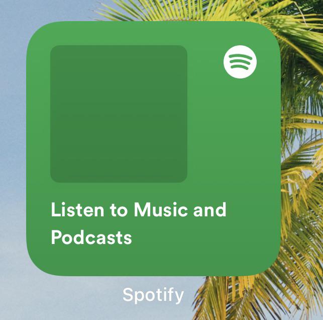
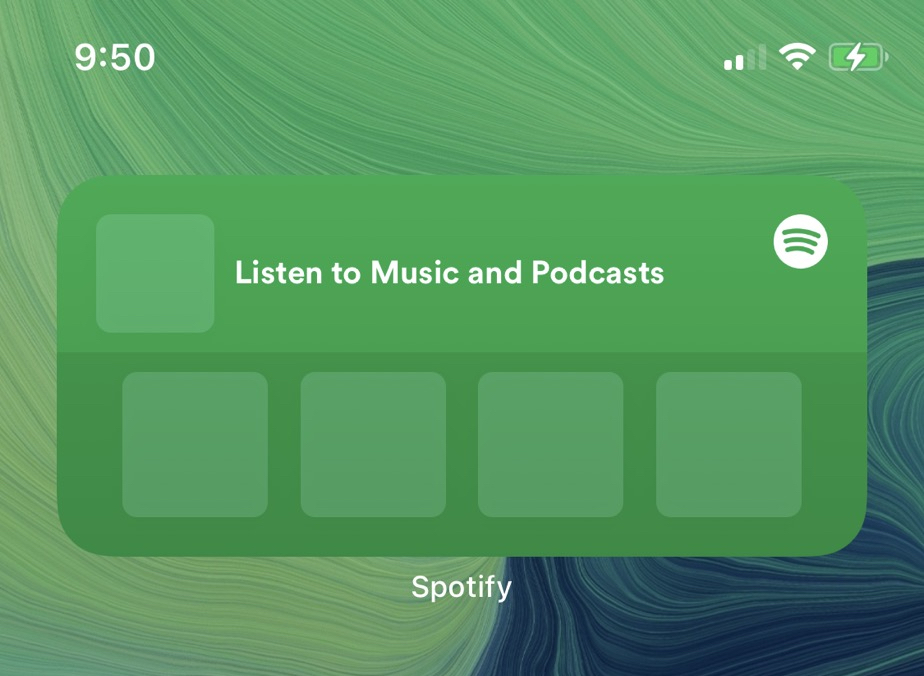
The widget is currently available in small and medium sizes, with the former designed to display the artwork of the last played artist, song, or album, while the latter size shows four of the same content elements.

Unfortunately there are no play, pause, or next song buttons, since Apple only allows widgets to present read-only information, with interactive elements such as scrolling elements or switches not allowed, presumably due to battery life considerations.

spotify-widget-beta.jpg

Image credit: Reddit user Lupolo

Instead, both widgets include the text "Listen to Music and Podcasts," and tapping the widget opens the Spotify app. Based on user reports on Reddit, the Spotify widgets don't yet display album artwork, but the fact that they exist at all proves that Spotify is working on them.

Last month, we reported that Spotify is testing dedicated support for direct audio streaming to Apple Watch without being connected to ‌iPhone‌.

There's no indication that the appearance of the beta feature is tied to a particular version of watchOS or iOS, but hopefully it won't be long before the ability to stream Spotify from the wrist will be available to all subscribers.

Article Link: Spotify Developing iOS 14 Widgets in Latest Beta
They have to bring back the live lyrics inside the app! I’m trying the premium for free and I won’t subscribe until this basic function is implemented. Huge miss
 
All Apple's widgets has achieved is to highlight just how far iOS is behind Android in features. These widgets are a bad joke.

How so? Having had Android widgets were useless battery hogs. These iOS widgets are actually useful. I don't need a media player on my home screen. I need to know what song I was listening to and have quick access to new podcasts.
 
All Apple's widgets has achieved is to highlight just how far iOS is behind Android in features. These widgets are a bad joke.

It’s the opposite to me.

Google had more than 10 year lead with features like widgets, and look where they have progressed during this time. Absolutely nowhere.

It’s pretty representative of everything google does. Core idea shows promise, but there’s no marketing, no guidelines, zero QC, just the Wild West where users and developers are left to sink and swim on their own. It’s just there.

Fast forward to today, the feature is still there on android, but there’s virtually zero fanfare. If google doesn’t care for it, why should users?

Apple’s implementation is more limited but prettier and the user base goes wild, because as it turns out, you need constraints and guidelines to shape behaviour and help ensure a better user experience for everyone.

App clips vs instant apps is another example of how Apple using this feature to seed the ground for something bigger (ie: AR glasses) vs google which just released it as a standalone feature, and the lacklustre adoption and support it has gotten since then is hardly surprising.

That’s why I am an iOS user. Not because I care about who did it first, but because I know that Apple will eventually implement and support it better.
 
To Apple’s credit, these weren’t designed as a “music widget”. If it’s true that they’re read-only to preserve battery life, then I’m all for that. I don’t need a bunch of flashy moving interactive bloat on my phone.

sorry, I didn’t realise you were being forced to use this?


I know everyone sees no point if there’s no interactive buttons but for someone who drives while listening to Spotify this is great. If I ever want to change a playlist or find a new song while driving I have to thimble around for the tiny app but if I had this I could click it way easier. I’m sure Apple has heard the complaints too and will add interactive abilities regardless.
you shouldn’t be using your phone whilst driving at all.
 
Just recently signed up for Spotify, I bought a Mighty Vibe music player for my daughter (she’ll be 7 this week) as I wanted a simple screen-less device for her to be able listen to music on. After a day of using Spotify I cancelled my Apple Music subscription. Damn the experience, and integration with other devices, is much better. Can’t believe I settled on Apple Music for so long.

Happy to see things like this coming, makes the switch even better.
 
  • Like
Reactions: Expos of 1969
Not much to be excited about with a non-functional widget in the Spotify beta (I am on it and it is indeed useless). In the meantime, Deezer (a truly global music streaming service) have included not one but 2 widgets with their recent update: Songcatcher (their Shazam-like) and Flow (their semi-interactive algorithmic radio feature).
 
What's the point of this widget design?! There's minimum info density and barely any calls to action for the user –it's a rounded waste of space. If it was at least as informative and interactive as the Watch app it would make sense. I can't believe it's 2020 and my mom can have THIS interface on her €150 Nokia and my €1300 iPhone is riddled with kindergartener sized squares that do nothing.

View attachment 964810

I kind of wish they were tighter too they seem massive.
 
I know everyone sees no point if there’s no interactive buttons but for someone who drives while listening to Spotify this is great. If I ever want to change a playlist or find a new song while driving I have to thimble around for the tiny app but if I had this I could click it way easier. I’m sure Apple has heard the complaints too and will add interactive abilities regardless.

Siri works quite well with Spotify too while driving. You can use exactly the same commands as with Apple Music, just add “on Spotify” at the end:

 
  • Like
Reactions: jinnj
What's the point of this widget design?! There's minimum info density and barely any calls to action for the user –it's a rounded waste of space. If it was at least as informative and interactive as the Watch app it would make sense. I can't believe it's 2020 and my mom can have THIS interface on her €150 Nokia and my €1300 iPhone is riddled with kindergartener sized squares that do nothing.

View attachment 964810
I concur with this! I have iPhone 11 pro max and Pixel 4 XL that just updated to Android 11.

A lot of unnecessary hate towards Android which has had stable releases for the past 2 years and can customize just about everything to my liking. Ask iOS 12 & 13 users how many embarrassing updates happened? I like both OS’s and they both have their flaws.
 
I am sure those buttons will be allowed by iOS 16 or so. Apple always has to come up with half baked and limited new features at first before opening it up to devs. Seriously, a music widget without play or next buttons is just dumb.

what do I gain from looking at an album artwork on the Home Screen?
I would side on "limited" just like past features. Make sure crap like Facebook pulled with the playback of empty audio to track the user doesn't happen again. Or with iOS bluetooth initial "limited" access prevented issues like Android device being hacked (Root Access) by just sitting next to the user [Demo'd at Defcon]
 
I know everyone sees no point if there’s no interactive buttons but for someone who drives while listening to Spotify this is great. If I ever want to change a playlist or find a new song while driving I have to thimble around for the tiny app but if I had this I could click it way easier. I’m sure Apple has heard the complaints too and will add interactive abilities regardless.
How old is your iPhone that you can bring up Spotify using voice while driving?
 
Register on MacRumors! This sidebar will go away, and you'll see fewer ads.