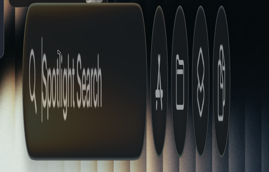
I know it's grading on a curve, but the choices made in 10.10 seem incredibly well thought out compared to this version, even if one can disagree with them. Instead of trying to make everything fit in a squircle they offered three different "recommended" layouts for consistency. They moved from photorealistic icons to more illustrative, but they understood that "just treat everything as glass" isn't a one-size fits all and that if you go too simple it loses meaning.
View attachment 2578778
There's a lot I don't like about many of the icons from that period (I always thought the very harsh drop shadows looked amateurish, and some classic icons got badly thought out when they enforced more consistency between iOS and MacOS) but I don't know anyone who wouldn't take the old icons wholesale. There are some improvements across the icons, I'd say more than a few; but considering so many of the icons have been badly thought out for years it doesn't really feel like a step forward.)


