Become a MacRumors Supporter for $50/year with no ads, ability to filter front page stories, and private forums.

Which orientation should text on a narrow banner use?

  • Text runs from bottom left up

    Votes: 8 42.1%
  • Text runs from top left down

    Votes: 11 57.9%

  • Total voters
    19

CortexRock

macrumors 6502
Original poster
Dec 3, 2006
413
0
Canterbury, England
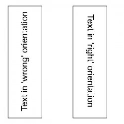
Something that's been bugging me recently... my colleagues in Marketing keep churning out vertical banners (0.5m wide by 3m high) with text in what I consider to be the 'wrong' orientation.

By 'wrong' I mean, the text reads from the bottom left up, as opposed to top left down (like a book or DVD spine).

Am I going mad, or what?
 

Attachments

  • banners.jpg
    banners.jpg
    10.7 KB · Views: 3,142

Blue Velvet

Moderator emeritus
Jul 4, 2004
21,929
265
Funny you should mention this... as it's something that we've discussed at work recently, not only in respect to banners but also book spines.

I agree with you, and custom also seems to agree with you, but sometimes the other way looks more visually right. To certain people at least. When it's an issue, I give internal clients both versions and let them choose unless when it comes to core branding and style-guide noted uses.
 

LeviG

macrumors 65816
Nov 6, 2006
1,277
3
Norfolk, UK
Now I think the first one looks right and the second one looks wrong in this context, although on books its better the other way. Also on web design it depends on the side of the screen too, the "wrong" way would look wrong if you put it on the right of the screen and vice versa.
 

shecky

Guest
May 24, 2003
2,580
5
Obviously you're not a golfer.
text reading up feels more positive and forward thinking - its rising to the occasion. text flowing down feels more derogatory and negative; its sinking down.

also all of the books i have seen from switzerland have the text going up on the spine. i assume this is true for some other countries as well.
 

CrazyWingman

macrumors member
Dec 14, 2005
38
0
(like a book or DVD spine)

If your goal is to imitate book/DVD spines, it depends which country you're targetting.

From http://en.wikipedia.org/wiki/Bookbinding#Spine_conventions:

In the United States the tradition stems back to England, where the titles are written top-to-bottom; when placed face-up, the title is correctly oriented left-to-right. this stems back to the time when books were stored flat, and in the humid conditions of Northern europe, the book (which was read more on its first page than last one) kept better shape if placed face down during storage.

This also underlies why multiple volume works are often shelved right-to-left: they're arranged "as if a stack".

On continental Europe, the general convention is to print titles bottom-to-top on the spine. Again in the warmer countries the books were stored face up in the old system. However, with exceptions in Denmark, Finland, Iceland, Norway, Sweden and the Netherlands, - (the humid countries) where titles are written top-to-bottom. , and in Spain, where styles vary among publishers.
 

snickelfritz

macrumors 65816
Oct 24, 2003
1,109
0
Tucson AZ
Imagine a border running clockwise (reading direction) around the perimeter of your page.
Vertical text on the left side of the page should probably run uphill.
Vertical text on the right side of the page should probably run downhill.
Text running opposite the reading direction will create tension and draw the reader's eye away from normal page flow.
ie: if a block of vertical text is placed on the left flowing downward, you will immediately draw the reader's eye down to the lower left corner, the likely end of the document.

Vertical banners placed on a wall should probably run downhill, with the first word beginning at the top of the banner, where the reader would normally be expected to start reading the banner. This mitigates problems with the bottom of the banner being partially obscured by other people or objects, such as in a mall. (it is easier to mentally finish a word than to begin it)
 

iMeowbot

macrumors G3
Aug 30, 2003
8,634
0
Veering off slightly, one of my childhood friends used to think that "rotarepo" was the funniest word ever (yeah, she was weird). I guess that sometimes there's no winning these things.
rotarepo.jpg
 

jng

macrumors 65816
Apr 6, 2007
1,011
1
Germany
Just to illustrate:

(I prefer the German one)
 

Attachments

  • harrypotter.JPG
    harrypotter.JPG
    215.9 KB · Views: 383

a cat *miaow*

macrumors regular
Jun 12, 2007
217
0
For banners I think the example you have on the left makes much more sense.
I work for an events company and had this discussion not long ago too.
Outside of banners the direction would be inter-changeable though
 

bluetooth

macrumors 6502a
May 1, 2007
662
1
Toronto
I would lean towards top, left down. I have done them both ways for clients. I was just at an IKEA store the other day and noticed that they use these sort of banners and always run their banners this way.

It is more natural to look at something from the top down, whether it be an 8.5x11 document or a banner - your tendancy is to always read from top of the page or media down.

I would also do both and let the client decide.
 
L

Lau

Guest
Instinct says I prefer the first, i.e. bottom left upwards. It looks "right" to me.

(This is looking at the two original samples, not the two above this post)
 

jng

macrumors 65816
Apr 6, 2007
1,011
1
Germany

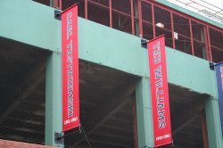
In the Red Sox one, I think the banner only makes sense that way.

The direction your text flows also hints at a sense of direction. You see a headline that interests you and your eyes look lower for more info. The way that sox banner is done, people look inward into the park.

It would look odd in the other direction, IMO. Therefore, if we approached Fenway not from Brookline ave but from Van Ness St., I'd expect it to be the other way. Does anyone know if it is?
 

iMeowbot

macrumors G3
Aug 30, 2003
8,634
0
It would look odd in the other direction, IMO. Therefore, if we approached Fenway not from Brookline ave but from Van Ness St., I'd expect it to be the other way. Does anyone know if it is?

The Fenway banners read top to bottom on both sides. Here are the ones for championships to give an idea. Flags and things like them do have long traditions with honor points and such that make people expect this.

The Disney banner is a little different since it's made up from two panels that break it from that flag-like expectation.
 

cgratti

macrumors 6502a
Dec 28, 2004
782
0
Central Pennsylvania, USA
Now I think the first one looks right and the second one looks wrong in this context, although on books its better the other way. Also on web design it depends on the side of the screen too, the "wrong" way would look wrong if you put it on the right of the screen and vice versa.


I disagree, I think the "right" one looks correct. I read from left to right, top to bottom. Thats just me, if I were to design something for a client, as Blue Velvet stated, I would design it both ways and ask the client.
 

jng

macrumors 65816
Apr 6, 2007
1,011
1
Germany
The Fenway banners read top to bottom on both sides. Here are the ones for championships to give an idea. Flags and things like them do have long traditions with honor points and such that make people expect this.

The Disney banner is a little different since it's made up from two panels that break it from that flag-like expectation.

Interesting. I'd expected to be different. I think they look odd (now that I think about it). But I guess it must make sense since I've never noticed it before and I go by Fenway all the time. :)
 

LeviG

macrumors 65816
Nov 6, 2006
1,277
3
Norfolk, UK
I disagree, I think the "right" one looks correct. I read from left to right, top to bottom. Thats just me, if I were to design something for a client, as Blue Velvet stated, I would design it both ways and ask the client.

But you are reading from the left still, the only difference is your head is rotated to the right not the left so its always going to be at the top so to speak. The images shown are the same except that one is rotated a further 180 degrees on a central axis.

I prefer tilting my head to the right rather than the left when reading vertical text its just my natural stance/fall/motion etc, I have my paper rotated to the left as I'm right handed meaning my head is tilted to the right to compensate to the left handed slant of the page and where my hand falls when writing.

As to the the client, I'd find out what they want too but this wasn't in the context of the original question
 
Register on MacRumors! This sidebar will go away, and you'll see fewer ads.