Become a MacRumors Supporter for $50/year with no ads, ability to filter front page stories, and private forums.
That yellow though
- Thread starter SoyCapitanSoyCapitan
- Start date
- Sort by reaction score
You are using an out of date browser. It may not display this or other websites correctly.
You should upgrade or use an alternative browser.
You should upgrade or use an alternative browser.
Your iPad pro doesn’t look bad – only a bit warm compared to the iPhone. Mine is the complete opposite – my iPhone 6 Plus has a warmer screen than my new iPad Pro, which has a cooler screen (not too blue-ish, just cooler).What's up at quality control? New iPhones with top half dim screen and iPad Pro with yellow screens?
My 6s plus has a great cool blue hue screen. I'd prefer that color over warmer hue any day. But my mini 4 has a warmer color. Some consider it better, some hate it. I've started to deal with it since I have no choice. My 4s got a warmer hue than my 4 and I've learned to deal with it. I think we just have to deal with the lottery.
If you paid at least 800 for it, you better be sure it's a reason for return.Does anyone know if this is reason for a return? I also have a yellow screen I wonder if all black ipad pros are yellow? Because I have two ipad pros and the white one is white screen, but the black one is yellow screen
Apple has extended returns for the Holiday Season. I gave mine back but the reason was because all the apps I used looked the same or almost the same as they do on iPad Air. There wasn't an impressive enough increase in real estate in landscape mode and no apps let me see two docs side by side.
Besides the obvious small aesthetic upgrades, speakers, processor, ram. the mini 4 can do everything the pro can. That's what makes the mini 4 the best bang for the buck apple tablet imo.Apple has extended returns for the Holiday Season. I gave mine back but the reason was because all the apps I used looked the same or almost the same as they do on iPad Air. There wasn't an impressive enough increase in real estate in landscape mode and no apps let me see two docs side by side.
Aside from the obvious UHD video edits and paintingBesides the obvious small aesthetic upgrades, the mini 4 can do everything the pro can.
The Pencil is actually really good. Wacom has some threat there so I expect to see some innovation from them soon.
Personally, I can't stand this warm "yellowish" screen. It looks like I am using a smoker's device.
Personally, I can't stand this warm "yellowish" screen. It looks like I am using a smoker's device.
Within a certain colour temperature range the eye will automatically compensate. In other words, we have a built-in auto white balance. This is there because white does and will look different under different lighting conditions, including ones that exist in nature. So just like a camera needs white balance controls, so do our own eyes, and nature has provided us with an auto white balance for this purpose (for example a cloudy vs a sunny day). However, there are 4 key things that can make this fail
1) The white is so far away from white, that the brain does not see it as white anymore. Then it will look yellow, or pink or whatever colour the screen is strongly biased towards
2) The screen is not uniform in terms of colour. If part of the screen is bluer and part is redder, then your brain will select one part as being "white", typically the bluer part, and the rest as being yellow or red etc
3) If you have a TV, or phone screen nearby with a different colour temperature for white, the brain will choose one of them to be "white", typically the bluer one, making the other look tinted. However if that "tinted" screen is seen without any other for comparison it will appear white.
4) A display emits light but also reflects some light from the room. Depending on the light bulbs colour temperature from the light in the room, it can modify the colour temperature of what we see. For example a warmer room lighting, will make the screen seem more blue. A photography editing monitor typically comes with a hood to help shield it from the influences of room lighting.
When we talk about a warm or cool display, we are talking about a scale that runs between red and blue. That is to say, when we talk about a colour temperature of 7000k, we are talking about a bias towards blue. And when we talk about a colour temperature of 6000k, we are talking about a bias towards red. You will of course know, that yellow is not the product of blue and red, but red and green. So in a display that is spot-on with red and blue levels but has a bias on green, it may look yellow, but it will be wrong to say it is warm...it is simply wrong!
6500k is the agreed standard that displays used for photos and video. 6500k or the almost identical but slightly better definition D65, refers to the colour temperature of natural sunlight. It should be emphasised that this will not and should not yield a white that looks like something from a commercial for laundry detergent. A lot of people do like a very blue white because it looks more pure, but it is not correct. Take a sheet of paper and take it outside on a sunny day..and you will notice that it does not look like the white from a detergent commercial. Take a photo of people outdoors with a camera set to the right white balance and take a mental note of how the scene looks in reality with skin tones. Look on it with a monitor set to D65 and you will feel like you stepped back into the photo.....on a blue screen, notice how all the skin tones have changed.
Bottom line is that every iPad pro or display is different. I have found through experimentation that the yellow bias is often linked to how tight the screen is under pressure in its casing...for example on some iPad pros, by pressing firmly (not too firmly) on parts of the screen it goes a bit yellow. So as every display varies, it is simply a case of whether the level of tint is within your brain threshold to auto-correct. But also consider that if you want accurate, think about how a piece of paper looks on a natural sunny day, and not the white t-shirt on the detergent commercial.
it's strange. my ipad pro has a 'warmer' tone than my ipad2. this now makes my ipad2 look quite blue and cold. the yellower tone i find on mine is most subtle and very agreeable.
is it because you are all comparing to your other devices you're intimately comfortable with?
granted, some look super yellow, but most I've seen look 'different' but not wrong.
is it because you are all comparing to your other devices you're intimately comfortable with?
granted, some look super yellow, but most I've seen look 'different' but not wrong.
If the warmer yellow tones are uniform then its half the battle and can be something desirable on a device, as oposed to blueish whites.
But if the screen is non uniform and (like my first A2) has the yellowing over the left side top to bottom then it plays havoc with how i perceive the screen as a whole.
The shift in tones 'left to right, were unsightly and had it been an overall shift to yellow or blue then i could have lived in blissful ignorance that anything was "Off" but having both was distracting and off putting.
If the warmer yellow tones are uniform then its half the battle and can be something desirable on a device, as oposed to blueish whites.
But if the screen is non uniform and (like my first A2) has the yellowing over the left side top to bottom then it plays havoc with how i perceive the screen as a whole.
The shift in tones 'left to right, were unsightly and had it been an overall shift to yellow or blue then i could have lived in blissful ignorance that anything was "Off" but having both was distracting and off putting.
I forgot to mention in my long rambling post, that human eyes are more receptive to variations in yellow and green light (for obvious nature reasons). Therefore if the screen is non-uniform but quite "blue", you are unlikely to see the uniformity errors, or if you do, you will see it more as brightness variations rather than colour ones. However, as the screen becomes closer to the desirable D65 calibration, our eyes will be able to see slight variations more easily. This is often seen with monitors, projectors that are blue out of the box, look uniform....calibrate, and then see uniformity issues you didn't see before.
Unfortunately display technology is not able to be manufactured yet with perfect uniformity. Some people are more upset by it than others as also humans vary one to one on their perception of small colour variations. So one persons perfect panel will not be another's. My iPad pro is not perfect, but a friend and my wife simply cannot see it...I can! So at the end of the day you have to "try" and focus on what you are using the iPad for, rather than staring and looking for screen uniformity problems. Obviously if there are gross errors, you won't be able to do it...but if its marginal, don't play the swap game...try and refocus on what you are reading/drawing/playing instead.
Yes, i agree. My replacement ipad is not perfect its just better than the original. I have decided its acceptable and am happy with it ( Not blown away with, just happy with) and i am not into the whole swap in swap out game searching for that elusive "perfect" display...As you say, It doesn't exist!
Cheers.
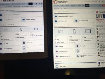
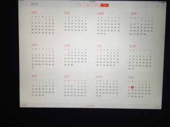
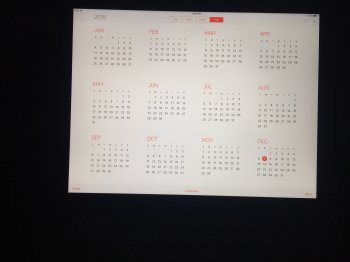
Right is yellowerI just got two new IPP's in after returning my first bad one that had yellow on the top 1/4 of the screen. I ordered two hoping one would be good. They are both much better but there is one that's perfect. Can you see?
View attachment 604282
View attachment 604283
View attachment 604284
Does anyone know if this is reason for a return? I also have a yellow screen I wonder if all black ipad pros are yellow? Because I have two ipad pros and the white one is white screen, but the black one is yellow screen
I returned my because of it. Top half was yellowish, bottom half was overly blue. Debating if I want to try again or not.
I just got two new IPP's in after returning my first bad one that had yellow on the top 1/4 of the screen. I ordered two hoping one would be good. They are both much better but there is one that's perfect. Can you see?
Neither is perfect. The right one is more yellow, but the left one demonstrates a colour gradient from left to right (more blue on right side), and also looks like its brighter on the right side too.
I just got two new IPP's in after returning my first bad one that had yellow on the top 1/4 of the screen. I ordered two hoping one would be good. They are both much better but there is one that's perfect. Can you see?
View attachment 604282
View attachment 604283
View attachment 604284
Mine looks like yours on the left. It's funny, I thought it looked kinda pink. Maybe this is the closest to "perfect," although I think i'm just uesd to the blueish whites of the iphone 6 plus.
You got a keeperLooks great.
Thanks. Yup, left one looks good to me. Better of the three.
Neither is perfect. The right one is more yellow, but the left one demonstrates a colour gradient from left to right (more blue on right side), and also looks like its brighter on the right side too.
It's not brighter or gradient. It's uniform all over and looks great to me and I'm picky!
Mine looks like yours on the left. It's funny, I thought it looked kinda pink. Maybe this is the closest to "perfect," although I think i'm just uesd to the blueish whites of the iphone 6 plus.
It's as close as I can get and its acceptable to me. Matches my phone.
Register on MacRumors! This sidebar will go away, and you'll see fewer ads.


