Got a tip for us?
Let us know
Become a MacRumors Supporter for $50/year with no ads, ability to filter front page stories, and private forums.
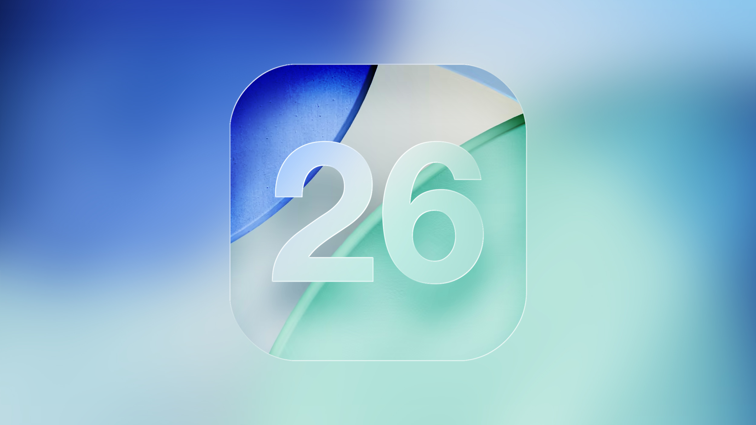
The 5 Most Important Apple Software Features Introduced This Year
- Thread starter MacRumors
- Start date
- Sort by reaction score
You are using an out of date browser. It may not display this or other websites correctly.
You should upgrade or use an alternative browser.
You should upgrade or use an alternative browser.
CATiNTHESTORE
Suspended
looks like respond from developer)Not sure what is going on but I am NOT able to reproduce it.
CATiNTHESTORE
Suspended
It’s amusing that the glossy border icon effects also appear in iOS 18 in some apps, resembling a broken geometry icon.
star-affinity
macrumors 68020
pfft
memory integrity enforcement doesn’t get a mention… what sort of coverage is this?

Memory Integrity Enforcement: A complete vision for memory safety in Apple devices - Apple Security Research
Memory Integrity Enforcement (MIE) is the culmination of an unprecedented design and engineering effort spanning half a decade that combines the unique strengths of Apple silicon hardware with our advanced operating system security to provide industry-first, always-on memory safety protection...security.apple.com
TLDR: This culmination of this half-decade plus of work, involving both the hardware and software/OS teams at Apple will make malware MUCH more difficult to develop for macOS and iOS due to a combination of software and hardware features built into the A19 and M5 and later.
Essentially, OS 26+ when running on A19/M5 and onward, the OS and CPU will stop about 90-95% of memory exploit bugs (read: malware) in their tracks, even if the software is buggy and exploitable.
WAY more relevant than liquid (gl)ass.
I read the article a couple of months ago and it’s cool stuff, but didn’t now A19/M5 and onward is needed to take full advantage. A bit sad.
I can live with Liquid Glass on iOS. It's a little bit ugly, but at least it remains functional. The macOS implementation on the other had is really terrible. I'm so glad I haven't upgraded my main Mac yet.
On macOS I think it is nice to turn on ”reduce transparency” in the settings. No Liquid Glass and everything becomes opaque. Doing that changes the GUI too much on iOS, so there I have Liquid Glass set to ”tinted”.I’m about the same. I don’t mind LG on iOS (not amazing but not horrible either), and like many of us, I’d prefer Apple focus on limiting the bugginess & improving stability for certain small things. My macOS experience has definitely been much worse and doesn’t feel as polished. Probably also doesn’t help that I’m running Tahoe on one of the last Intel supported devices…
I think, hope/think Apple will continue to adjust Liquid Glass as I think it works well in some situations, but can be a bit glitchy and affect readability in others.

coolfactor
macrumors G3
“Liquid Glass: In practice, it is one of Apple's biggest visual redesigns”
Why do you guys keep saying this? Except for some annoying bubbles around the menu items and oversized toggles, nothing changed.
And here we have the reason why Liquid Glass is getting such a bad rap...
Liquid Glass is built around 3-dimensional physics. Controls next to each can morph into each other, or into some new contextual controls depending on the current context and action being taken.
It's not 100% perfect, or perfectly implemented in every app, but some apps have done an excellent job that embraces the strengths of the technology and experience that Liquid Glass is meant to bring.
I'm not entirely happy with some of the changes. Because toggle bars overlay the content at the bottom of the screen, rather than being physically separated, it becomes too easy to switch toggles accidentally when scrolling. This happens for me all the time.
coolfactor
macrumors G3
I read the article a couple of months ago and it’s cool stuff, but didn’t now A19/M5 and onward is needed to take full advantage. A bit sad.
On macOS I think it is nice to turn on ”reduce transparency” in the settings. No Liquid Glass and everything becomes opaque. Doing that changes the GUI too much on iOS, so there I have Liquid Glass set to ”tinted”.
I think, hope/think Apple will continue to adjust Liquid Glass as I think it works well in some situations, but can be a bit glitchy and affect readability in others.
Instead of using "Reduce Transparency", I use the "Increase Contrast" option on iOS and I'm very happy with that. Edges and controls are much more defined, rather than be softer and blurry.
Devnul0
macrumors 6502
It's more than just appearance. There are things that are fundamentally broken. Here's an example: iPhone 16 Pro, iOS 26.2 … open Photos, turn the phone to landscape, and select a photo that has a location saved with it. Swipe up or tap the (I) button. Tap on the caption box and the photo location (and sometimes timestamp) bubble comes back, completely obscuring what you're trying to type. One in ten times it will dynamically push the caption box down out of the way some amount of time after rendering the screen (!) but most of the time you're typing blind.
Parowdy
macrumors 68000
I would feel embarrassed for posting this. Both your comment and the article.“Liquid Glass: In practice, it is one of Apple's biggest visual redesigns”
Why do you guys keep saying this? Except for some annoying bubbles around the menu items and oversized toggles, nothing changed.
mathiasinthe314
macrumors 6502
I am really in the minority. I like Liquid Glass and dislike the windowed approach to iPadOS multitasking.
throAU
macrumors G4
I read the article a couple of months ago and it’s cool stuff, but didn’t now A19/M5 and onward is needed to take full advantage. A bit sad.
Yeah unfortunately this requires new hardware features in the CPU to implement.
Apple is the only vendor in the position to do so, and it’s going to be in all their new hardware from this point forward so there is that, but yeah. Unfortunate.
For existing hardware the status wuo remains. M2 through m4 (iirc) already had some levels of additional hardware for memory protection but was a less complete evolutionary step.
I’m sure future apple SOCs will continue to feature improved hardware mitigations beyond a19/m5 in the future, but a19/m5 and the 26 OS releases are a significant milestone release security wise!
throAU
macrumors G4
Have you used Microsoft copilot?2025 was the year the iOS went into the burning dumpster! Liquid Glass is the most pathetic software around.
Makes Siri look like a frickin genius
throAU
macrumors G4
People cried massively at the flattening last ui overhaul.Yeah Liquid Glass. The reason of why I ditched the iPhone.
I hope, in maybe 5 years, Apple will erase that terrible UI and a new design will appear to come back to the iPhone.
For now, no thank you. iOS 26, neither Macos 26.
My M1 Air will be on Sequoia for a long time (after all, there will be a couple more of OS updates and that's all)
They cried hard about aqua on macOS when it was new.
It will evolve. A couple of years and going back to old releases will feel really old and ugly. Happens every decade or so.
That said I really hope 27 is a stability and ui polishing release. Whoever thought those larger radius rounded corners were a good idea needs to revert. They take up more screen space and look hideous next to everything else with the correct radius.
Nope and would never use microsoft copilot crap.Have you used Microsoft copilot?
Makes Siri look like a frickin genius
throAU
macrumors G4
I can’t say I’ve had any serious issues with my 16 pro max on ios 26 from beta 4 onward. Seems solid here. Ditto for Tahoe on m4 max for me.I don't have to imagine. This 17 Pro Max has had more Springboard crashes than all the previous iPhones I've had combined. And yeah, the keyboard is laggy and the animations are buggy. Meanwhile the hardware in this thing is amazingly impressive. They just wasted their time on window dressings instead of taking advantage of its power.
More likely it’s new hardware support teething issues. Expect a couple of software updates to sort it out.
My M1 Pro (touchID), m4 max (crash on wake from sleep anfter undock, dock failing to reconnect) and 2011/2015 MacBook Pros (kernel panics) also had some stability issues and bugs in the first 6 months or so after hardware release. All since fixed with os and firmware updates.
I’ve had a few quirks with iPadOS 26 on m5 also.
For anyone who cares about stability, I’d suggest waiting until 6 months after hardware release to jump on a new model.
Buying New models on day one is always a bit rough. I do it because I like living on the bleeding edge. But I also know what to expect at this point and always have other hardware to work with.
Last edited:
Happy with the changes iPadOS got this year and also very happy with my M4 11" cellular iPad purchase. Also I like the liquid glass effect. Nice changes to Phone/phone app functionality. Both call screening and holding are useful and call screening has come in handy for me many times.
AlanBeyond
macrumors regular
Liquid Glass is 🤮 Everything is basically the same except some toggles and menu bars changes. And the developers aren't even trying to adopt the new design. For my mostly used apps, only telegram adopted the new design.
2025 was a significant year of advancement for Apple's software, with a noticeable focus on visual design, productivity, and communication.
While Apple introduced and continued to iterate on a wide range of features throughout the year, several additions stood out for their scope and practical impact across multiple devices. As the year comes to an end, these five new features provide a useful lens for weighing up what the company focused on this year and how far its platforms evolved in 2025.
Liquid Glass
This year's most immediately visible change is the introduction of Liquid Glass, a new system-wide visual design language applied across Apple's operating systems. Liquid Glass replaces many of the flat, opaque UI elements introduced over the past decade with layered translucency, subtle refraction, and motion-responsive surfaces that react to underlying content.
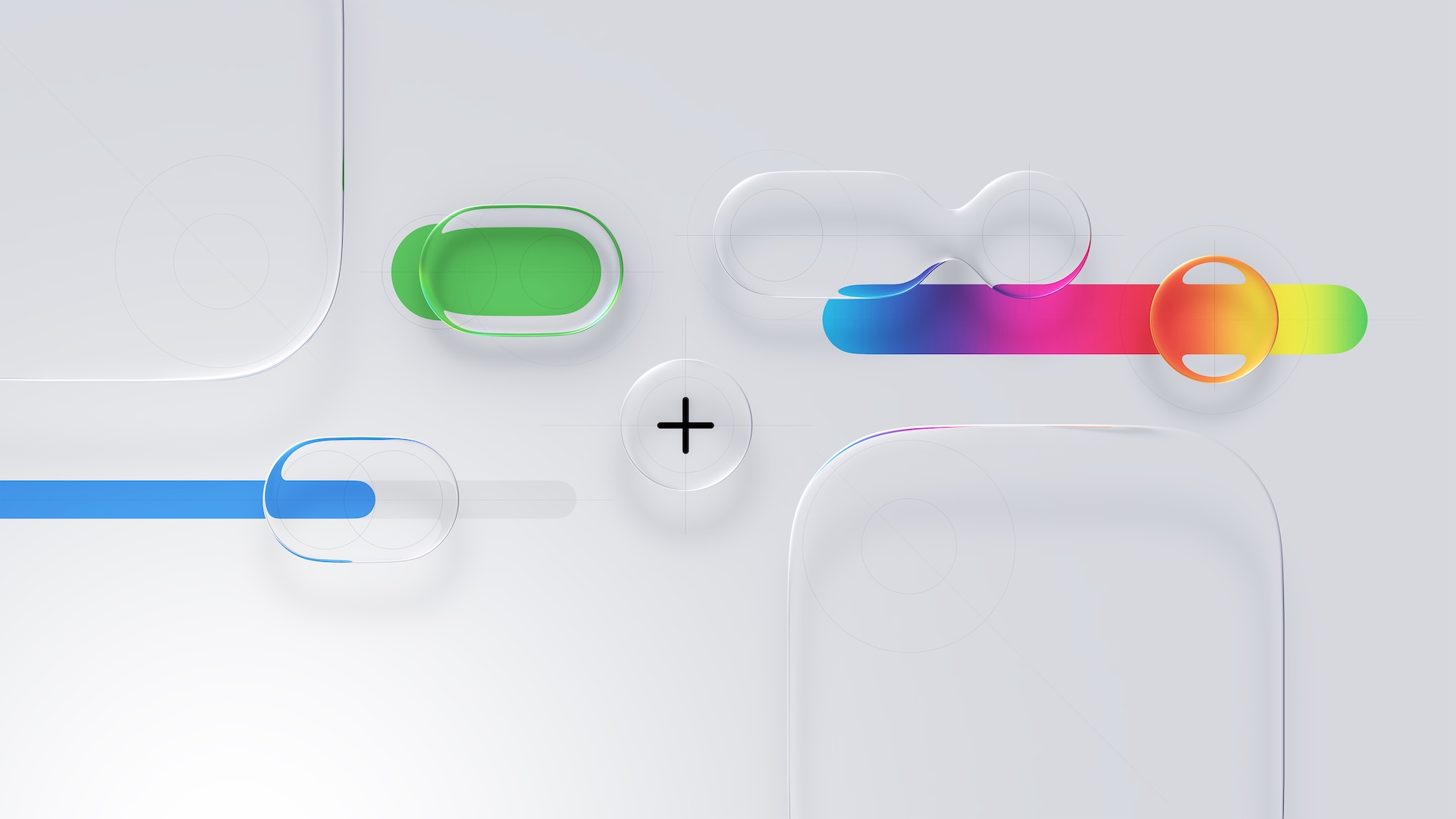
Navigation bars, sidebars, control panels, and system overlays now appear as semi-transparent sheets that blend into their surroundings rather than sitting on top of them. Apple framed this as a unifying material across platforms rather than a purely aesthetic refresh, with the same visual logic appearing on iPhone, iPad, Mac, Apple Watch, and Apple TV.
In practice, it is one of Apple's biggest visual redesigns since the original iOS 7 shift away from skeuomorphism, and it signals a renewed focus on making the interface feel fresh, spatial, playful, and responsive rather than static.
Revamped iPad Multitasking
On the iPad, the most consequential change is the introduction of an all-new multitasking system with windows and a macOS-style Menu Bar and cursor in iPadOS 26.
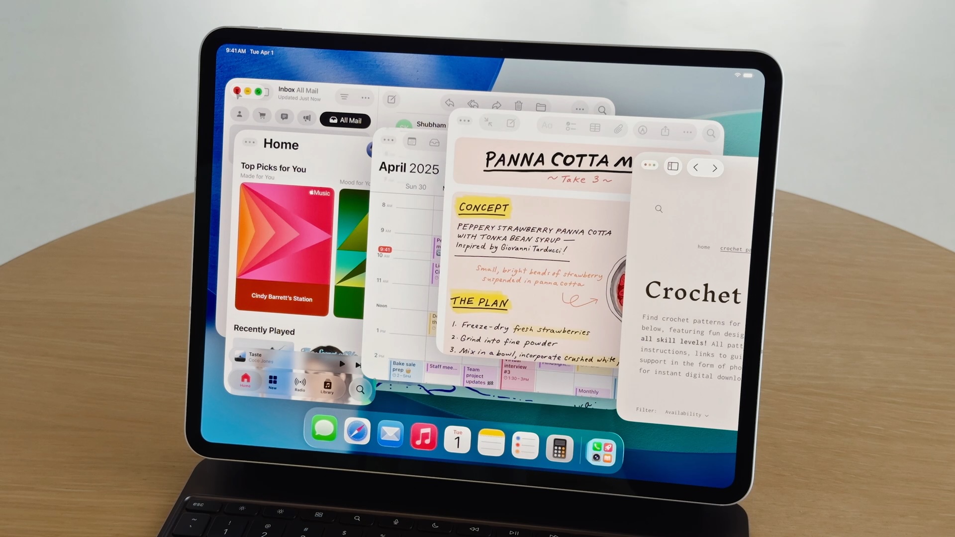
Apps can now run in freely resizable windows rather than being constrained to fixed split-screen layouts, allowing multiple overlapping windows to coexist on screen. Alongside this, a Menu Bar appears at the top of the display when invoked, exposing app commands in a structured, searchable format similar to macOS.
Instead of asking users to adapt desktop workflows to a touch-first model, Apple has now explicitly imported desktop interaction styles into iPadOS, addressing a significant number of user complaints about the software limitations of the iPad. For users who want to use the iPad with true multitasking and desktop-style workflows, this is one of the most substantive capability upgrades the platform has ever received.
More Powerful Mac Spotlight
On the Mac, Spotlight received its most extensive overhaul to date, transforming it from a passive search tool into an actions-first command interface, similar to third-party apps like Alfred or Raycast.
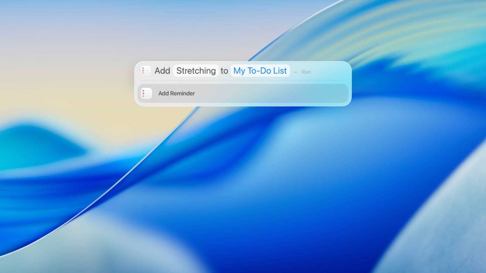
Spotlight in macOS Tahoe can now execute hundreds of actions directly from the search field. Users can create and edit notes, send emails and messages, start timers, run Shortcuts, adjust system settings, and perform app-specific commands, without opening the corresponding app.
Apple also redesigned Spotlight's results presentation with richer, more structured browsing views. Instead of returning a flat list of matches, Spotlight now surfaces grouped results for files, applications, actions, and suggestions, allowing users to scan and refine results more quickly.
Spotlight now includes a built-in clipboard history, allowing users to view and reuse previously copied text or images directly from the Spotlight interface. Apple also integrated an app library-style view, providing a centralized, searchable overview of all installed applications.
Live Translation
Another major addition is Live Translation. Real-time translation now operates inside Messages, FaceTime, and the Phone app, translating both text and spoken audio during conversations.
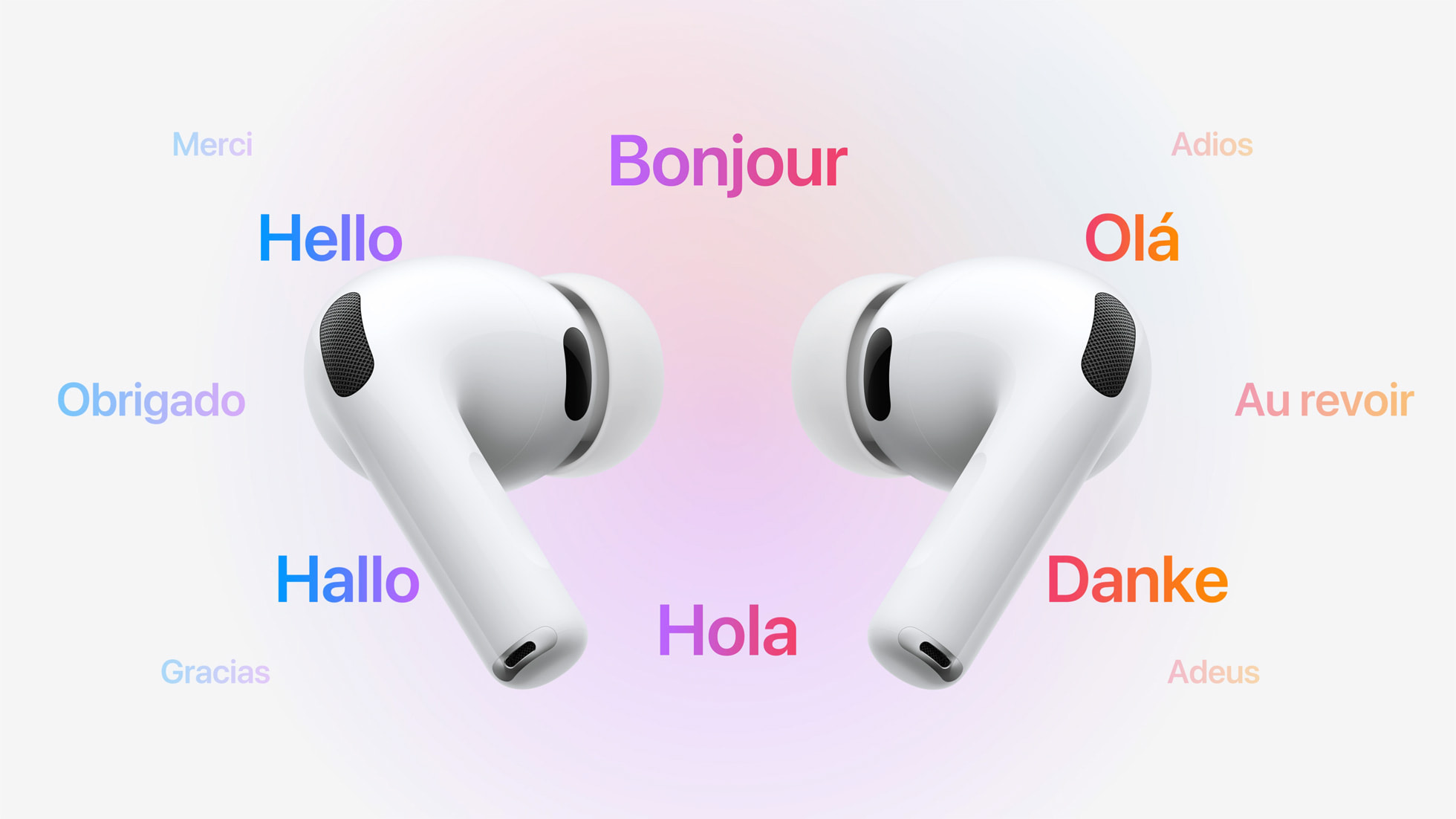
In Messages, incoming and outgoing text can be translated inline. In FaceTime, Live Translation provides real-time translated captions during video calls, allowing participants to speak naturally while reading translations as the conversation unfolds. In phone calls, spoken dialogue can be translated in near real time, with translated audio and on-screen text presented during the call.
Apple also extended Live Translation to AirPods, enabling real-time spoken translation directly through the earbuds during in-person conversations. When Live Translation is active, speech from another language can be translated on the paired iPhone and played back in the user's AirPods, while the user's responses can be translated and spoken aloud by the iPhone for the other participant.
Communication Screening and Hold Assist
Call Screening allows the iPhone to automatically answer calls from unknown numbers on the user's behalf. The system asks the caller to identify themselves and explain the reason for the call, then presents the user with a live transcript of the response before the call is connected.
With Hold Assist, when a user is placed on hold during a phone call, the iPhone can remain in the queue on their behalf and monitor the call until a live agent becomes available. Once the system detects that the call has resumed, it notifies the user to return to the conversation.
In Messages, Apple introduced more aggressive screening for unknown senders. Messages from numbers that are not in the user's contacts are automatically routed into a separate area, keeping potential spam and scam attempts out of the main conversation list.
Article Link: The 5 Most Important Apple Software Features Introduced This Year

It’s mostly on iPhones 16. What phone you use?Not sure what is going on but I am NOT able to reproduce it.
I think they get kickbacks… 🖖🥸“Liquid Glass: In practice, it is one of Apple's biggest visual redesigns”
Why do you guys keep saying this? Except for some annoying bubbles around the menu items and oversized toggles, nothing changed.
Pro Apple websites and influencers who cover Apple, all have a vested interest in pandering to and keeping Apple happy with their support and praise for the Cupertino company.I would love for the author to explain WHY Liquid Glass was such an "important" software feature.
Often their fear of offending the giant that feeds them is palpable. Thus at the end of the day it’s essential they participate in promoting what Apple is selling.
The tinted setting helps. My biggest gripes about the interface have more to do with other aspects of the GUI. I hate the extremely rounded corners, lacking contrasts makes it hard to find and read buttons, icons are misaligned everywhere, too much useless whitespace in my opinion.On macOS I think it is nice to turn on ”reduce transparency” in the settings. No Liquid Glass and everything becomes opaque. Doing that changes the GUI too much on iOS, so there I have Liquid Glass set to ”tinted”.
I think, hope/think Apple will continue to adjust Liquid Glass as I think it works well in some situations, but can be a bit glitchy and affect readability in others.
And then there is the Contacts app. What happened there? It looks like an unfinished product made by an intern as a weekend project.
throAU
macrumors G4
The tinted setting helps. My biggest gripes about the interface have more to do with other aspects of the GUI. I hate the extremely rounded corners, lacking contrasts makes it hard to find and read buttons, icons are misaligned everywhere, too much useless whitespace in my opinion.
And then there is the Contacts app. What happened there? It looks like an unfinished product made by an intern as a weekend project.
Yup, these are the big issues with Liquid glass.
When your typical Linux distribution desktop has more consistent UI widgets than you do, there's something seriously wrong.
I don't mind the glass part so much - crying about that is overblown in my view and can be fixed with some minor tweaks to transparency levels, etc..
its the excessive radius on corners (only on some apps!) that aren't consistent with the rest of the UI and various widget layout bugs. This is especially so on macOS, but also on ipadOS. The older radius (slightly more square) was way more aesthetically pleasing. Probably because Steve had a hand in it. Like him or hate him, he had a great grasp of aesthetics.
Especially so on ipadOS 26 when using it with a mouse and keyboard. I've constantly got widgets in the way of other widgets, etc.
I get it, ipadOS has had a major UI redesign for windowing and stuff... so hopefully they'll fix next year, but these are the bigger issues in my view outside of "i don't like the glass effect".
Funny, that I also use a 15PM (thankfully now back with iOS18)IMO, this is not the case on my 15PM.
Fair enough, I prefer my content not to be covered by other content.As I said I disagree having used it both turned up and toned down.
I've had the bar at the bottom for a long time with iOS18. That's not the issue. A lot of websites are fundamentally broken with iOS26 due to the way that Safari uses the extra space for some things but not others.I discovered I like the bar at the bottom of the page. Took some muscle memory to get use to, but for me works out well.
I'm not talking about Safari here, i'm talking across the OS. Big round circles around elements that dont need them, taking up more space. Thats a loss on a small screen (and when I say small screen I mean mobile devices / tablets). Even their odd design choices on Tahoe take up waste valuable real estate.IMO, I don’t believe there are oversize buttons in Safari.
As I said, 15PM user here and all the eye candy bloat was taking up valuable screen real estate and creating distractions. I stand by my comment that it does work well on the Apple TV, but it's not an OS for productivity devices.Maybe on a mini type screen it’s a “disaster” but on my 15PM it works well.
I7guy
macrumors Westmere
Yeah, no issues out of the ordinary on my 15PM on iOS 26.2.Funny, that I also use a 15PM (thankfully now back with iOS18)
Either websites aren’t breaking or I’m not noticing or they look normal. Do you have an example of a website that breaks. MacRumors does not.Fair enough, I prefer my content not to be covered by other content.
I've had the bar at the bottom for a long time with iOS18. That's not the issue. A lot of websites are fundamentally broken with iOS26 due to the way that Safari uses the extra space for some things but not others.
Okay fair enough. I stand by my comment iOS 26.2 works well on my iPhone 15PM.I'm not talking about Safari here, i'm talking across the OS. Big round circles around elements that dont need them, taking up more space. Thats a loss on a small screen (and when I say small screen I mean mobile devices / tablets). Even their odd design choices on Tahoe take up waste valuable real estate.
As I said, 15PM user here and all the eye candy bloat was taking up valuable screen real estate and creating distractions. I stand by my comment that it does work well on the Apple TV, but it's not an OS for productivity devices.
It does, when using the compact tool bar. The problem is fixed divs don't utilise the space underneath the compact address bar, and there is an erratic behaviour where if on the odd occasion they do, they flood the area with a colour which then doesn't go away when the div is removed. You have to refresh the page.Either websites aren’t breaking or I’m not noticing or they look normal. Do you have an example of a website that breaks. MacRumors does not.
Maybe people don't care about issues like this, but as a developer I do because it detracts from the UX for a lot of people and I have to pay extreme attention to the smallest details (and isn't that the problem with iOS26 - the smaller details are either unfinished or ignored)
As a developer, I have logged this issue (and others) for all the beta releases, and each release dot version. It's persisted from the beginning.
This is just one issue, using MacRumours as an example given that it's one you asked for. There are many more examples of issues with Safari (some worse).
I sometimes wonder if Apple are aware that they can get away with things like this because people don't care about the quality they are chucking out with their annual releases. Well, my clients certainly do!
Attachments


This might actually be one of the issues with Liquid Glass. Controls morphing into other controls might be a cool visual effect, but it's not necessarily a good thing for usability, for example in regards to muscle memory. The same applies to the loss of color in control icons and the loss of shapes in app icons.Liquid Glass is built around 3-dimensional physics. Controls next to each can morph into each other, or into some new contextual controls depending on the current context and action being taken