Got a tip for us?
Let us know
Become a MacRumors Supporter for $50/year with no ads, ability to filter front page stories, and private forums.
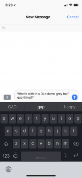
The Bottom Gray Bar - even WORSE than the Notch
- Thread starter Fluttershy
- Start date
- Sort by reaction score
You are using an out of date browser. It may not display this or other websites correctly.
You should upgrade or use an alternative browser.
You should upgrade or use an alternative browser.
Because the keyboard was intentionally raised up so that it’s easier to type with the way you naturally hold your phone.
Why hasn't anyone - to my knowledge - kicked up a stink about the awful gray bar under the keyboard?
Terrible!
Talk about trying to find anything to bitch about. Once apps and the iOS is ironed out it’ll be perfect, in the meantime it’s not that bad.
From memory Chris Pirillo called it a 'permaturd', never heard that expression before, he wasn't keen on it at all.
Guys prepare for a lot of complaint threads today finding anything and everything to complain about
I regulalry type in two languages too, so I appreciate moving the keybaord option to somewhere easy to still get to but not actually on the kayboard itself. I never find myself needing to swap back and forth mid sentence lol
Why hasn't anyone - to my knowledge - kicked up a stink about the awful gray bar under the keyboard?
Terrible!
Think for a moment how an iPhone SE, 8, or 8+ keyboard sits in relation to your thumb.
The iPhone X presents the key board in the same way, only you are accustomed to seeing a home button there.
I'm happy about it. I'm forever accidentally hitting the globe or microphone when I type. This looks like it eliminates that issue.
That guy is kind of a DB. I don’t trust his opinion.From memory Chris Pirillo called it a 'permaturd', never heard that expression before, he wasn't keen on it at all.
Why hasn't anyone - to my knowledge - kicked up a stink about the awful gray bar under the keyboard?
Terrible!
Honestly it's not that bad. It looked ugly at first. But I'm finding it is actually easier to type. I'm sure later on Apple will add a option to remove it.
But honestly it's easier to type with.
It’s already been confirmed that this is intentional and for typing ergonomics. That’s why there’s no stink being kicked up. That or everyone else understands that it’s not that big of a deal.Why hasn't anyone - to my knowledge - kicked up a stink about the awful gray bar under the keyboard?
Terrible!
From Gruber responding to Buzzfeed’s review:
It does look like a waste of space, but I wonder if testing showed that there needs to be some space under the keyboard to separate it from the virtual home button? If there weren’t a gap under the keyboard, you might hit the home button while trying to hit the space bar, and vice versa. UPDATE:I’ve heard from a little birdie that my speculation is correct; also: it’s about typing comfort.
Dude is a old angry has been, who is dark and bitter at the world because he's no longer a tv personality.From memory Chris Pirillo called it a 'permaturd', never heard that expression before, he wasn't keen on it at all.
May be true, and his personality is that of a hyena in need of Adderall. However, many of his points in that video were pretty spot on.Dude is a old angry has been, who is dark and bitter at the world because he's no longer a tv personality.
LMAO... It's been mentioned. But why are you looking down there while you type???Why hasn't anyone - to my knowledge - kicked up a stink about the awful gray bar under the keyboard?
Terrible!
OMG. Return that piece of crap immediately. Everybody is talking about that bar.Why hasn't anyone - to my knowledge - kicked up a stink about the awful gray bar under the keyboard?
Terrible!


It looks fine with the stock keyboard though, doesn’t it.
It really does take up some screen real estate with the default keyboard and that gray bottom bar.
I do feel like there will be plenty of wasted space all over the UI, but it is something Apple will improve on over time. Definitely not a huge deal though.
Think for a moment how an iPhone SE, 8, or 8+ keyboard sits in relation to your thumb.
The iPhone X presents the key board in the same way, only you are accustomed to seeing a home button there.
I actually wondered about this in a different thread discussing the usability of swiping up all the time. The way I hold my 7+ balanced on my pinkie, reaching to the bottom of the screen is not at all easy.
This is the first I’ve seen that they bumped the keyboard up on the X. To me, that seems like a pretty tacit acknowledgment that reaching all the way to the bottom of the screen is not that easy.
Register on MacRumors! This sidebar will go away, and you'll see fewer ads.