Become a MacRumors Supporter for $50/year with no ads, ability to filter front page stories, and private forums.

Cabbit

macrumors 68020
Original poster
Jan 30, 2006
2,128
1
Scotland
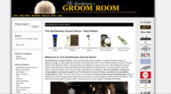
Hey folks i am just finishing up a refresh to this site for my client. The old site was created by a company i am not affiliated with but i have included a screen shot of it so you know what has been changed.

My aim was to keep the feel of the original site somewhat has it has been up since 2006, but to make it much more organised and easier to find and buy products. To that effect i am also making product categories(the brands are currently set as categories and everything has a manufacturer of manufacturer1 :( )

There is still a lot of fighting going on between me and Joomla(it insists on adding lots of guff and tables).

If there are any suggestions for improving the new site or any errors i would love to hear them.

New site
http://www.thegentlemansgroomroom.com/

Old Site Screen shot (To find a product users would have to click on one of the logos on the right)
http://www.thegentlemansgroomroom.com/images/old_site.jpg
 
Last edited:

Arganos0

macrumors member
Sep 24, 2008
55
0
Hey,

My first impression: there is very much white/black contrast.
I think the white borders on the sides make it slightly weird.

Maybe you could somehow make the colors match more smoothly. I think black is a bit off here considering what you're trying to sell. It's hard to focus on the website.


If you want to give it an authentic, and maybe a bit luxurious feel, I suggest you browse some sites like louisvuitton.com, armani.com etc. to check what they do with style. Usually they do either white OR black, with grey fonts and yellow, gold, blue subtle accents etcetera.

These are my opinions - I tried to give constructive criticism.
 

Cabbit

macrumors 68020
Original poster
Jan 30, 2006
2,128
1
Scotland
Thanks for the input, yep i do agree the design could do with tweaking however my client wants to keep much of the feel of the old site so not to alienate his customers and he himself is a little afraid of the changes already made.
 

Arganos0

macrumors member
Sep 24, 2008
55
0
I see the point. Difficult. Still, I'd make the *html background black, because if you have a widescreen, you see a black website in the centre with a huge amount of whitespace to the left and right. With a small screen this is not noticeable.
 

elppa

macrumors 68040
Nov 26, 2003
3,233
151
I agree with the previous comment that it in no way feels luxurious, boutique or special. Whilst I appreciate your markup might be (where it can be!) throughly modern, the overall aesthetic is of a early 00s template. I have some sympathy, I hate CMS HTML black boxes as much as the next person.

I think it is your responsibility to convince the client afraid to “alienate his customers” that a modern, fresh and easier to navigate site would be beneficial to existing customers and new customers alike. I don't know your relationship with the client/how easy that might be to achieve — but it surely has to be worth a try! Also remember that you are investing a good deal of your time on this and may wish to include it in a portfolio etc. at a later date. It's not fair on you if your application of best practice and design is handicapped by this vague notion of not wanting to “alienate” customers. If you turn the thing on its head - what is to say that plenty of potential customers weren't alienated by the previous site? And thus are just as likely to be alienated by any site with the same "feel".

In many ways it is less ethical to “give them what they want” if “what they want” isn't necessarily best for the business. At the end of the day your client is most interested in their bottom line.

Anyway a couple of practical points you can probably change:
[1] Top Navigation:
- Home
- Shop Online
- Wholesale
- About Us
- News
- Login
Information Box:
- About Us
- Terms and Conditions
- Privacy Policy
- Contact Us
- Wholesale

There's a bit of cross over. I'd eliminate the box altogether and push contact, privacy and terms into the footer, just above the copyright notice. I don't think duplication of creates options and helps navigation. I think it confuses and makes building a mental model of the site harder.

[2] Don't have two listings of brands, one with text and one with pictures. Combine them, then loose the right sidebar.

[3] Like the category/brand listing in the sidebar. Don't like the “Male Grooming” which follows. It is not clear (to me at least) what to expect underneath. Because (correct me if I'm wrong) the products you find using brand/categories can be added the cart, these services cannot, you need to ring up. I would create a new top level navigation item called services/treatments. Or maybe a separate area entirely for the Jermyn Grooming and Lifestyle Suite.

[4] Put the opening hours with the address. They are too easy to miss at the moment. And maybe add a map.

[5] Loose the hideous brush. :)

[6] Try grey, white or a light yellow (lighter shade of the main text in the logo) for the background, keep the header black if you can't change the logo (screenshot attached).

[7] Do you have any say over the logo? I'd use gold instead of yellow. (Idea Attached).

[8] I don't know if it just there while building, but a login without a register link nearby isn't the best idea.
 

Attachments

  • Screen shot 2010-11-07 at 23.28.57.png
    Screen shot 2010-11-07 at 23.28.57.png
    373.7 KB · Views: 122
  • ggr-logo.png
    ggr-logo.png
    11.6 KB · Views: 124
Last edited:

Cabbit

macrumors 68020
Original poster
Jan 30, 2006
2,128
1
Scotland
Some great ideas and points put forward, my client found this page himself also so we are talking about a lot of improvements we can make within his budget.

I think the suggestions for changing the logo would make a big difference also and making the size flexible and more white would look great. I do have some ideas i am doodling down on paper that mite work to further improve on these concepts.

I have in mind to take the Contact section and include with it the map to the shop and opening hours.

There is still the major change to come which is organising all the products by category, and the shop by brand will be simplified.

The login and Registration does need work, i am not quite sure where best to put them for now i thought it worked ok being a pop up box.

The image on the right used to be the only way to buy products, current ideas are to ether remove them or to change there behaviour so that the screen will darken out and there will be information about that company in a style somewhat like safari's reader.

My client loved your logo idea so i think that is perhaps a style i will try to develop with him, though as i have explained to my client i am not a designer i am there to sell him on a backend order processing, cms, integrated paypal direct with 3Ds etc.

The design stuff is being done primarily to facilitate the shop by category and enhance the usability, but i do really want to make this look terrific to the best of my ability i really like this client's shop and story, of course it will be perhaps my only design focussed peace in my portfolio.
 

definitive

macrumors 68020
Aug 4, 2008
2,051
895
I like the new site's front page over the old one, but as elppa points out, it needs some work on the color scheme. the black header is nice, but the background on the rest of the page would make the website more attractive to the visitor if it was lighter in color. The page menu could also benefit from having some kind of a color instead of having yellow text floating on black header.

As far as the product pages go; I don't know if they're finished or not, but some of the text overlaps (back/forward arrows with product name) due to sizing. When you click on a product to view the full size image, it takes the visitor away from the main product page, and to the image itself. It would be simpler to either have the image pop up in a separate window, or to use some kind of a script that works in a way similar to fancybox to display the popup inside the main page.
 

Cabbit

macrumors 68020
Original poster
Jan 30, 2006
2,128
1
Scotland
As far as the product pages go; I don't know if they're finished or not, but some of the text overlaps (back/forward arrows with product name) due to sizing. When you click on a product to view the full size image, it takes the visitor away from the main product page, and to the image itself. It would be simpler to either have the image pop up in a separate window, or to use some kind of a script that works in a way similar to fancybox to display the popup inside the main page.

(I agree with your first point but this one needs main attention.)

To address this point directly the products pages are all being revamped which required working with the live site due to the way the database works(Or doesn't in some cases).

Currently the products are assigned a manufacturer as there category and there for there page templates are all for the manufacturer details etc.

Over the next few days i am reworking all the products so the belong to a manufacturer and to a category. So the main shopping menu will have the 15 or so categories and product pages and the manufacturer pages will have manufacturer information and all the products belonging to that manufacturer.

I have new template code and css ready for this but with 488 products its not a overnight job to reassign all the products especially as i have to do it direct to the database.
 

Cabbit

macrumors 68020
Original poster
Jan 30, 2006
2,128
1
Scotland
I've started to work on a fresher layout based on your comments and heres how it's looking so far.

I've been working on the logo based somewhat on a suggestion above that looks quite nice and have prepared two versions that have a similar feel.

Font's are not really in the budget at the movement so i need to work on ether free web fonts or the ones included with Photoshop appear to be licensed as long as the font can't be shared so bitmaps are ok.

Heres demo 1 which has a flat look to the logo and shows the newer style i am working on.

demo 2 which has a part embossed look to the logo and also shows the newer style i am working on.

demo 3 which has a embossed look to the logo and also shows the newer style i am working on.

logo4.png
4th look of the logo.

logo5.png
5th look of the logo.
 
Last edited:

elppa

macrumors 68040
Nov 26, 2003
3,233
151
Just wanted to echo the previous comment. You are making amazing progress. It's looking a lot more attractive.
 

Leddy

macrumors regular
Dec 16, 2008
111
0
The new direction is a big step forward IMO ... re. your logo, remember the apostrophe (it seems to have disappeared from Gentleman's) ...

Also, I'm glad you managed to remove the head of the shaving brush from the header of the site - it looked pretty odd just chopped off like that and stuck in a disembodied fashion at the top of the screen.

Cheers.
 

Cabbit

macrumors 68020
Original poster
Jan 30, 2006
2,128
1
Scotland
The new direction is a big step forward IMO ... re. your logo, remember the apostrophe (it seems to have disappeared from Gentleman's) ...

Also, I'm glad you managed to remove the head of the shaving brush from the header of the site - it looked pretty odd just chopped off like that and stuck in a disembodied fashion at the top of the screen.

Cheers.

Thanks sorted the apostrophe. Im now looking for a good font for the headers and menu. I've seen a few nice ideas to make a elegant looking footer.

There is now a way to see the styling i am working on in context to the live site using the demo switch.

http://www.thegentlemansgroomroom.com?demo to enter the new style.
http://www.thegentlemansgroomroom.com?enddemo to return to the old style.
 
Last edited:

Cabbit

macrumors 68020
Original poster
Jan 30, 2006
2,128
1
Scotland
Since the menu is quite large i have decided to make it a accordion. Well try it like that anyway.
But i would like to add a class to the active accordion and have not quite enough knowledge of jquery to work it out for the first opened object to be highlighted.
Code:
// Menu
$(document).ready(function() {
	$('div.accordionButton').click(function() {
        $('div.accordionContent').slideUp('normal');
        $(this).next().slideDown('normal');
        $("div.accordionButtonSelected").removeClass().addClass("accordionButton");
        $(this).removeClass().addClass("accordionButtonSelected");
    });
	$("div.accordionContent").hide();
	$("div.first").show();
});

Demo
http://www.thegentlemansgroomroom.com/?demo
 
Last edited:

elppa

macrumors 68040
Nov 26, 2003
3,233
151
Code:
$("div.first").show();
$(".accordionButton:first").removeClass("accordionButton").addClass("accordionButtonSelected");

Probably a better way, but it will do the job.
 

Cabbit

macrumors 68020
Original poster
Jan 30, 2006
2,128
1
Scotland
Site seems to be running quite smoothly now that the new design is up, still need to work out a nice place to put the user login without messing up the look of the layout.
 

Cabbit

macrumors 68020
Original poster
Jan 30, 2006
2,128
1
Scotland
Daft question maybe, is jquery able to store state in some kind of session?

It would be nice if it remembered where in the menu the customer was last during the session.
 
Register on MacRumors! This sidebar will go away, and you'll see fewer ads.