The iPhone 8 cut-out at the top is not innovative.

I think it gives it more character..........................................
If the corners are colored it gives the iPhone the character of looking hideous and it gives Apple the character of being morons
[doublepost=1504839642][/doublepost]
Let's not forget that more hideous vertical camera bump. The iPhone gets uglier every year, it's like they discuss new ways to make it uglier.
Well, I mean technically they discuss new ways to make it superior, but I'm not sure you understand that.

Let's see if you understand though:

Why is the camera vertical in the iPhone X?

Also just as a note (pun unintended): the galaxy note 8 window on the back is around 1000 times more hideous than the iPhone camera. It's honestly a travesty in design.
[doublepost=1504839988][/doublepost]
Well, by this point I am of the firm belief that Apple considers the camera bump to be a feature. How else to explain what seems to be a larger and larger bump in every revision of the 6 series?

I've been told that in order to maintain the thinness of the phone at the current (or larger) size that physics determines that there will be a bump. I find that difficult to accept given that multiple non-Apple manufacturers can produce phones equivalent in dimensions but with cameras that are flush with the casing. Apple can still maintain a flush camera with the SE as well.

So, ultimately, that tells me Apple considers this to be a design feature. It's one I totally disagree with. But you know, there were people who bought the Pontiac Aztec so that style of design has people who appreciate it.
[doublepost=1504824918][/doublepost]
Yes. The iPhone 6s/6s+ and the iPhone 7/7+.
This is so face-palm worthy. Please just do one of two things:

A. Go check the actual device thicknesses instead of using the inaccurate ideas in your head. (Hint: the new Samsung devices that are 'flush' are 8mm+ in device thickness, and the iPhone SE you talked about is 7.6mm and has a much worse camera with less lenses)

B. Don't bother looking anything up, but consider for a moment that you may be completely unaware of the truth.
[doublepost=1504840123][/doublepost]
Imagine Samsung has a camera bump and a awkwardly shaped cut out, people here would be laughing their asses off.
I'm already laughing my ass off about the Samsung Galaxy S8, S8 Plus, and Note 8 rounded screen corners and rounded edges. Also about a rear-fingerprint scanner, and also about the Note 8 gigantic window on the back which is so terrible looking that they should've just left the cameras out.
[doublepost=1504840278][/doublepost]
I think it's intended to replace the old look of the front of the phone with the circular home button. Now they have a new signature look.
No.

They still have their signature look. That comes from the radius of the corners, the fact that the screen doesn't curve over the edge idiotically, and the cameras on back.
[doublepost=1504840916][/doublepost]
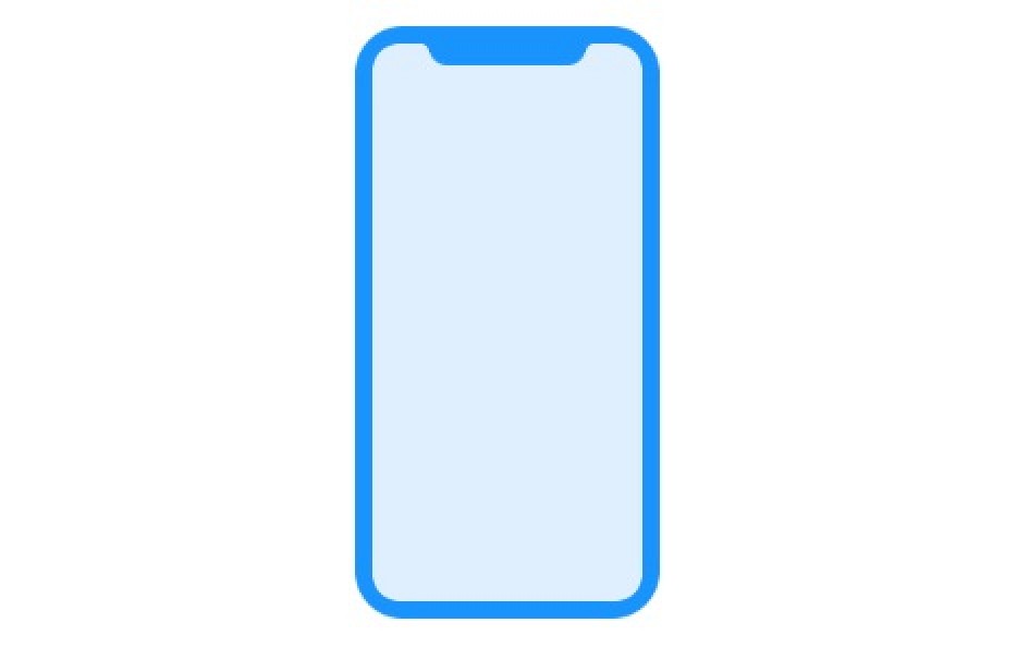
IMG_3472.JPG
IMG_3475.JPG
I don't understand any of apple's design choices now. Just like I don't see the purpose of that ugly cutout on the iPhone 8, when the galaxy s8 and note 8 don't have that on their edge to edge display.
Its really simple....

See how the status bar takes about 1/8" of screen height? Well, when you move it to the corners where no other content can go, it nets you screen size increase. Ta-da
 
There have been over 1 million cell phones designed in the history of the world and iPhone 8 is the FIRST to have the cut-out. I'm not sure whether it's a great feature or not (will wait for Tim Cook's presentation to find out) but to claim that it isn't innovative is a lie.

Do an internet search (I recommend Google) for Essential phone
 
You would be surprised then just how many products from multi billion dollar companies
slap stuff together and then let marketing convince the customers that they spend an agonizing amount of time on design and implementation.

This is Apple we're talking about, not just any old company. And besides, we've been seeing this notch design for a while now. So not exactly slapped together at the last minute, is it?
 
This is Apple we're talking about, not just any old company. And besides, we've been seeing this notch design for a while now. So not exactly slapped together at the last minute, is it?

I have no Issue with the Notch and I understand it's main functionality. Perhaps I can look past design cues and appreciate other features this new iPhone has to offer. But one thing is certain, this Keynote cannot arrive fast enough for some.
 
The top of the new, revolutionary iPhone is just ugly. What were the designers thinking?
I can't recall anyone from Apple describing it as innovative.

Maybe it's just how a phone can make use of most of its front as a screen + having enough sensors for a decent FaceID system & camera.

We're not at a stage where a screen can be 100% usable. Maybe in a few years.

But we're getting there, & the iPhone X/Edition looks to be a pretty decent evolution toward that goal.

Has any iPhone ever received this much criticism before it's even been officially seen by the public?

I've noticed more praise than criticism myself. Depends which sector of the web you want to focus on.

& don't forget, the web's a haven for extreme opinions, especially that of the negative, whiny type, so don't let their bombardment of complaints fool you.
 
Last edited:
The iphones notch cutout may have actually been Samsung's design first based on this 2016 patent design by Samsung so clearly Apple wanted something similar to this which may be the S9 design. Once again no innovation is correct.

http://www.gsmarena.com/samsung_patents_bezelless_design-news-27121.php

View attachment 716343 View attachment 716343View attachment 716344
and this comes from a samsung fan? dude, seriously? you want a list of everything samsung has tried to copy from apple exactly a year after apple releases those features? looks and UI of the iPhone (first galaxy s), siri,the health app, passbook, fingerprint scanner, continuum, even the samsung stores look like apple stores,..
This is samsung at its best, copying things that have succes. recently they even made an almost exact copy of a dyson vacuum cleaner.
 
The top of the new, revolutionary iPhone is just ugly. What were the designers thinking?

What were you thinking when you made this comment?

Obviously the top notch isn't a "design choice" it's a design compromise, it's the maximum screen they could get in that body while retaining all the necessary front hardware.

Of course the designers of new smartphones all wanted a 100% screen to body ratio, but until you come with a solution to put cameras, sensors speakers, etc behind the screen while still be functional, then you'll have to do with the notch...

Those "ears" will allow to put information (reception, battery, etc) in a place that isn't usable for anything else, getting rid of the top bar that was using space that you now can use for the "real usage" of apps. Call it ugly, but it's actually a very functional design
 
What would you have done differently?

Get rid of the "notch." Simple. What about the cameras and earpiece? Well figure it out. Simple.

Same for the camera protrusion. In that case just make the phone thicker and heavier. Thinness and weight have no relevance to a mobile device. People aren't impressed with thin and light technology. It doesn't emote sleek and design ingenuity. Just make it thicker.

They have a choice. Make the body thicker to even with the camera or make it as thin as possible and let the camera stick out. It's a trade off. They took the dumb choice. Just like the "notch." Instead of maximizing screen real estate they should have made it a bezel and put the status bar under it like current iPhones. But they went the dumb route and maximize display size just like they maximized device thinness.

Haha, just figure it out. Seems reasonable.
[doublepost=1504898447][/doublepost]
The iphones notch cutout may have actually been Samsung's design first based on this 2016 patent design by Samsung..... so clearly Apple wanted something similar to this which may be the S9 design. Once again no innovation is correct.

http://www.gsmarena.com/samsung_patents_bezelless_design-news-27121.php

View attachment 716343 View attachment 716343View attachment 716344

Haha yes, Apple just started working on the design of this years iPhone right after they saw the unreleased patent info from Samsung. Makes sense. You do know who works for who right?
 
No.

They still have their signature look. That comes from the radius of the corners, the fact that the screen doesn't curve over the edge idiotically, and the cameras on back.

Radius of the corners? That is not a signature look like they had before. And why they fought for so long to keep the home button.
 
If an engineer had taken that cutout to Steve Jobs, Jobs would have thrown it at him.
 
If an engineer had taken that cutout to Steve Jobs, Jobs would have thrown it at him.

Why? As long as the status bar fits in the ears that are left I don't see an issue with this specifically. I have issues with the rest of the design but this is not a big deal to me.
 
Why? As long as the status bar fits in the ears that are left I don't see an issue with this specifically. I have issues with the rest of the design but this is not a big deal to me.
I'm far from a Jobs fan boy, and no disrespect, but that is exactly why Jobs didn't much go for "what the public wants"
 
Function is what they were thinking. Wow as I have stated on the other 500000 threads on similar issues I spend almost 14 hours a day staring at the design and top area and I don't know how I'm going to survive that ugliness. Maybe I'll actually have to use the phone and not stare at the top of the screen and the bump at the back. What to do - what to do
 
Radius of the corners? That is not a signature look like they had before. And why they fought for so long to keep the home button.
They kept the home button because it's a fundamental aspect to the iPhone. They'll retain the functionality this year, but they can finally get rid of the waste of face real estate thanks to tech improvements.
 
Register on MacRumors! This sidebar will go away, and you'll see fewer ads.
Back
Top