Become a MacRumors Supporter for $50/year with no ads, ability to filter front page stories, and private forums.
Did someone link to sites that somehow had the hosting and domain still valid but nobody updated for 10 years? That's what some of these look like
eek.gif
 
http://www.pingu.net/uk/ About as horrid as Pingu's new title song.

Edit: Having seen Iceman's website I consider my contribution hugely inferior. Don't worry however, it still manages to make me sick. It has a certain uncanny quality that is particularly nauseating.
 
MIA's Site

I think we can justify MIA's site, it is her whole vibe being portrayed.

The clothes she wears look just like her website, as do her music videos. I am sure she (Or her art director whatever) is pleased as punch with the site:confused:

You are right though, its ugly and I had to close the window immediately after looking at it. But then again, I have to avert my eyes whenever I see her.
 
The offending site:
http://www.betweenthebuns.com/

The site of the "designer" that made it:
http://www.icemantech.com/

Be sure to read all of the IceMan's "tips" and try not to fall over laughing. Especially gems like "never pay more than $4 per month [for hosting]". The random price/feature comparison chart with him against unnamed and probably totally made-up "Competitor #1, Competitor #2, Competitor #3" is great too.

The guy is from my hometown, I found it awhile back while checking the Between the Buns site for their hours. It still is the pinnacle of awful, at least in terms of someone who seriously considers himself a web designer.

Wow, I read the 'Kudos' page and saw the owner of Between the Buns give this guy props for the job he does.

I wish my clients were that easy to please! I'm sure we'd all love a crack at all of his customers and get them a revamp of their sites!

All of these examples are making me squirm. It reminds me of when it was 1995 and the internet was just getting popular.
 
HAHA, Iceman was the chief excutive designer of tuffypad.com? That website wins every award in my book! How any of his clients were willing to fork over cash for his work is beyond my imagination. And how Iceman is able to conjure up such designs is also beyond my imagination. :)

The websites aren't even post 1990's, but it seems as if they were made at the birth of the internet.
 
I'd sooner find my way through a jungle than this through this website: http://www.adobe.com/. Ugh.

Edit: I forgot to get started on those horrible, inexcusable, hurtfully annoying in- and expanding menubars.

Edit 2: Inpand? What the hell was I thinking?
 
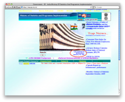
That site it truly horrible and you would think it would be unacceptable for a country's government's site. The yellow text on the top is such a noob mistake and the use of Marquee and Times New Roman is just... blech.

I just looked at the site again, and there's a series of white links on the left that I didn't even see before.:eek:
 
Great thread, good laughs!

I think the so-called "web designers" sites that are rancid the funniest. So, here is my contribution to the list:

http://www.thedynamitedesigns.com

I especially like the way the text disappears (or nearly does) when you hover over links. And the textures are pretty awesome. :cool:
 
There is a small wedding dress rental company in the US. I was looking for the ugliest websites and that's how I come across their site. It's effing hilarious! It's so bad that it's good. Also, I think now they purposely adding ugly bits to it, so it ranks high on Google. Please, somebody find it!

EDIT:

here it is:


http://www.yvettesbridalformal.com/


Enjoy!
 
For a prime example on how NOT to do things, look at verizons site, especially if you go to pay your cell phone bill online. Unless things improved since I was with them two years ago, it takes FOURTEEN CLICKS to pay your bill.
 
Register on MacRumors! This sidebar will go away, and you'll see fewer ads.