Become a MacRumors Supporter for $50/year with no ads, ability to filter front page stories, and private forums.
its so old its new. black is the new black. if you want to get ahead of the curve go back to space invaders pixelated look, TIA chip, 76 machine cycles per line, 192x160 CRT television. You will be the coolest kid on the block before we inevitably move back to the abacus.
 
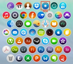
I don't like the concept (e.g. every icon a circle)...too boring and limiting and makes it harder for the user to easily discern one application from another.
 
I visit Arn0 & Humex threads all the time to see their handy work. They do some really creative work. Kudos to them for their hard work and effort. Without ever asking for anything. Not everyone will like them, but keep up the great work Humex & Arn0.

I guess if you don't like them, then you just create your own or live with what is create by the developer.
 
Not a fan of all the icons being round. It just means that as soon as you have one that doesn't confirm the whole package looks ugly.
It's the same for third party apps on iOS when a developer follows a system. The whole page looks bad because not everything follows their system and it never will. iOS grid system in general fails for the same reasons. There will always be something that doesn't fit. At least pre-grid system when "nothing was consistent" nothing stood out like an eyesore either.
 
Inspired by Apples new UI choices TV manufacturers release round screen TVs

Apples iTV follows shortly and is as you guessed O
 
There is some nice work there. I like most of them, but there are a few that aren't as nice.
 
Last time I checked, Apple killed iDVD (sadly)... unless this is supposed to be some other app.
 

Attachments

  • dots_by_dradis75-d7n2hpn-800x710.jpg
    dots_by_dradis75-d7n2hpn-800x710.jpg
    155 KB · Views: 131
I guess you're being sarcastic, but I actually really like that idea. It could flow out of the icon into a splash screen. (And seriously, what the hell has happened to splash screens? I don't care if app load times are now very fast, I want something to look at so I know something important's being loaded, dammit!)

If I had my way thats how I would do it. Firework Icons? Oooh :D bursting with life and fun. The *cough* was because I was being extravagant, just like how I buy my food skipping all the "Just the basics" and "Economy" brands which is how I feel the new OS design is heading.
 
I... I don't like the circles...

Plus Messages, Mail, Preview etc. Didn't get turned into circles, no reason to think it would or should happen to EVERYTHING.
 
I hate 'em, I hate 'em, I hate 'em!
Took 20+ years to get some nice 3D effects in OSs and Apps; Took only one year to take it all out. I guess that they simply ran out of ideas esthetically-wise ;)
 
As others have said, most of these do not look that good. The current Adobe icons are much more stylish and professional than these. And it's frankly confusing if *every* icon is round with a white border and uses a similar color palette.
 
In the next release of OS X, all icons will use only different shades of yellow.
 
Im tired of this kind of hacky, unoriginal and meaningless shadow that every "designer" loves to do so much.
tumblr_mpcityIXrF1sydqgpo3_1280.png
 
Yosemite isn't even all that flat, it just looks a little different. Most of the icons are still 3D and glossy.

I'm not a big fan of that 100% flat design though.
 
I don't know. We've managed to differentiate iOS's square icons pretty easily over the years. I guess it'll depend on the image.

not if they're just coloured circles :(

At least with iOS prior to iOS 7 all the icons were 3D like and with cool image designs. Now they look plain and ****.
 
Register on MacRumors! This sidebar will go away, and you'll see fewer ads.