What is this ****? how is this news?
In a world where blogs aren't posting click-bait stories, this is NOT news. But I dream. Sigh.
What is this ****? how is this news?
IMO, there's a happy medium to be struck between "felt" in Game Center or "ripped edges" in Calendar and this cartoony mess.
Is it bad that I love this? Maybe not as anything more than a gimmick OS, but I love the aesthetic.
Too flat. Paper mario flat.
Agreed. This is crap.
Way over the top.
Oh please, don't start giving ideas to Apple. Following this frigging absurd path, it wouldn't surprise me at all if they come out with something like this in a few years:
Image
")
Bleh - apps that still have splash screens irritate me. There's StarCraft 2, which for whatever reason wants you to click a big yellow "Play" button a few seconds after you start the app before it'll actually load anything. Lotus Notes also has a splash screen, where it insists you enter your password before it loads anything.
No, Apple properly satisfied the need for something to happen by making the icon immediately start to bounce in the dock all the way back in the first version of OS X. It's much better than Microsoft's "Sometimes the icon gets highlighted eventually in the task bar" that they have in Windows 7.
Actually, if you want modern splash screens, all iOS apps use them. When you tap the icon in iOS, it "zooms in" on a splash screen that's part of the standard iOS app bundle. The splash screen looks like the initial screen that will appear, minus any interactive elements.


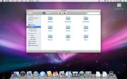
What a shame, that after the evolution of the most beautiful computer OS, we've ended up with a "flat" fad driven monstrosity. Take a look at this picture folks, in a few years we'll look back at this, longing for the return of true Apple design. Say goodbye to the beautiful dock, with distinctive shaped icons that pop with subtle reflections. Say goodbye to subtle tones, visual clarity and a general sense of order and maturity. Say goodbye to well designed type that is natural and easy to read, instead welcome the use of deceptive letter shapes, poor spacing and awful finials, and get ready to be unable to distinguish between I and l
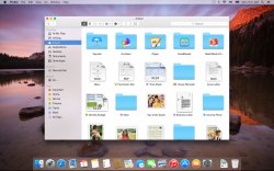
Instead, welcome the use of dull and uninspired icons that all look the same. Be ready for a fisher price colour scheme with icons that aren't even proportionally sized. Just look at those elegant folder icons! Lovely and obtrusively large, with a wonderful preschool colour!
I certainly will be sticking with Mavericks for as long as I can.
awful reimagination. why do all the icons have to circular?