Become a MacRumors Supporter for $50/year with no ads, ability to filter front page stories, and private forums.

awesomedeluxe

macrumors 6502
Original poster
Jun 29, 2009
262
105
acer-aspire-r7-windows-8-laptop-notebook.jpg

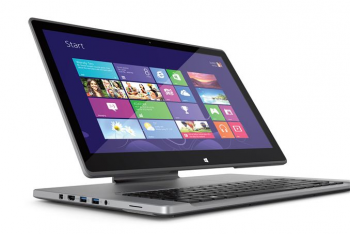
Forget finicky "Surface Book" designs that try and fit CPU components under the screen. Forget "Yoga" designs that just fold backwards.

The Acer Aspire R7 is it. With a hinge that looks like an iMac or an iPad Pro w/ Magic Keyboard, it fits perfectly into Apple's aesthetic.

Acer Aspire R7_Ezel_678x452.jpg
Now this is a bit of an ugly notebook, and it makes one heck of a poor choice: it puts the touchpad above the keyboard. After mulling it over a bit, I came up with a solution that keeps this hinge design but doesn't put the touchpad above the keyboard. What you do is, you keep the hinge, but you put the touchpad below the keyboard. Genius.

06gnARAgbY5Vkkuj55wgYu0-8.fit_scale.size_2698x1517.v_1569480338.jpg

Imagine it's all aluminum, thinner, and has an apple logo where it says acer. Pretty, right? Yeah. It's a useful hinge design for desktop use, but it also provides great access to the screen for your iOS apps. Plus, it's basically an easel, so break out that Apple Pencil. What's not to love?
 

Attachments

  • 1595367148906.png
    1595367148906.png
    283.1 KB · Views: 142
  • Like
Reactions: Duckyduckbumps
This feels like a design that's trying to solve a problem that doesn't exist.

It looks interesting, but yeah, the kb layout would kill my forearms in a hot second, and building the hinge into the back of the display like that would require a much thicker lid than we have now to support the hinge, pivoting, and have enough strength to not stress the lid/arm/hinge when moving it around.

I feel like we'd give up a lot to not really gain much.
 
Last edited:
Apple can just adapte the new iPad Pro Keyboard design which has a ton of buzz already, and evidently people really like.

On the other hand. Apple sets design aesthetics, they don't copy them, from anybody. For Apple Design, its a pride/ego thing.

I really don't see this coming to the Macbook lines; at the very least, it makes the laptop thicker. I think we can all guess as to how Apple feels about that.
 
Last edited:
This feels like a design that's trying to solve a problem that doesn't exist.

It looks interesting, but yeah, the kb layout would kill my forearms in a hot second, and building the hinge into the back of the display like that would require a much thicker lid than we have now to support the hinge, pivoting, and have enough strength to to stress the lid/arm/hinge when moving it around.

I feel like we'd give up a lot to not really gain much.
Your forearms? Did you not read my solution to that? It was very innovative. What I did was, I moved the touchpad to to bottom. So you can rest actually rest your palms on the sides of the touchpad. It's a very groundbreaking design.

Apple can just adapte the new iPad Pro Keyboard design which has a ton of buzz already, and evidently people really like.

On the other hand. Apple sets design aesthetics, they don't copy them, from anybody. For Apple Design, its a pride/ego thing.

I really don't see this coming to the Macbook lines; at the very least, it makes the laptop thicker. I think we can all guess as to how Apple feels about that.
I am utterly confused. This is very similar to the iPad Keyboard design. That is the point.
ipadkeyboard.jpg
I basically went and looked at laptop hinge designs to see if anyone had done this, saw someone had, and made this post.

Hard pass, thanks.
You are welcome.
 
  • Like
Reactions: Marlon DLTH :)
No it is not similar to the iPad Keyboard design, concept is similar, but lots of details are different. The Acer design is visibly thicker, and requires that the display itself be correspondingly thicker to accomodate the relatively thick hinge mechanism. Also, the iPad Keyboard hinge is full width, the Acer is only about 1/3 the width.

look at a folded/closed iPad Pro, and the Acer. do you see a difference in thickness? I bet you will.

It would be interesting to know which came first, the iPad Pro keyboard, or this Acer laptop.
Splitting hairs here. We agree fundamentally that what ASUS has done is take the Magic Keyboard design and build it into the hinge here; we can agree to disagree on whether we consider that "similar."

I'm not married to this particular implementation of the design. Of course I would expect Apple to do it thinner. I'm a little less certain they would go wider. Asus seems clearly inspired by the iMac with their aesthetic here, and while they don't do a great job pulling it off, I think wider would look worse.

I'm open to other ideas for a hinge design that would enable touch, but I like this one a lot because I think raising the screen a little would be comfortable for desktop usage.
 
it would be nice to know who did it first, out of curiosity.

if Apple were to do somrthing similar for the MacBooks, I can see them bringing it further down near the base, possibly near the bottom edge of the screen, still raised above the keyboard section, and possibly having the keyboard/touch section sliding out towards the user.

The Apple hinge is the full width of the Ipad Pro, it is entirely possible that the MacBook design would be as well. It would have advantages in terms of durability and stability, at the tisk of being clunkier looking possibly.
 
Splitting hairs here. We agree fundamentally that what ASUS has done is take the Magic Keyboard design and build it into the hinge here; we can agree to disagree on whether we consider that "similar."

No, they have not. What they have done is used the same split hinge.

The huge difference is that there's not only vastly increased bulk at the back, there's also zero wrist rest at the front, nor is there a usabke touch pad.

Hard pass from myself also.
 
Your forearms? Did you not read my solution to that? It was very innovative. What I did was, I moved the touchpad to to bottom. So you can rest actually rest your palms on the sides of the touchpad. It's a very groundbreaking design.

Ah, yes, indeed. Someone should snatch you up on their design team, asap!
 
it would be nice to know who did it first, out of curiosity.

if Apple were to do somrthing similar for the MacBooks, I can see them bringing it further down near the base, possibly near the bottom edge of the screen, still raised above the keyboard section, and possibly having the keyboard/touch section sliding out towards the user.

The Apple hinge is the full width of the Ipad Pro, it is entirely possible that the MacBook design would be as well. It would have advantages in terms of durability and stability, at the tisk of being clunkier looking possibly.
It's actually... Asus by a longshot! This monster came into this world in 2013. I'm surprised too, though that helps explain some of the design missteps.

What I struggle with is envisioning what a wide hinge would look like in aluminum. The iMac has already defined the look for a narrower hinge, and I think it's safe to say ASUS took a few design cues there. In terms of function, though, a wide hinge certainly does everything you would want it to do.

No, they have not. What they have done is used the same split hinge.

The huge difference is that there's not only vastly increased bulk at the back, there's also zero wrist rest at the front, nor is there a usabke touch pad.

Hard pass from myself also.
You responded to me saying "we agree this is the same concept for the hinge" with "no, what they did is use the same hinge." I know people tend to skim these threads but you are staking out a hard stance against a position no one has actually taken.

Anyway, the wrist rest and touch pad aren't a problem with the hinge design, and are problems that are easily fixed. The touchpad goes at the bottom of the base where it is supposed to go.

Instead of having the screen rest in the middle of the machine, I would have it go between two positions:
  • Resting on the edge of the base, so it looks sort of like the angle ⦟ on a raised drafting table. This would be the default touch position.
  • Upright, raised slightly from the keyboard (think iMac). You would have three axes of maneuverability to set the screen to a position of your liking.
This really only leaves the issue of the increased bulk at the back. A lot of that bulk is clearly unnecessary. How much is hard to say, but I think we can improve on ASUS' 2013 design.

It's an ugly child, but that hinge design does not demand an ugly notebook.
 
Last edited:
Hm, definitely not my taste. What's wrong with the classical laptop hinge? This thing just makes a laptop more clunky for no reason whatsoever. How would you make it more compact?
 
Hm, definitely not my taste. What's wrong with the classical laptop hinge? This thing just makes a laptop more clunky for no reason whatsoever. How would you make it more compact?
ASUS didn't make any effort to make this machine compact when it debuted in 2013. But that does not mean it can't be done.

As I understand it, this hinge has two working parts. The "base axis" connects what I'm going to call the stand (the narrow piece of metal that holds the screen up) to the base, and the "screen axis" connects the stand to the screen. This Slashgear review (everything you need is in the first 60 seconds) is the most illustrative.

If we want to make the stand thinner, we can do three things:
  1. Eliminate the exposed part of the top case which mandates another layer of protection
  2. Make the screen it supports lighter
  3. Make the stand wider.
One is solved by limiting our screen axis to ~80 degrees of rotation, enough to get us to a drafting table position where the bottom of the screen touches the front edge of the base from which the screen reclines at a slight angle ( ⦟ ). This is our touch position. Because the stand no longer needs to collapse to the other side of the top case, we no longer need to leave any part of our top case exposed, and we no longer need an extra layer of shielding.

Two is solved by routing a display cable through this stand and putting the working parts in the base. This is much easier to do with our stand than ASUS' since the axis needn't rotate even 90 degrees in our design.

Now, fix the stand's thickness to the thickness of the MBP's top case, and have it lie flush with it. Make the stand as wide as necessary to support the screen.
 
Last edited:
I mean, maybe if they made a big 20" drafting design (like a portable Surface Studio) but for a conventional laptop I'm seeing more negatives than positives with this.
 
I mean, maybe if they made a big 20" drafting design (like a portable Surface Studio) but for a conventional laptop I'm seeing more negatives than positives with this.
You know if I opened with the Surface Studio I might have gotten more actual discussion of this kind of hinge than hate for the ASUS... I definitely got a response, though!

7resize2-100717495-large.jpg

Look, it's pretty now.

So the Studio has the same kind of two-joint hinge design under discussion here. And it's actually designed to go back and forth between the two modes I recommend, a raised display and a canvas mode.

The difference is that it's bolted to a mac-mini like deal, instead of a laptop base - which means it's raised by default, and never needs to rest face-down on its base.

On a laptop, the two arms would need to be flipped so they rest flush against the machine. You can get a slight raise just by bringing the slab forward a bit and inverting the angle on the screen axis -- ASUS maximized this by swapping the keyboard and touchpad so the screen could be brought further forward, but of course this tradeoff is not worth it.

The obvious question in my mind is whether or not it's feasible for the laptop to "slide" up along the arms to raise the display. No solution is forthcoming, since there must be a cable traveling along at least one of these arms to connect the display and I can't imagine any such cable would be able to accommodate one of its connecting points being shifted up and down like this.
 
The problem with the ASUS design is the size and bulk that comes with it. Even if you move the keyboard back to accomodate the touchpad, you now have the keyboard underneath the screen, which can create issues for people with larger hands and/or people who type with their hands well above the keyboard itself. Outside of the new Magic Keyboards for the iPad Pros, nobody has released something similar in design that isn't bulky or places the kayboard and trackpad in unusual positions.
 
Register on MacRumors! This sidebar will go away, and you'll see fewer ads.