Lots of people are complaining about the front of the G5, and I happen to agree.
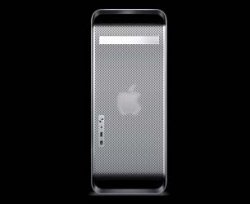
I think it's too plain, and the huge amount of space the grate takes up is ugly, and should be broken up.
this one simple change makes it look much better, and IMO really nice. It's not the best PS job, but you get the point.
I think it's too plain, and the huge amount of space the grate takes up is ugly, and should be broken up.
this one simple change makes it look much better, and IMO really nice. It's not the best PS job, but you get the point.