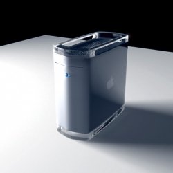
I love the new look, except maybe a small Apple logo recessed into the drive bay at the top would look nice. Dead central.
Also, I don't see the point of the ports on the front... I'd much rather they were on the monitor - with additional on the keyboard for regular access. But I know that it's something that users have requested, and I think that the ports are in the correct place if they have to be on the front - so Apple did the right thing there. And, if you consider the internal design of the machine, the ports had to be at that level (vertical displacement), due to the PSU cooling, and horizontal would have looked wrong if raised from the base.
In response to the 'smaller holes for an apple logo' on the front, I think this may have looked messy - and would it not have increased the manufacturing costs by a great amount? Right now, surely, they can just cut front sections from a rolled sheet??
The design at the top of the page looks okay, but holes on the top... asking for trouble in my opinion.
Yeah, I certainly think that with the new G5 form follows function perfectly. Wonderful. And the only G4 that looked nice was the Quicksilver. The original one looked like Lego at the front, and the mirrored drive doors were ugly- and those vents at the bottom?? Ugh.
Also, and perhaps more importantly, I think that the new G5 is going to look fantastic in CTU for the next series of 24. Try claiming you don't have the processor power on-site now, technogeek!!

Nice.


