Become a MacRumors Supporter for $50/year with no ads, ability to filter front page stories, and private forums.

Creative One

macrumors 6502
Original poster
Apr 25, 2009
404
1
Ontario
Hi all,

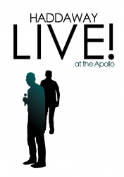
Doing a school poster for music in class.. We right a press release, poster, cd cover, and all, then we lip-sync the song and video tape it/edit for iMovie. I would like some peoples thought's and suggestions on my creation of it. I've silhouetted us, and then put a gradient behind, as well as some text overtop... I'd like some suggestions, as well as some examples.

PSD - http://rapidshare.com/files/237251455/Poster___Not_finished_.psd.zip.html

ljk9ca


PS: The edges on us have since been fixed.


EDIT- Awkward legs have been fixed, middle guys shoulders have been smoothed.
 
This is just my un-professional personal opinion, it doesn't just "stand out" to me, like it doesn't catch my eye, maybe if you used some colors that stood out a little more, but honestly if I walked past it in a hall way or on the street, I'd probably just blow right by it without even seeing it, it could just be me, but that's what I think, it looks nice and all, but if it's supposed to be a poster, it just doesn't draw my attention like a poster should!
 
This is just my un-professional personal opinion, it doesn't just "stand out" to me, like it doesn't catch my eye, maybe if you used some colors that stood out a little more, but honestly if I walked past it in a hall way or on the street, I'd probably just blow right by it without even seeing it, it could just be me, but that's what I think, it looks nice and all, but if it's supposed to be a poster, it just doesn't draw my attention like a poster should!

If it were your's what would your colour choice be? Were singing What is love; Haddaway... Ideas for a whole different poster?
 
I would clean up the edges on the silhouettes, for one. I'd also make it less dark, and change the font to something clearer. Nothing about this poster tells me that music is involved in any way.

I see 3 dudes, and some words that only state that it's some sort of live event at the Apollo. Think if over, and focus on it as if you had no clue what was going on, except by what was shown on the poster that caught your eye in passing. :)

Good first effort!
 
I like it....but I do have a few suggestions...

the words "at the" should be lowercase and on its own line in a smaller font size...
The word "apollo" should have its own line
of course a real poster would have date and time of the event along with ticket price and other info...look at a real poster and take a few ideas from that.

also the band name should have a splash of color or a logo to make it stand out

hope this helps!
 
I might mess around with this tomorrow and post what I come up with.

It's late and I'm too tired right now. But everything rhythmac said is right on the money. A good poster design, or any design for that matter, relies heavily on effective use of hierarchy of text. You want to emphasize the most important information and make it stand out. Having everything in the same font, in similar sizes just makes it all blend together. You want to lead the viewers eyes down to the smaller, detailed info. It's all about the hook, so make a logo for Haddaway that pops (he never had the greatest promo stuff, says google images) and make the other text secondary. I'll try and give an example or two tomorrow.

Mike
 
Lose the Gradient

Downloading the PSD: but before I get it some questions,
What size are you printing on? Have you taken bleed into account?
 
I see, it's A4. Unless you have access to a borderless printer, design it with a white border in mind.
 
Sorry for the needless bump, but I thought this imagery might help in the font category as a starting off point.
 

Attachments

  • haddaway.png
    haddaway.png
    70.9 KB · Views: 109
How about something like this...?

[NOTIMG]http://i304.photobucket.com/albums/nn165/louiseb388/Poster-1.png?t=1243367540[/img]

Haha, I see we inversed which words we thought were important :p

Which strengthens the OP's need for typography. ;)
 
I can do A4 and A6 at school, as well as 12x18. At home, we can do everything (thanks to my parents owning a printing business.) ... I'm in love with the one by oseven.. Although I am putting the date in (Wednesday June 16 1992) so could I get the psd for your's oseven?

If so, thank you!


Also, I would like to personally thank each one of you for your supportive criticism, and suggestions throughout. Thanks!

Also, my group really liked a brighter gradient (Oj & Green; REALLY :p)

Webers.
 
Sorry man, they're right. If it's your school work you need to do it yourself...that's why I only posted a png not the psd.
Good luck with it though! You'll thank us when you're a wiz with photoshop ;)
 
Register on MacRumors! This sidebar will go away, and you'll see fewer ads.